Statistical process control that stands up to audit Shewhart, CUSUM, and EWMA control charts with detection rules, process capability analysis with confidence intervals, and Pareto charts for defect prioritisation — plus the full general statistics toolkit for hypothesis testing, ANOVA, and regression.

Every feature from all five editions for 15 days, no sign-up.
Quality Control & Improvement edition from US$ 290 a year · 30-day money-back guarantee.
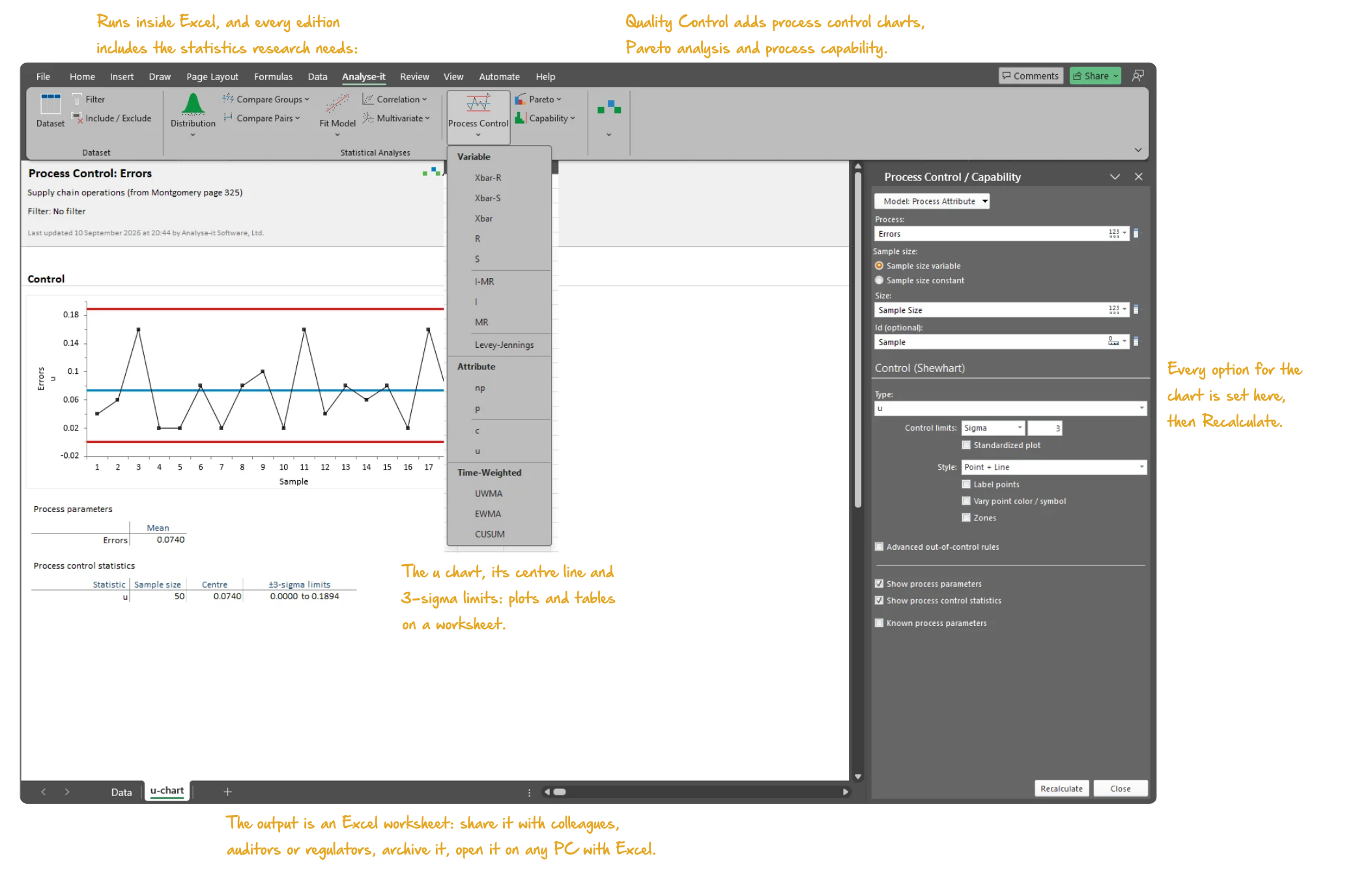
Microsoft Excel with the Analyse-it tab of the Quality Control edition selected: a process control report with a u chart of errors per sample with its centre line and 3-sigma limits and the statistics table beneath, the Process Control task pane open on the chart type, and the Process Control menu dropped open on the ribbon listing the variable, attribute and time-weighted charts. Handwritten notes: Runs inside Excel, and every edition includes the statistics research needs:; Quality Control adds process control charts, Pareto analysis and process capability; The u chart, its centre line and 3-sigma limits: plots and tables on a worksheet; Every option for the chart is set here, then Recalculate; The output is an Excel worksheet: share it with colleagues, auditors or regulators, archive it, open it on any PC with Excel.

DMAIC improvement work demands a complete statistical toolkit. Control charts to measure stability. Capability indices to quantify performance. Pareto and hypothesis tests to analyze root causes. Regression to model relationships during improve. Ongoing SPC to control the gains.

Most teams end up with one tool for charts, another for capability, and a third for the hypothesis tests and regression that the analyse and improve phases require.

The Quality Control & Improvement edition brings the full DMAIC toolkit together in one package inside Excel. Shewhart, CUSUM, and EWMA control charts with proper detection rules. Capability indices with confidence intervals and non-normal data handling. Pareto charts for prioritisation. The complete general statistics toolkit — hypothesis tests, ANOVA, regression — for the investigation phases.

No data leaves your PC. Results stay in standard Excel workbooks that you can share with colleagues, send to auditors, and archive for quality records.

Using Analyse-it we have improved several of our quality control testing steps, better controlled our decision making and are still undergoing process improvements.
Laura Smith
Production manager
The Binding Site

Monitor processes with control charts

Shewhart variable and attribute charts with automatic detection rules, plus time-weighted charts for detecting small, sustained shifts that Shewhart charts miss:

  • Xbar-R, Xbar-S, I-MR and the individual component charts for continuous data; p, np, c and u charts for attribute data — limits from the data or from known process parameters
  • CUSUM, EWMA and UWMA time-weighted charts — particularly useful where small drifts accumulate, such as reagent degradation, tool wear or calibration drift, that a Shewhart chart is slow to signal
  • WECO, Nelson and Montgomery detection rules, or a custom set — runs, trends, stratification and oscillation flagged automatically, each signal labelled with the rule it broke
  • Phases for before-and-after comparison — installation, qualification and production, say — each with its own control limits on the one chart
  • Stratification by operator, shift, machine, material lot or any factor — points coloured and labelled by the factor, so the cause of a signal is visible on the chart
Control chart details →
Microsoft Excel showing the Control section of a process control report for copper concentration: the EWMA chart with weight 0.2 and 3-sigma limits across the OQ and Production phases, the out-of-control point on 23/01 flagged, the R chart beneath, and the Process Control task pane open on the EWMA chart section. Handwritten notes: EWMA chart across the phases, with the signals flagged; R chart beneath; EWMA: weight lambda and limit width L.
EWMA chart (λ = 0.2, L = 3) of copper concentration with the R chart beneath, across the OQ and Production phases: one signal on 23/01.

Determine whether the process meets the specification

Capability and performance indices with confidence intervals, non-normal data handling, and the control charts to confirm stability first:

  • Cp, Cpk and Cpm for the inherent capability of a stable process; Pp and Ppk for the performance actually delivered — each with a confidence interval, so a marginal index is read as such
  • Z-benchmark and sigma level, and the nonconforming units outside each specification limit — observed %, expected % and expected PPM
  • Box-Cox and power transformations for non-normal distributions — so the indices are computed on data that meet the assumption behind them
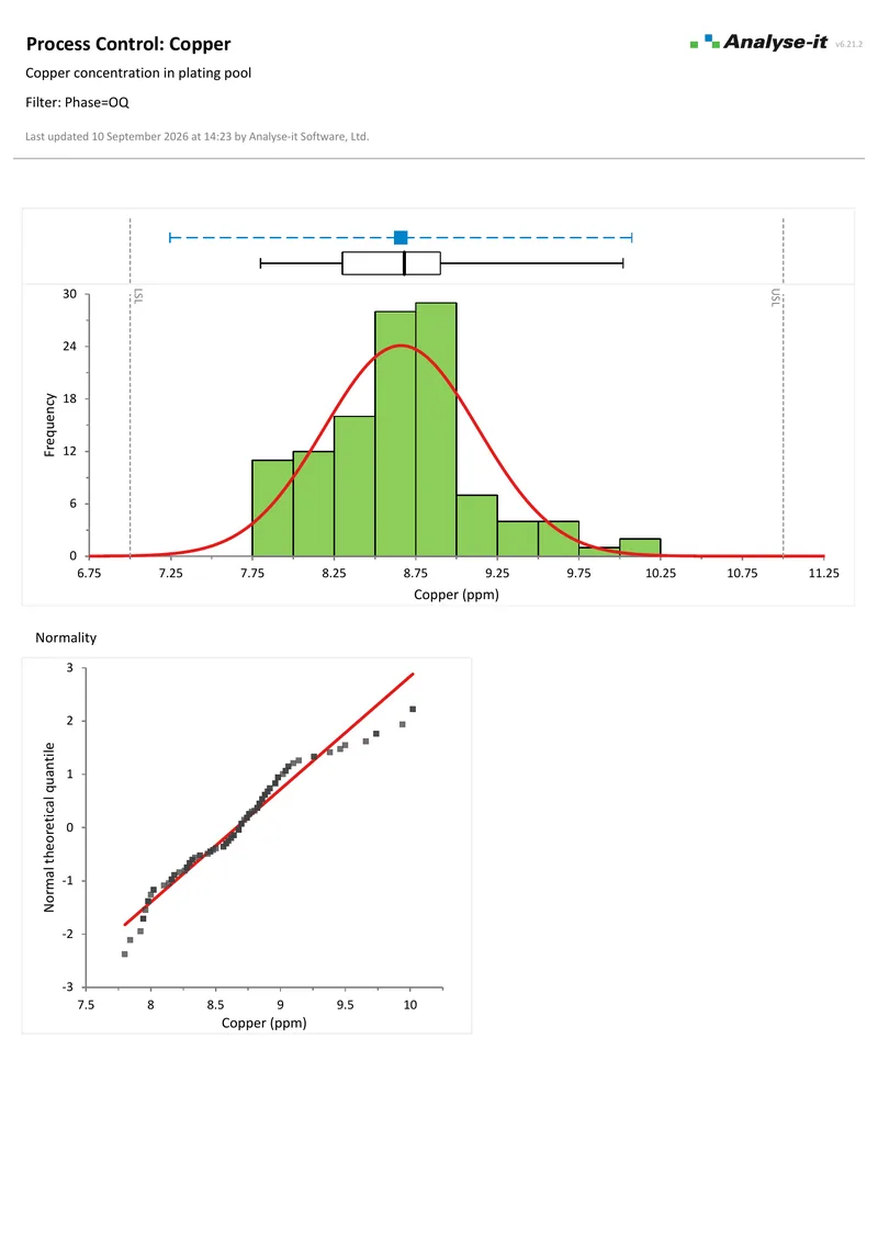
  • Histogram with the specification limits and a fitted normal curve, and a normal Q-Q plot with Lilliefors band — see whether the process is centred, and whether the data are normal
Capability analysis details →
Microsoft Excel showing the Capability section of a process capability report: specification limits 7 to 11, mean and long-term sigma, the Pp, Ppl, Ppu and Ppk indices with 95% confidence intervals, observed and expected nonconforming units in PPM, and the Z benchmark table. Handwritten notes: Pp, Ppl, Ppu and Ppk with 95% CIs; Expected nonconforming units, PPM; Z-benchmark.
The Capability section for copper concentration in a plating pool: Pp, Ppl, Ppu and Ppk with 95% confidence intervals, the nonconforming unit estimates and the Z-benchmark beneath.

Focus improvement effort on the vital few

Pareto charts to identify the most frequently occurring defects and break them down by contributing factors:

  • One-way and two-way comparative Pareto charts — defect type by operator, shift, machine or product line, one chart per cell so the vital few in each are compared side by side
  • Merge low-frequency categories into one bar, reorder the bars by any key, and colour by subgroup — the categories table in the task pane, no data editing
  • Cumulative percentage line with each point labelled — the 80/20 cut-off read straight off the chart, bars labelled with their frequencies
Pareto analysis details →
Microsoft Excel showing a two-way comparative Pareto chart: a row of Pareto panels for each of the operators GMH, JDH and SNH, a column for before and after training, each panel with its cumulative percentage line, and the failure category legend, with the Pareto task pane open. Handwritten notes: One Pareto chart per cell: operator by training; Layout: matrix.
Two-way comparative Pareto chart: colorimeter failures for each of three operators, before and after training.

Confirm root causes and test for differences

When the control chart flags a problem and the Pareto points to a suspect, hypothesis tests and ANOVA confirm whether the difference is real:

  • Student’s t, Welch’s t and Wilcoxon-Mann-Whitney for two independent groups; one-way ANOVA, Welch’s ANOVA and Kruskal-Wallis for three or more — with the homogeneity of variance tests that decide between them
  • Eight multiple comparison procedures — Tukey-Kramer, Dunnett, Hsu, Scheffé, Steel, Dwass-Steel-Critchlow-Fligner among them — to find which groups differ after a significant ANOVA, each controlling the family-wise error rate
  • Paired t-test and Wilcoxon signed ranks for two related measurements; within-subjects ANOVA and Friedman for repeated measures on three or more occasions
  • Cohen’s d and Hedges’ g effect sizes with non-central t confidence intervals — how large the difference is, not only whether it is significant
Hypothesis testing details →
Microsoft Excel showing a Compare Pairs report for body fat before and after an exercise programme: side-by-side box plots with a line joining each of the 28 pairs, the descriptive statistics for Before, After and the differences beneath, and the Compare Pairs task pane open on Descriptives. Handwritten notes: Before and after for each subject, joined; box plots for each measure; Descriptives of the pairs and their differences; Connect the pairs.
Body fat before and after an exercise programme, 28 pairs: box plots with a line for each pair, and the descriptive statistics for Before, After and the differences.

Model relationships and quantify improvements

Regression to model the relationship between process inputs and outputs, and ANOVA to quantify the effect of changes:

  • Simple, multiple, polynomial and logistic regression — model a response on one predictor or many, with the diagnostics that show whether the model holds
  • ANOVA and ANCOVA with crossed factors, interactions and continuous covariates — effect means, main effect and interaction plots, and multiple comparisons on the effect means
  • Residual diagnostics, leverage plots, Cook’s D influence and VIF for multicollinearity — the checks that show whether a model can be trusted before it is reported
  • Predicted values from the fitted model for new observations, with confidence intervals, and residuals saved back to the dataset
Regression details →
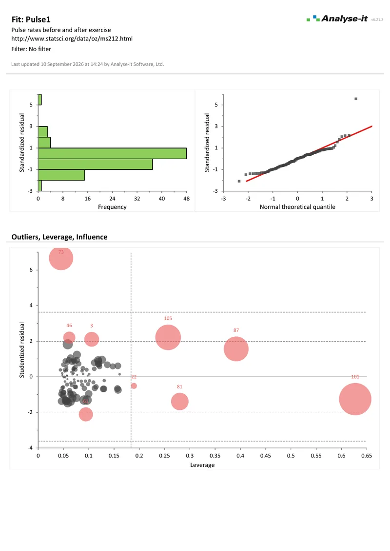
Microsoft Excel showing the Outliers, Leverage, Influence section of a multiple regression report of pulse rate on eight predictors: studentised residuals plotted against leverage for 109 observations, bubble size Cook's D, with the unusual cases labelled by observation number, and the Fit Model task pane open on the Outliers section. Handwritten notes: Studentised residual against leverage, bubble size Cook's D; influential cases labelled; Plot type, and labelling of influential cases.
Studentised residual against leverage for the 109 pulse-rate observations, bubble size Cook’s D, with the unusual cases labelled by observation number.

Describe and understand the data first

Before investigating root causes, understand the distribution:

  • Mean, median, SD, CV%, skewness, kurtosis, geometric mean and quantiles — the location and dispersion of a variable, with confidence intervals, in one table
  • Histograms, box plots, dot plots, CDF plots and Q-Q plots with Lilliefors bands — see the shape of the distribution, and any outliers, before choosing a test
  • Shapiro-Wilk, Anderson-Darling and Kolmogorov-Smirnov normality tests — a formal check on the assumption behind a t-test or ANOVA, alongside the Q-Q plot
  • Correlation — Pearson r, Spearman rs and Kendall τ for every pair of variables, each with a confidence interval and test, and a scatter plot matrix to see the relationships
Descriptive statistics details →
Microsoft Excel showing the Frequencies section of a discrete distribution report for the eye colour of 592 people: the bar plot of relative frequency for brown, blue, hazel and green, the pie plot beneath it, the frequency table, and the Distribution task pane open. Handwritten notes: Frequency bar chart with the cumulative relative frequency line; Whole-to-part pie chart, sectors labelled; Plot: bar or pie, with the cumulative line.
Eye colour of 592 people: the bar plot of relative frequency and the pie plot from the discrete distribution report, with the task pane open.
We have incorporated Analyse-it into our real-time daily QA analysis, making us both more efficient and proactive in addressing QA issues. Analyse-it has saved us time and provides the statistics and professional reports we need.
Dalton Seegert
Medical Technologist QA/Ancillary Testing
Veterans Administration

Includes the full Standard edition

The Quality Control & Improvement edition includes every feature from the Standard edition — the general-purpose statistics toolkit that quality teams use for the investigation and improvement stages of the workflow. Hypothesis tests, ANOVA, regression, descriptive statistics, correlation, contingency tables, PCA, and logistic regression are all in the same workbook as your control charts and capability analyses.

Related guides in our Learn section: which control chart do you need, reading out-of-control signals, Cp, Cpk, Pp and Ppk explained, and Pareto analysis and the 80/20 rule.


Validated, reliable, trusted for nearly 30 years

Validated calculations Every statistic tested against published datasets and thousands of internal test-cases. No reliance on Excel’s built-in functions — Analyse-it handles all calculations internally. See how we develop and validate Analyse-it →
Data stays on your PC No cloud processing, no uploads, no third-party access. Your data never leaves your computer — essential when working with proprietary process data, customer specifications, or regulated production records.
Standard Excel workbooks Charts and results are ordinary Excel workbooks. Share with colleagues, send to auditors or customers, archive for quality records — no Analyse-it licence required to view.
No formulas to break Results contain no formulas, so they cannot be accidentally edited or corrupted. The control chart you reported will be exactly what you find when you reopen the workbook.

Example analyses

Download example datasets, open them in the trial, and see exactly what the output looks like.

Control Example 1 Shewhart, EWMA and CUSUM
Copper concentration in a plating pool.
Three reports across the IQ, OQ and production phases. Xbar-R with Montgomery rules and points coloured by operator, then EWMA and CUSUM on the same data.
Control Example 4 p chart and standardised p chart
Nonconforming purchase orders.
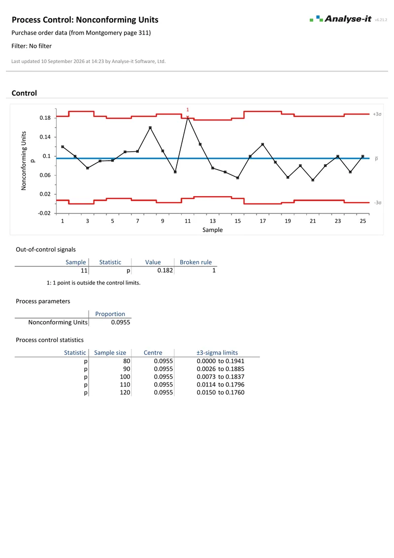
Montgomery, page 311. 25 samples of varying size. A p chart whose limits move with the sample size, and the same data as a standardised Z-score chart. Sample 11 is out of control on both.
Capability Example 1 Process capability
Copper concentration against a 7 to 11 ppm specification.
Xbar-R chart to confirm control, then a histogram with the specification limits, Q-Q plot, Shapiro-Wilk test, Pp, Ppl, Ppu and Ppk with 95% CIs, expected nonconforming units at 216 PPM, and Z benchmarks.
Pareto Example 1 Pareto analysis
Colorimeter downtime before and after training.
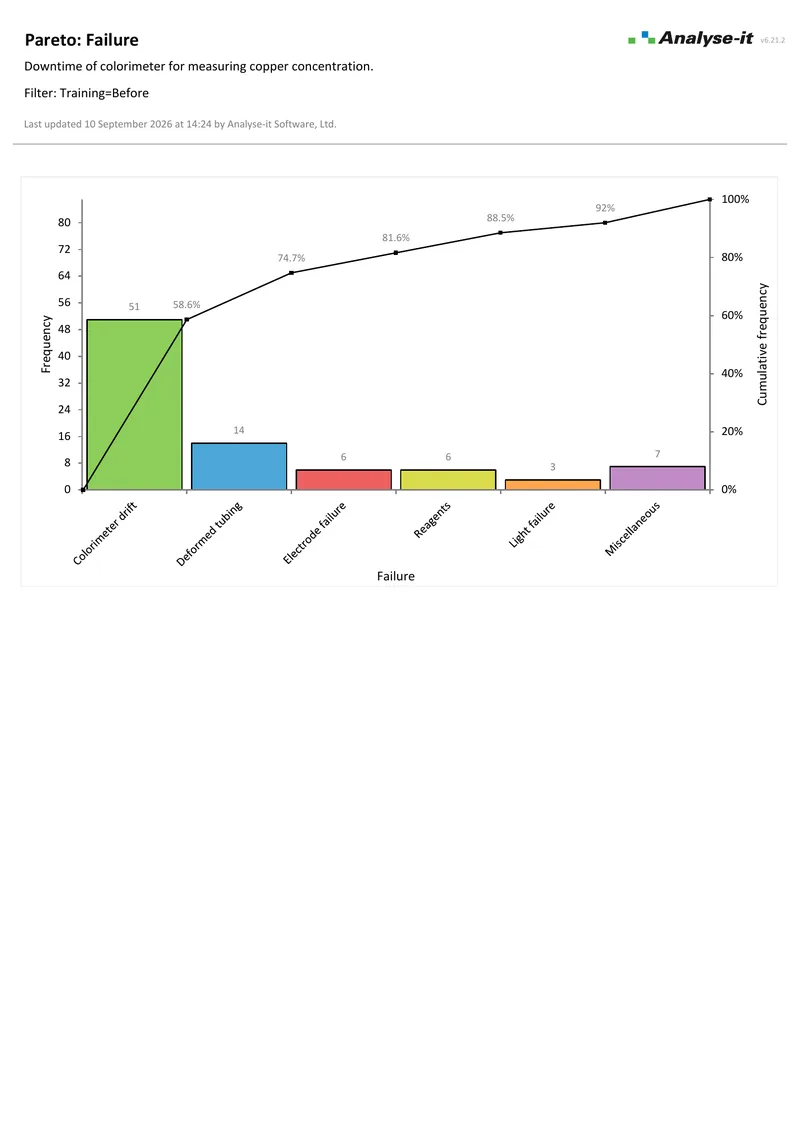
Three reports. A comparative Pareto stratified by three operators and by training status, then a Pareto for the 87 failures before training and one for the 58 after.
Compare Groups 1 One-way ANOVA
Y by brand, 7 groups, 19 observations.
Levene test for homogeneity of variance, one-way ANOVA, Tukey-Kramer over 21 contrasts, and a Mean-Mean scatter plot.
Fit Model 2 Multiple regression
Pulse rates before and after exercise, 8 predictors.
VIF, leverage plots, residual diagnostics, outlier/influence plot.

Free trial and pricing

Try it on your own data first. The 15-day trial is every feature from all five editions, with no sign-up and no licence key — install it and start straight away.

Quality Control & Improvement edition from US$ 290 per year, or US$ 760 for a perpetual licence. Every purchase carries a 30-day money-back guarantee. Need a quote for purchasing? Add the licence to the cart and save it as a PDF quote.

Technical details

Process control

Shewhart variable charts

  • Xbar-R
  • Xbar-S
  • Xbar
  • R
  • S
  • I-MR
  • I
  • MR
  • Levey-Jennings chart

Shewhart attribute charts

  • p
  • np
  • c
  • u

Time-weighted charts

  • CUSUM (cumulative sum), standardised or in the original units
  • EWMA (exponentially weighted moving average)
  • UWMA (uniformly weighted moving average)

Detection rules

  • WECO rules
  • Nelson rules
  • Montgomery rules
  • Custom rules

Chart features

  • Phases with separate control limits per period
  • Stratification by any factor (colour points)
  • Label out-of-control points
  • Control limits from data or specified standard
  • k-sigma or probability (α) control limits
  • Zones A, B, C and standardised charts
  • Plot styles: point, line, high-low, box plot

Process capability

Capability indices

  • Cp, Cpl, Cpu, Cpk
  • Cpm
  • All with confidence intervals

Performance indices

  • Pp, Ppl, Ppu, Ppk
  • All with confidence intervals

Yield and sigma

  • Z-benchmark (short-term and long-term)
  • Sigma level
  • Nonconforming units — observed %, expected %, expected PPM

Distribution assessment

  • Histogram with specification limits
  • Normal Q-Q plot with Lilliefors confidence band
  • Box-Cox and other power transformations

Pareto analysis

  • Pareto chart with cumulative percentage line
  • 1-way comparative Pareto chart
  • 2-way comparative Pareto chart
  • Merge bars to reduce clutter of small-frequency categories
  • Reorder bars to highlight specific problems
  • Vary colour of bars to distinguish categories or subgroups

Included from the Standard edition

The Quality Control & Improvement edition includes every feature from the Standard edition. See the Standard edition page for the full technical specification, including:

  • Descriptive statistics, histograms, box plots, dot plots, Q-Q plots, normality tests
  • Compare groups: t-test, Welch, Wilcoxon, ANOVA, Kruskal-Wallis, 8 multiple comparison procedures
  • Compare pairs: paired t-test, Wilcoxon signed ranks, Friedman, within-subject ANOVA
  • Effect sizes: Cohen’s d, Hedges’ g, Hodges–Lehmann
  • Contingency tables: Pearson χ², Fisher exact, McNemar, odds/risk ratios
  • Simple, multiple, polynomial, logistic regression with diagnostics
  • ANOVA/ANCOVA with effect means, interaction plots, multiple comparisons
  • Correlation: Pearson r, Spearman rs, Kendall τ
  • PCA, common factor analysis, biplots, 12 rotation methods
  • Cronbach’s alpha

System requirements

  • Microsoft Excel 2013, 2016, 2019, 2021, 2024 and Microsoft 365 for Microsoft Windows (32- and 64-bit)
  • Microsoft Windows 8, 10, 11, Server 2016, 2019, 2022
  • 2 GB RAM minimum recommended
  • 80 MB disk space