Every feature from all five editions for 15 days.
Quality Control & Improvement edition from US$ 290 a year · 30-day money-back guarantee.
Excel has no control chart. A line chart with limit lines drawn by hand plots the data and stops: no detection rules, no phases, no time-weighted charts, no attribute charts. Runs, trends and oscillation patterns have to be found by inspection. Dedicated SPC tools often cover only some chart types — Shewhart charts but not time-weighted charts, CUSUM but not attribute charts. Quality teams combine several tools, transfer data between them and lose continuity between charting and investigation.
Is the process stable, or is a small sustained shift building that no single point outside the limits will show? Did the new supplier, the revised procedure or the recalibrated equipment move the process? Is one operator, shift or machine the source of the variation?
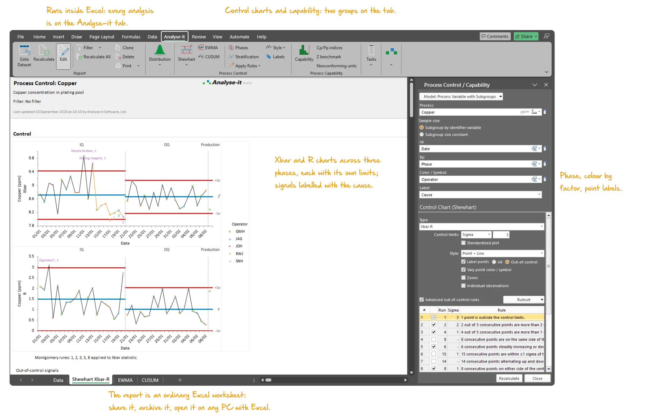
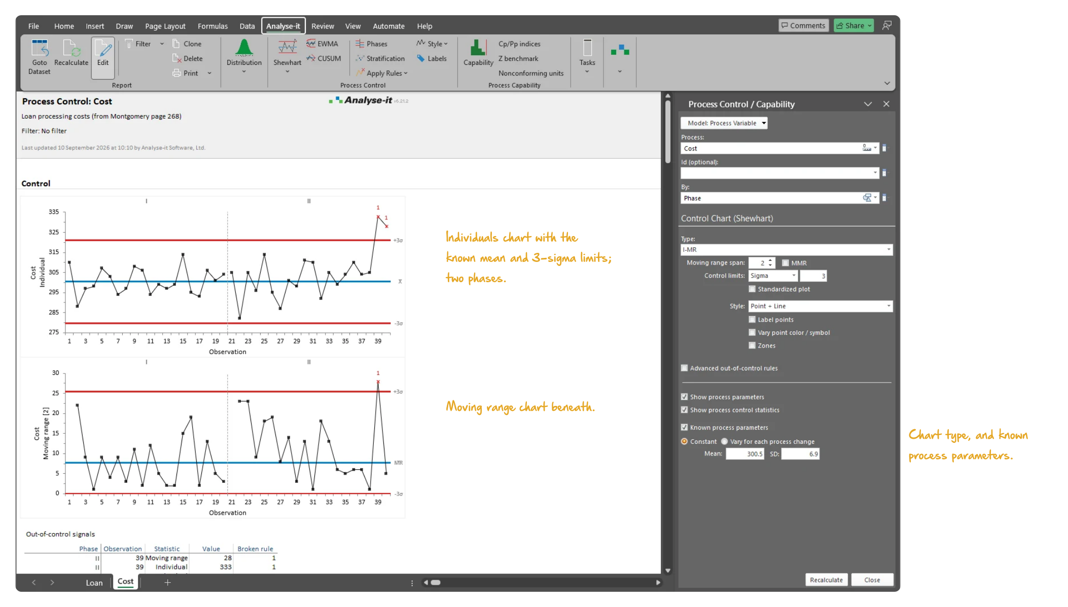
The chart should match the subgroup size and the structure of the data. Use Xbar-R for subgroups of 2–8, Xbar-S for larger subgroups, I-MR for individual measurements, or a single Xbar, R, S, I or MR chart on its own. Plot the points as point, line, high-low or box plot.
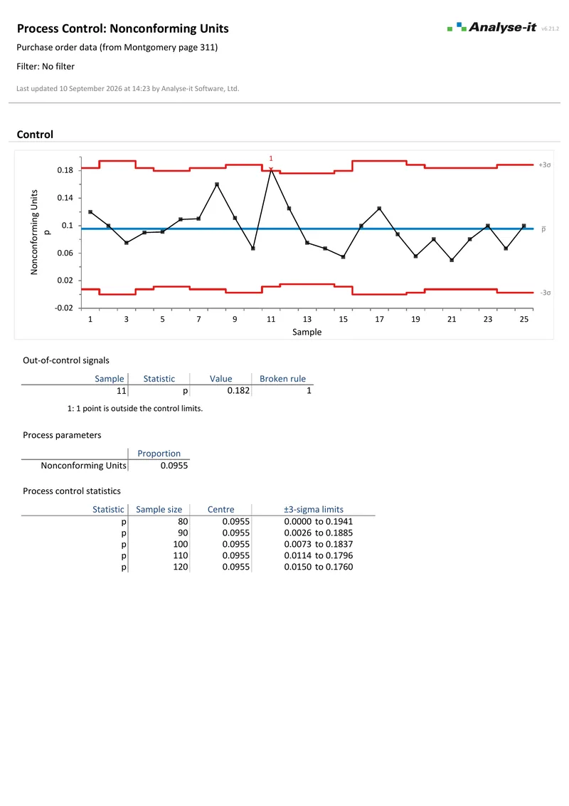
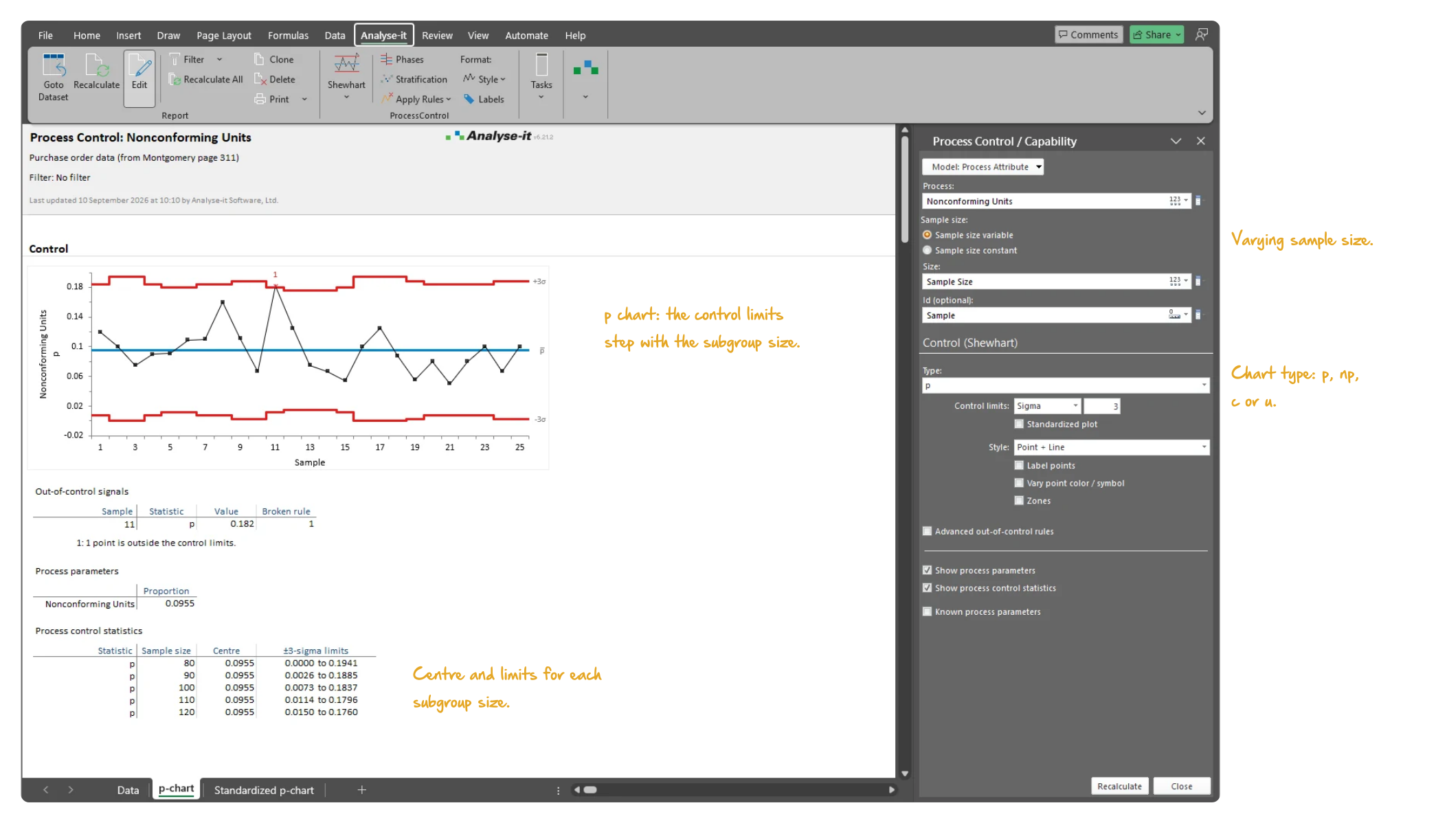
Pass/fail inspection results and defect counts need attribute charts, not variable charts. p and np chart the proportion or count of defective units in a sample; c and u chart the number of defects per unit or per inspection. The same detection rules, phases and stratification apply as for variable charts.
Shewhart charts detect large, sudden shifts; a reagent degrading gradually or a tool wearing over time does not produce one. CUSUM (cumulative sum), EWMA (exponentially weighted moving average) and UWMA (uniformly weighted moving average) charts accumulate the evidence of a small, persistent change in the process mean.

A point outside the limits is the easiest signal to see; runs, trends and oscillation are not. Apply the WECO, Nelson or Montgomery rule set, or define custom rules, on any chart. Points beyond the control limits, runs above or below the centre line, trends, stratification and oscillation patterns are flagged on the chart without manual inspection. The out-of-control signals table lists each signal with its phase, date, statistic, value and the rule broken. Label the out-of-control points directly on the chart for reporting and investigation.
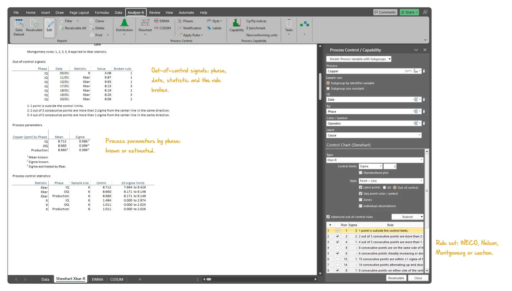
A process change — a new supplier, a revised procedure, recalibrated equipment — should not have its limits pulled by historical data. Set a new phase and each period gets its own control limits, calculated from the data or specified from a known standard. The effect of the change shows directly on the chart. Stratify by operator, shift, machine, material lot or any factor, and the points are coloured by that factor. Patterns hidden in aggregate data — one operator consistently above the centre line, greater variability on a particular shift — become visible.
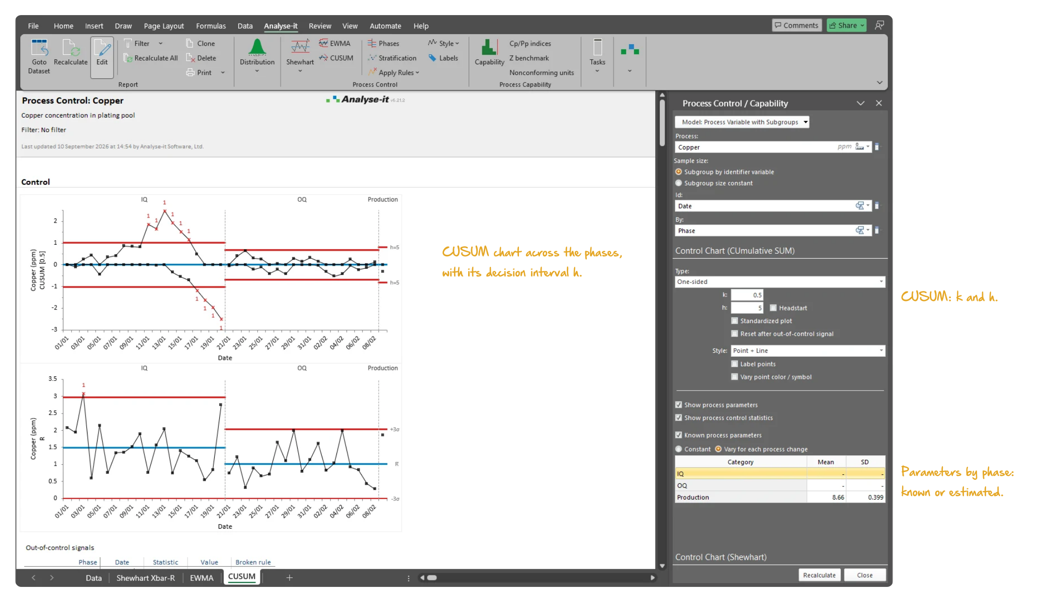
See control chart output in detail — Shewhart, CUSUM, EWMA and attribute charts with detection rules, phases and stratification. Each uses a real dataset you can download and follow along with.
 6 pages
Shewhart, EWMA and CUSUM
6 pages
Shewhart, EWMA and CUSUM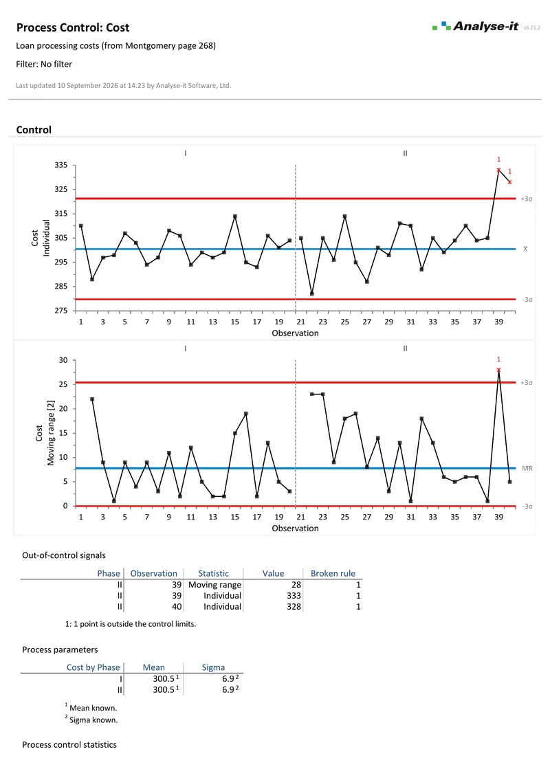 2 pages
Individual and moving range
2 pages
Individual and moving rangeControl charts are one part of the complete SPC and improvement toolkit. The Quality Control & Improvement edition also includes process capability analysis (Cp, Cpk, Pp, Ppk, Cpm, Z-benchmark) and Pareto analysis. The full Standard edition, with hypothesis tests, ANOVA and regression for root cause investigation, is included as well. See everything in the Quality Control & Improvement edition →
Related guides in the Learn section: which control chart do you need, reading out-of-control signals and Levey-Jennings charts explained.
Try it on your own data first. The 15-day trial is every feature from all five editions — install it and start straight away.
Quality Control & Improvement edition: US$ 290 per year or US$ 760 for a perpetual licence. Every purchase carries a 30-day money-back guarantee. Need a quote for purchasing? Choose the licence on the pricing page and click Get a quote.