Statistical analysis software for Excel The Standard edition is a comprehensive analysis toolkit for researchers and analysts, from descriptive statistics and ANOVA through to regression, PCA and multiple comparison procedures. The price is a fraction of the cost of Minitab, JMP or SPSS.

Every feature from all five editions for 15 days, no sign-up.
Standard edition from US$ 155 a year · 30-day money-back guarantee.
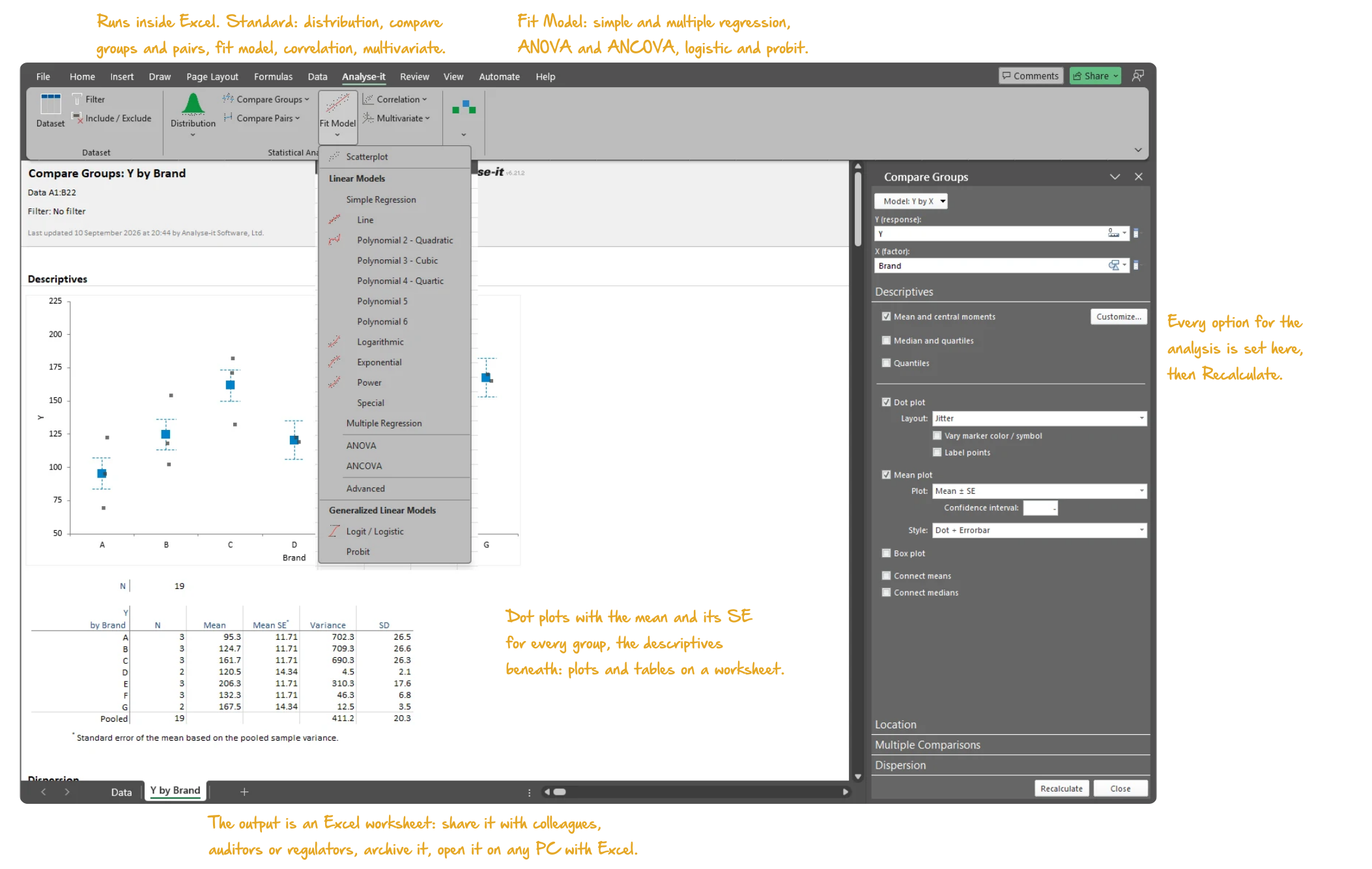
Microsoft Excel with the Analyse-it tab of the Standard edition selected: a compare groups report with dot plots and the mean with its standard error for each of seven brands and the descriptives table beneath, the Compare Groups task pane open on the descriptives options, and the Fit Model menu dropped open on the ribbon listing the linear and generalized linear models. Handwritten notes: Runs inside Excel. Standard: distribution, compare groups and pairs, fit model, correlation, multivariate; Fit Model: simple and multiple regression, ANOVA and ANCOVA, logistic and probit; Dot plots with the mean and its SE for every group, the descriptives beneath: plots and tables on a worksheet; Every option for the analysis is set here, then Recalculate; The output is an Excel worksheet: share it with colleagues, auditors or regulators, archive it, open it on any PC with Excel.

Excel’s built-in Analysis ToolPak handles a few basic tests — a t-test, a one-way ANOVA, a simple regression. The output is static, with no diagnostics, no multiple comparisons and no way to check whether the assumptions hold.

Other add-ins and standalone spreadsheet tools fill some of the gaps, but most are a collection of disconnected tests and plots without a coherent workflow. Few have been rigorously validated against published reference datasets.

Analyse-it provides the depth you need to do the job properly. Describe and visualise data, compare groups, fit regression models, reduce dimensionality with PCA and analyse categorical data, all inside Excel. The iterative workflow lets you build, examine and refine until you are confident in the result. Every calculation is validated and tested for accuracy against the NIST Statistical Reference Datasets (StRD).

It makes my routine stats analyses a breeze. My analyses are available immediately without waiting for other departments. Over the years I have tried several statistics programs, some Excel based, some not. But I always came back to Analyse-It, which is powerful enough for my purposes but the easiest to use.
Klaus T.
Chief R&D Officer
Pharmaceuticals

Describe and visualise data

Every analysis starts with understanding the data. What does the distribution look like? Are there outliers? Is it normal?

  • Mean, median, SD, CV%, skewness, kurtosis, geometric mean, harmonic mean, quantiles and mode — the location and dispersion of a variable, with confidence intervals, in one table
  • Histograms, dot plots, box plots (skeletal, Tukey outlier, quantile), CDF plots and Q-Q plots with Lilliefors bands. See the shape of the distribution, and any outliers, before choosing a test
  • Shapiro-Wilk, Anderson-Darling and Kolmogorov-Smirnov normality tests — a formal check on the assumption behind a t-test or ANOVA, alongside the Q-Q plot
  • One-sample t-test, Wilcoxon and Sign test for location, and the χ² test for variance. Test a mean, median or SD against a hypothesised value, with the confidence interval alongside
  • Frequency tables, bar plots and pie charts for categorical data, with binomial and multinomial tests of the proportions against hypothesised values
Descriptive statistics details →
Microsoft Excel showing the Frequencies section of a discrete distribution report for the eye colour of 592 people: the bar plot of relative frequency for brown, blue, hazel and green, the pie plot beneath it, the frequency table, and the Distribution task pane open. Handwritten notes: Frequency bar chart with the cumulative relative frequency line; Whole-to-part pie chart, sectors labelled; Plot: bar or pie, with the cumulative line.
Eye colour of 592 people: the bar plot of relative frequency and the pie plot from the discrete distribution analysis, with the task pane open.

Compare groups and pairs

Independent samples, paired samples, two groups or ten — parametric and non-parametric tests with the assumption checks built into the same workflow:

  • Student’s t, Welch’s t and Wilcoxon-Mann-Whitney for two independent groups; one-way ANOVA, Welch’s ANOVA and Kruskal-Wallis for three or more — with the homogeneity of variance tests that decide between them
  • Paired t-test, Wilcoxon signed ranks and Sign test for two related measurements; within-subjects ANOVA and Friedman for repeated measures on three or more occasions
  • Eight multiple comparison procedures — Tukey-Kramer, Dunnett, Hsu, Scheffé, Steel, Dwass-Steel-Critchlow-Fligner among them — to find which groups differ after a significant ANOVA, each controlling the family-wise error rate
  • Cohen’s d and Hedges’ g effect sizes with non-central t confidence intervals — how large the difference is, not only whether it is significant
  • Mean-Mean scatter plot showing every pairwise difference on one chart — the pairs that differ in red, those that do not in green. The simultaneous confidence intervals are beside it
Hypothesis testing details →

For method comparison studies in regulated environments, see the Method Validation edition.

Microsoft Excel showing a Compare Pairs report for body fat before and after an exercise programme: side-by-side box plots with a line joining each of the 28 pairs, the descriptive statistics for Before, After and the differences beneath, and the Compare Pairs task pane open on Descriptives. Handwritten notes: Before and after for each subject, joined; box plots for each measure; Descriptives of the pairs and their differences; Connect the pairs.
Body fat before and after an exercise programme, 28 pairs: box plots with a line for each pair, and the descriptive statistics for Before, After and the differences.

Explore relationships with correlation

The exploratory step between describing variables individually and fitting a regression model:
  • Pearson r, Spearman rs and Kendall τ for every pair of variables, each with a confidence interval and a significance test — not just the coefficient
  • Colour-mapped correlation matrices showing every pairwise relationship in one view — the strong positive and negative correlations stand out from the rest
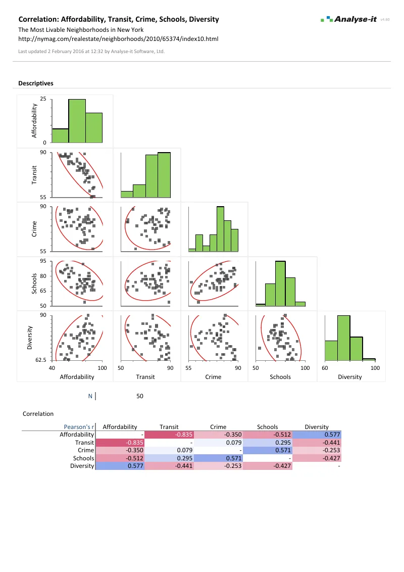
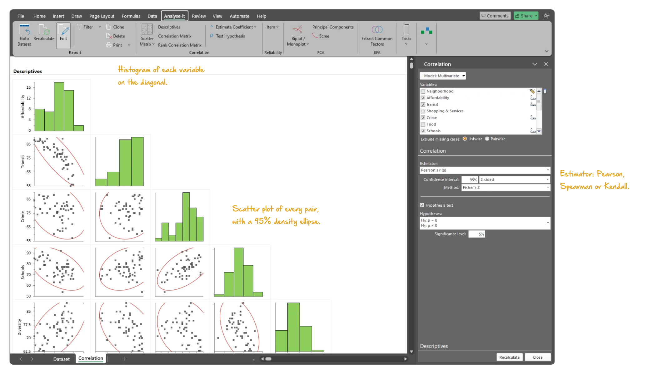
  • Scatter plot matrices with histograms on the diagonal and a density ellipse on every panel — see the shape of each relationship, and the outliers, before trusting a coefficient
  • Colour the observations by a factor to see group structure — a relationship that holds within groups but not across them shows at once
Correlation details →
Microsoft Excel showing the Descriptives section of a correlation report for five liveability ratings of New York neighbourhoods: the scatter plot matrix with a histogram of each variable on the diagonal and a 95% density ellipse on every panel, with the task pane open on the Descriptives section. Handwritten notes: Histogram of each variable on the diagonal; Scatter plot of every pair, with a 95% density ellipse; Estimator: Pearson, Spearman or Kendall.
The scatter plot matrix for five liveability ratings of 50 New York neighbourhoods. A histogram of each variable is on the diagonal, and a 95% density ellipse on every panel.

Fit and diagnose regression models

Regression as a process of building, examining and refining — not a single pass from data to p-value:

  • Simple linear, polynomial (2nd to 6th order), logarithmic, exponential, power and probit regression — fit the curve the relationship calls for, with a confidence band on the fit
  • Multiple regression with continuous and categorical predictors, crossed terms and interactions — categorical predictors are dummy-coded automatically, one row per level in the estimates
  • Parameter estimates with confidence intervals, VIF and standardised betas; R², adjusted R², AIC and BIC for the fit; Type I and Type III tests for the effect of each term
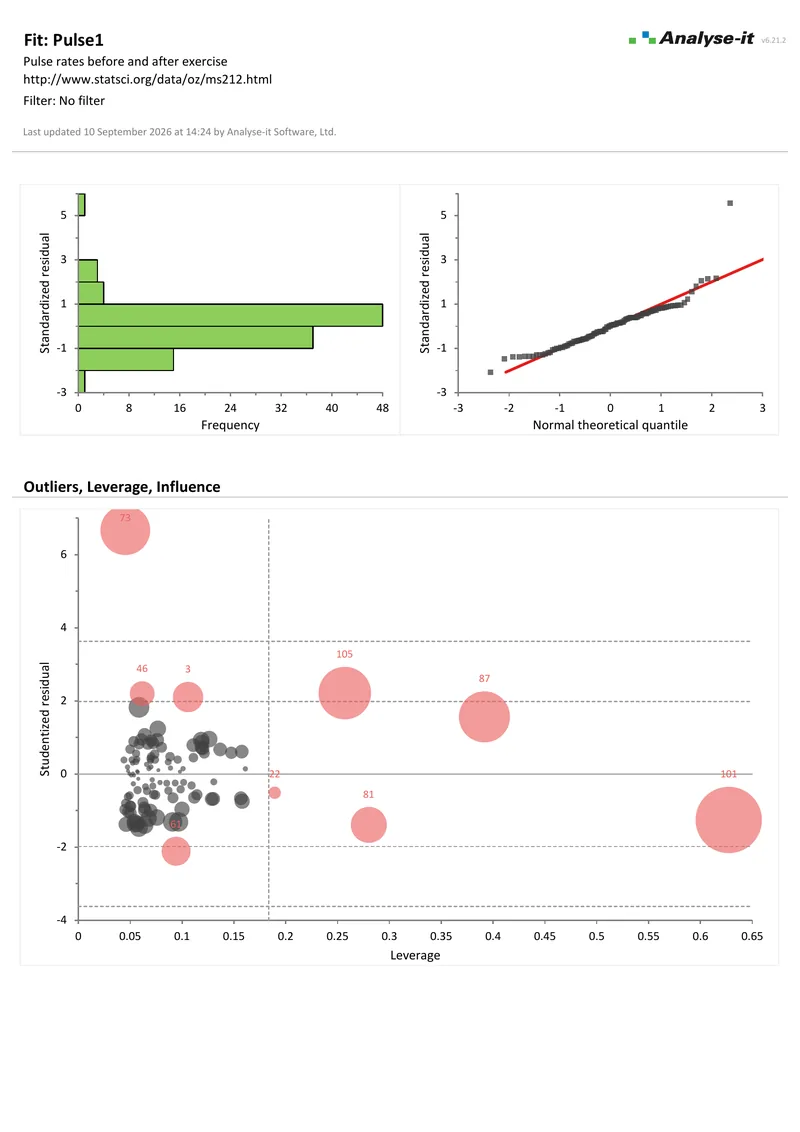
  • Outlier and influence plot — studentised residual against leverage, bubble size Cook’s D — to see immediately whether a few observations are driving the result
  • Leverage plots isolating each predictor’s contribution after accounting for all the others — the term’s own line against the line without it
  • Predict new observations from the fitted model, and save residuals, leverage and Cook’s D back to the dataset for further analysis
Regression details →
Microsoft Excel showing the Outliers, Leverage, Influence section of a multiple regression report of pulse rate on eight predictors: studentised residuals plotted against leverage for 109 observations, bubble size Cook's D, with the unusual cases labelled by observation number, and the Fit Model task pane open on the Outliers section. Handwritten notes: Studentised residual against leverage, bubble size Cook's D; influential cases labelled; Plot type, and labelling of influential cases.
Studentised residual against leverage for the 109 pulse-rate observations, bubble size Cook’s D, with the unusual cases labelled by observation number.

Build multi-factor models with ANOVA and ANCOVA

One-way, two-way and full multi-factor designs with the same diagnostic and comparison tools as regression:

  • Two-way and multi-factor designs with crossed factors, polynomial terms, interactions and continuous covariates — ANOVA and ANCOVA from one Fit Model command
  • Effect means with confidence intervals, and main effect and interaction plots — parallel lines mean no interaction, lines that cross mean the factors combine
  • Eight multiple comparison procedures on group means after a one-way ANOVA, and five on effect means after a Fit Model ANOVA or ANCOVA. Comparisons of all pairs, against a control or with the best
  • Leverage plots, residual diagnostics and outlier and influence analysis — the checks that show whether the model holds before the conclusion is reported
  • Within-subjects ANOVA and Friedman for repeated measures — the same subjects measured on three or more occasions, or under three or more conditions
ANOVA and ANCOVA details →

For ANOVA used in process investigation alongside SPC and capability analysis, see the Quality Control & Improvement edition.
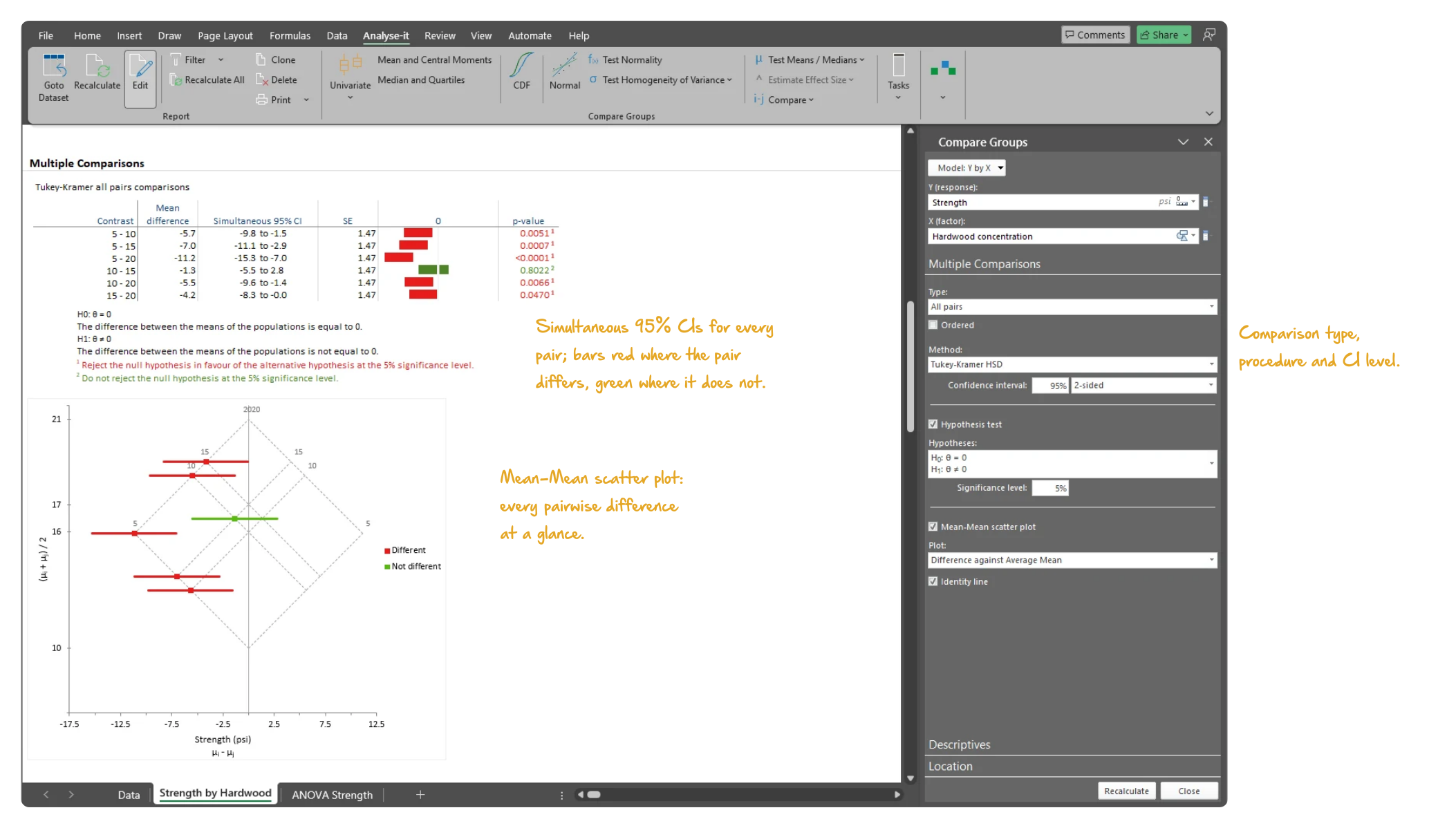
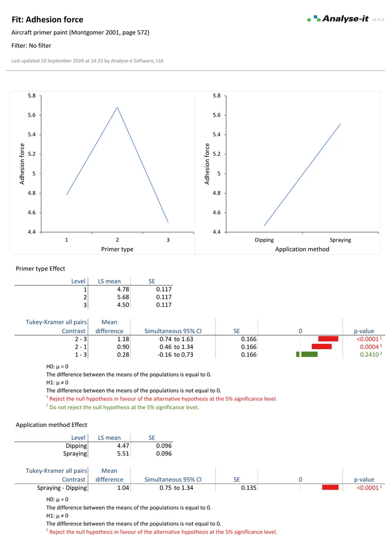
Microsoft Excel showing the Multiple Comparisons section of a one-way ANOVA report: the Tukey-Kramer all-pairs table with simultaneous 95% confidence intervals, p-values and red and green significance bars, the Mean-Mean scatter plot, and the Compare Groups task pane open on Multiple Comparisons with the type, method and confidence interval options. Handwritten notes: Simultaneous 95% CIs for every pair; bars red where the pair differs, green where it does not; Mean-Mean scatter plot: every pairwise difference at a glance; Comparison type, procedure and CI level.
Tukey-Kramer all-pairs comparisons after a one-way ANOVA, with the Mean-Mean scatter plot and the comparison type, procedure and confidence level in the task pane.

Model binary outcomes with logistic regression

When the outcome is binary — survived or not, responded or not, defective or not:

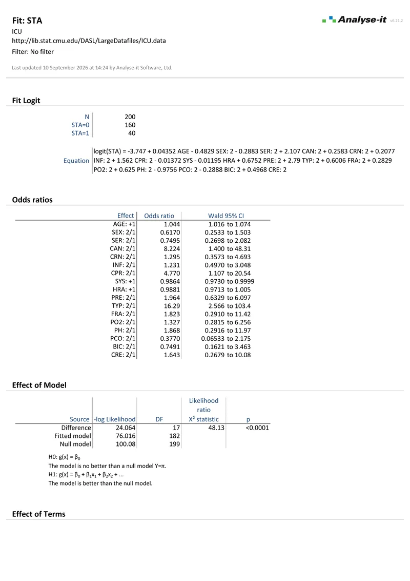
  • Odds ratios with confidence intervals and Wald significance tests for every predictor — each categorical predictor reported against its reference level
  • Wald and likelihood ratio tests for the whole model against the null and for each term — which predictors belong in the model
  • Inverse prediction — the X value at which the outcome reaches a specified probability, such as a 95% probability of detection, with its confidence interval
Logistic regression details →

For clinical prediction modelling alongside ROC, Bland-Altman and survival analysis, see the Medical edition.
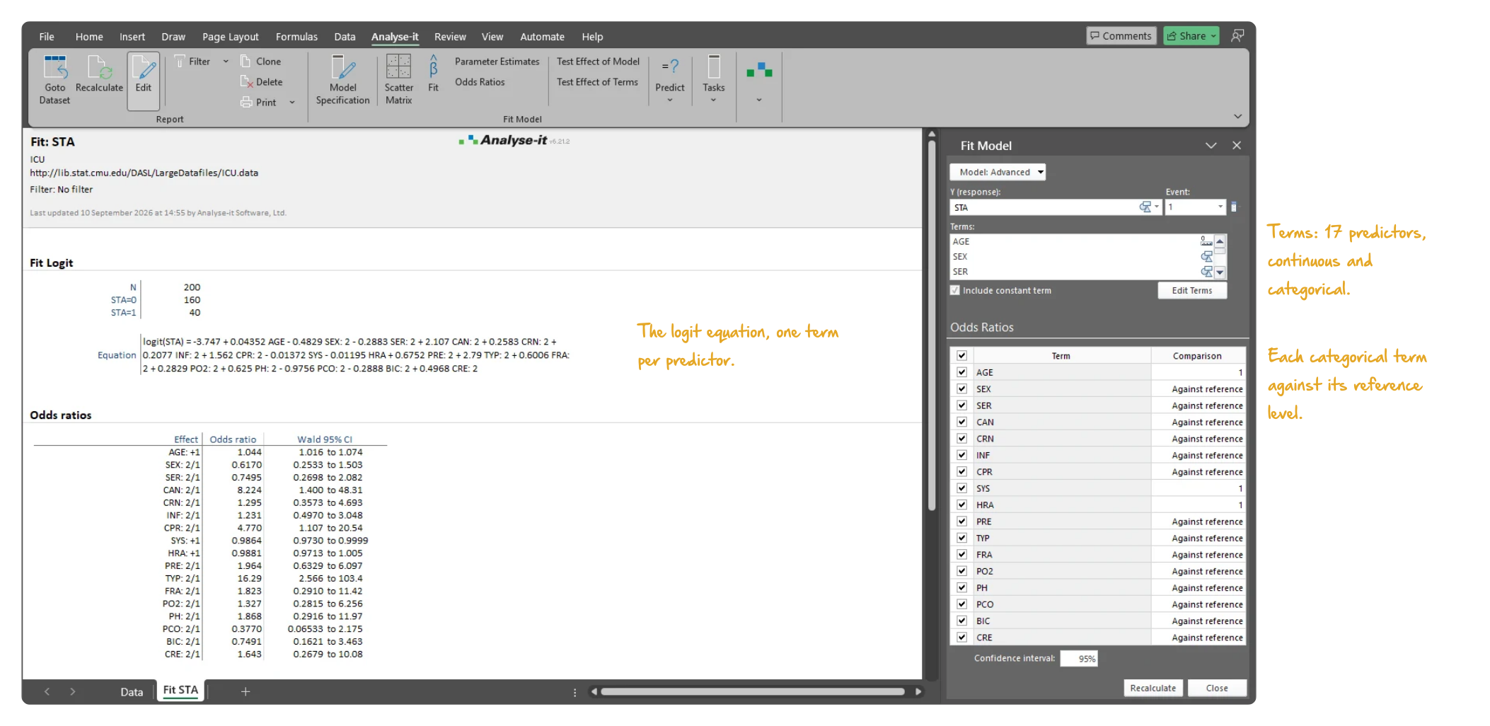
Microsoft Excel showing the ICU survival logistic regression report from the top: the report title, N 200, and the odds ratio table for 17 predictors with reference levels for each categorical predictor, and the Fit Model task pane open on Fit listing the response STA and the 17 model terms. Handwritten notes: The logit equation, one term per predictor; Terms: 17 predictors, continuous and categorical; Each categorical term against its reference level.
The ICU survival model: 17 predictors listed in the Fit Model task pane, and the odds ratio table with each categorical predictor against its reference level.

Reduce complexity with PCA and factor analysis

Make multivariate data interpretable with visualisations most packages do not offer:
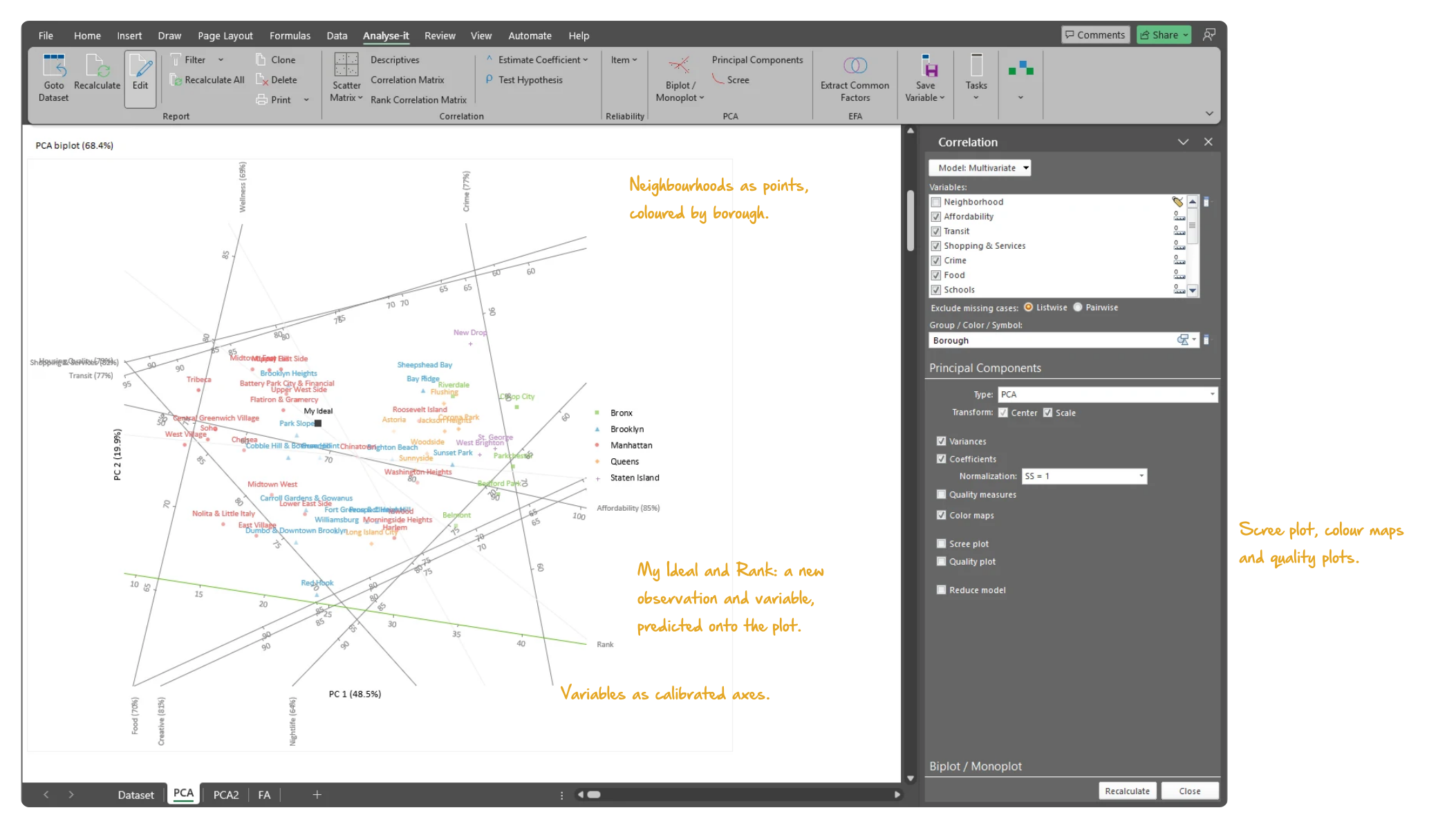
  • Gabriel and Gower-Hand biplots of the observations and variables together, with reflection, rotation and scaling set in the task pane and new observations predicted onto the plot
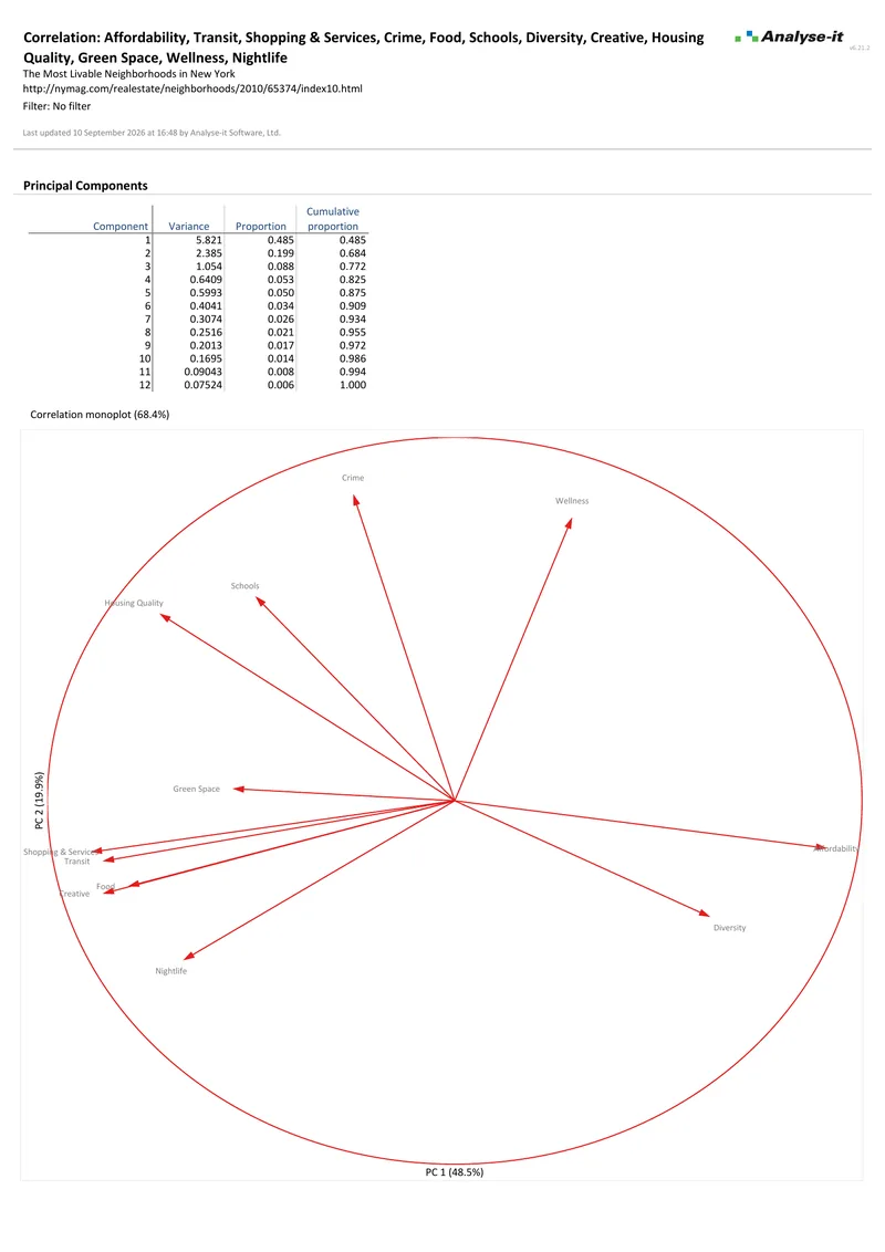
  • Correlation monoplots and colour-mapped coefficient matrices — see which variables load on which component without reading the numbers
  • Common factor analysis with 12 orthogonal and oblique rotation methods — uniqueness, communality and colour-mapped factor loadings for every variable
  • Cronbach’s alpha with the alpha if each item is deleted — the reliability of a scale, and the items that weaken it
PCA and factor analysis details →
Microsoft Excel showing the Gower-Hand biplot of a principal component analysis: fifty New York neighbourhoods as points coloured by borough, the twelve variables as calibrated axes labelled with the share of their variance shown, the new observation My Ideal and the new variable Rank predicted onto the plot, with the task pane open on Principal Components. Handwritten notes: Neighbourhoods as points, coloured by borough; Variables as calibrated axes; My Ideal and Rank: a new observation and variable, predicted onto the plot; Scree plot, colour maps and quality plots.
The Gower-Hand biplot of 50 NYC neighbourhoods on 12 liveability variables, coloured by borough, with the task pane open.

Analyse categorical data properly

When the data is categorical — pass/fail, treated/untreated, exposed/unexposed — you need tests designed for proportions, not means:
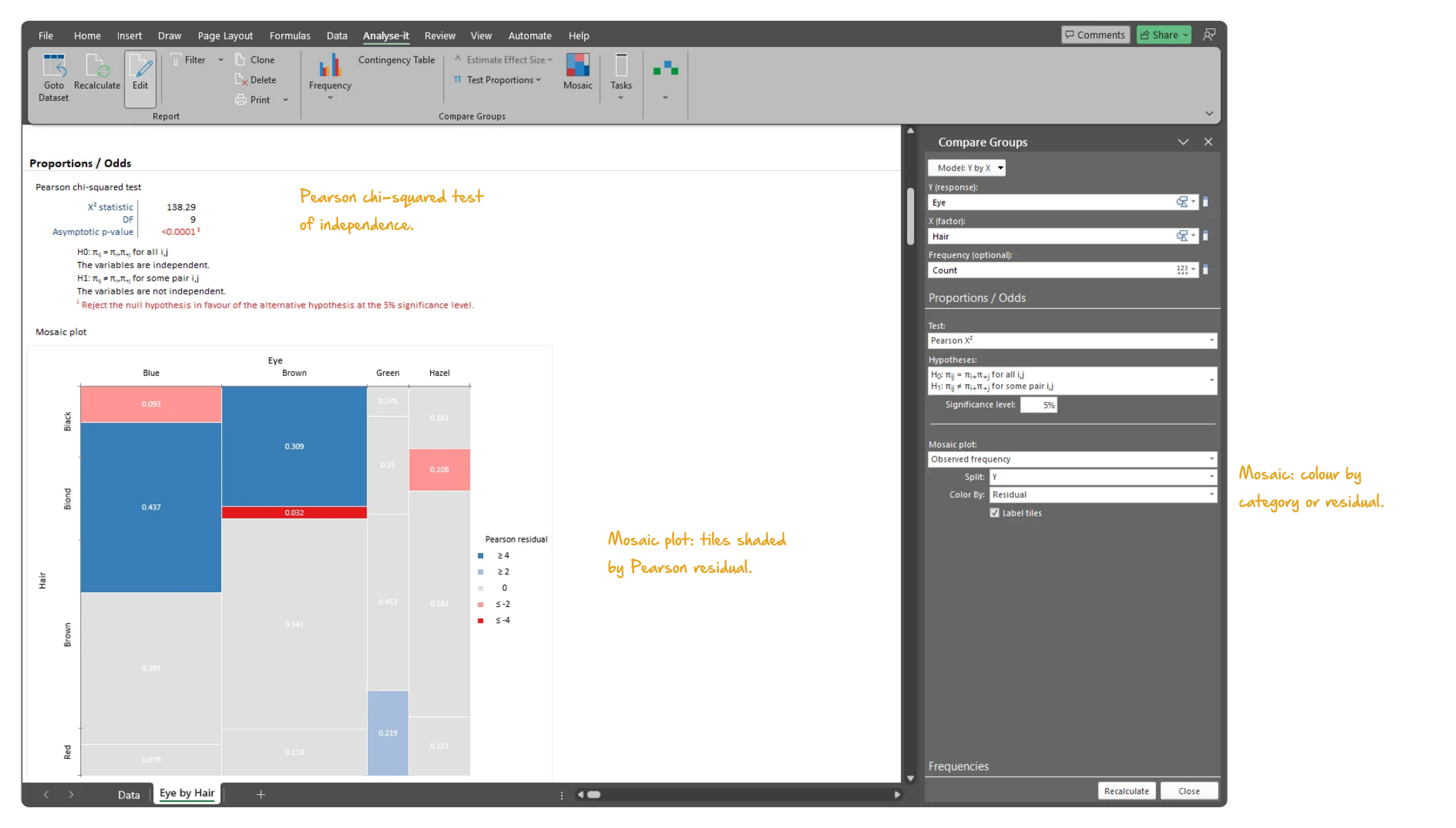
  • Pearson χ² and likelihood ratio G² tests for independence in any r×c table — the frequencies, expected counts and the hypotheses stated with the decision
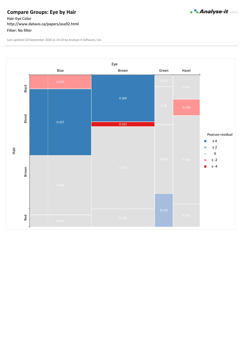
  • Mosaic plots with each tile coloured by its Pearson residual — the cells with more, or fewer, observations than independence predicts stand out
  • Fisher exact test for small tables where χ² is unreliable, and the McNemar test for related 2×2 tables such as before and after an intervention
  • Proportion difference, risk ratio and odds ratio as effect sizes for a 2×2 table, with Miettinen-Nurminen, Newcombe, Tango, Clopper-Pearson and Wilson confidence intervals
Contingency table details →
Microsoft Excel showing the Proportions / Odds section of the hair and eye colour report: the Pearson chi-squared test table with the statistic, degrees of freedom, p-value and the null and alternative hypotheses, and the mosaic plot beneath it coloured by Pearson residual, with the task pane open. Handwritten notes: Pearson chi-squared test of independence; Mosaic plot: tiles shaded by Pearson residual; Mosaic: colour by category or residual.
The Pearson χ² test for independence of hair and eye colour, and the mosaic plot beneath it with each tile coloured by its Pearson residual.
I use Excel to analyze, validate, and sumarize volumes of data every day. Since Analyse-It is always right there on my Excel ribbon, I go to it regularly. The correlation matrix is a great data validation tool because so much of my data is inter-related. The tests under Compare Groups and Compare Pairs let me evaluate significance before publishing data. I am not a professional statistician, but Analyse-It gives me all of the tools in an easy to use package that lets me focus on understanding my data.
Shawn W.
Analyst

The foundation for every edition

The Standard edition is included in the Medical, Quality Control & Improvement, Method Validation and Ultimate editions. If you need survival analysis, ROC curves, control charts or CLSI method validation protocols, the general statistics toolkit comes with them. You can investigate and go further when the specialist analysis raises questions.


Software you can trust

Validated calculations Every statistic tested against the NIST Statistical Reference Datasets, published datasets and thousands of internal test cases. No reliance on Excel’s built-in functions. How Analyse-it is developed and validated →
Data stays on your PC No cloud processing, no uploads, no third-party access. Your data never leaves your computer — essential when working with sensitive, confidential or patient-identifiable data.
Standard Excel workbooks Analyses are ordinary Excel workbooks that you can share with colleagues, archive for audit and open on any machine with Excel — no Analyse-it licence required.
No formulas to break Results contain no formulas, so there is nothing to overwrite and no cell reference to break. The results you reported will be exactly what you find when you reopen the workbook.

Example analyses

Download example datasets, open them in the trial and see exactly what the output looks like.

Distribution 1 4 pages Continuous distribution
Newcomb’s speed of light, 64 observations.
Descriptive statistics, frequency histogram with custom classes, box and dot plot, cumulative distribution plot, normal Q-Q plot, Shapiro-Wilk normality test and a one-sample t-test against a hypothesised 29.97. A second analysis shows the frequency distribution on its own.
Compare Groups 1 3 pages One-way ANOVA
Y by brand, 7 groups, 19 observations.
Descriptive statistics by group, Levene test for homogeneity of variance, one-way ANOVA, Tukey-Kramer all-pairs comparisons over 21 contrasts with simultaneous 95% CIs and a Mean-Mean scatter plot.
Correlation 2 pages Correlation matrix
New York neighbourhood liveability, 5 variables.
50 observations. Pearson r matrix with a colour map, a scatter plot matrix and every pairwise coefficient with a 95% CI and a significance test.
Fit Model 2 p4 4 pages Multiple regression
Pulse rates before and after exercise, 8 predictors.
109 observations, three continuous predictors and five categorical. Parameter estimates with 95% CIs and VIF, F tests for each term, leverage plots for every predictor, residual diagnostics and an outlier, leverage and influence plot.
ANOVA 2 p2 3 pages Two-way ANOVA
Aircraft primer paint adhesion force.
Montgomery 2001, page 572. Three primer types × two application methods, 18 observations, R² = 0.908. F tests for each term — both main effects significant, the interaction not — LS means, main effect plots and Tukey-Kramer on both factors.
Fit Model 3 2 pages Binary logistic regression
Intensive care unit survival, 17 predictors.
200 observations. Odds ratios with Wald 95% CIs and likelihood ratio tests for the model and for each term. Age, cancer, CPR, systolic blood pressure and admission type are significant at 5%.
Contingency Tables 1 p2 2 pages Independent contingency table
Hair and eye colour, 4×4 table.
592 observations. Clustered frequency plot of the conditional proportions, Pearson χ² test for independence and a mosaic plot.
Multivariate p2 3 pages PCA and factor analysis
New York neighbourhood liveability, 12 variables.
50 neighbourhoods. Principal components with eigenvalues and coefficients and a biplot labelled by borough, a correlation monoplot and a common factor analysis reporting uniqueness, communality and factor loadings. Two components carry 68.4% of the variance.

Free trial and pricing

Try it on your own data first. The 15-day trial is every feature from all five editions, with no sign-up and no licence key — install it and start straight away.

Standard edition: US$ 155 per year or US$ 395 for a perpetual licence. Every purchase carries a 30-day money-back guarantee. Need a quote for purchasing? Add the licence to the cart and save it as a PDF quote.

Technical details

Distribution

Continuous

  • Sum, Mean, Mean SE, Variance, SD, CV%, Skewness, Kurtosis
  • Geometric Mean, Harmonic Mean
  • Median, Minimum, Maximum, Range, 1st and 3rd quartiles, IQR
  • Quantiles
  • Mean and median absolute deviation (MAD) new in v5.30
  • Mode
  • Transform variable new in v5.50
  • Histogram with optional normal overlay
  • Frequency distribution table by class interval: frequency, relative frequency, density, cumulative
  • Frequency polygon
  • Dot plot — jittered, aligned, spread; vary symbol/colour
  • Skeletal box plot, Tukey outlier box plot, Quantile box plot
  • Mean error bar plot, Mean confidence diamond plot
  • CDF plot with optional Kolmogorov-Smirnov confidence band
  • Normal Q-Q plot with optional Lilliefors confidence band
  • Shapiro-Wilk, Anderson-Darling, Kolmogorov-Smirnov normality tests
  • Z test, one-sample t-test, Wilcoxon, Sign test for location
  • TOST equivalence test for the mean new in v5.40
  • χ² test for variance
  • Mean with t-based or Z-based CI
  • Median with Thompson-Savur CI
  • Hodges-Lehmann pseudo-median with Tukey CI
  • Variance with χ²-based CI

Discrete

  • Frequency table (frequency, cumulative, relative, cumulative relative)
  • Frequency bar plot with optional cumulative line
  • Frequency pie (whole-to-part) plot
  • Binomial exact test for proportions
  • Score Z test for binomial proportions
  • Pearson χ² and G² test for multinomial proportions
  • Proportion with Clopper-Pearson exact or Wilson score CI
  • Odds with confidence interval

Compare groups

  • Descriptive statistics by group
  • Side-by-side dot plots, mean plots, box plots
  • Z test, Student’s t, Welch’s t, Wilcoxon-Mann-Whitney
  • 1-way ANOVA, Welch’s ANOVA, Kruskal-Wallis
  • Mean difference with t-based, Welch-Satterthwaite or Z-based CI
  • Cohen’s d and Hedges’ g with non-central t CI
  • Hodges-Lehmann location shift with Moses CI
  • Multiple comparisons: Student’s t, Tukey-Kramer, Dunnett, Hsu, Scheffé, Steel, DSCF, Wilcoxon
  • Mean-Mean scatter plot
  • F-test, Bartlett, Levene, Brown-Forsythe for homogeneity
  • Variance ratio with F-based confidence interval
  • TOST equivalence test for the difference in means new in v5.40

Compare pairs

  • Paired t-test, Wilcoxon signed ranks, Sign test
  • TOST equivalence test for the mean difference new in v5.40
  • Within-subjects ANOVA, Friedman test
  • Difference plot with identity line and histogram
  • Mean difference with t-based or Z-based CI
  • Cohen’s d and Hedges’ g with non-central t CI
  • Median difference with Thompson-Savur CI
  • Hodges-Lehmann location shift with Tukey CI

Contingency tables

  • Contingency table, grouped and stacked frequency plots
  • Row, column and total percentages; expected frequencies and Pearson residuals
  • Pearson χ² and G² tests for independence
  • Mosaic plot coloured by category or residual

2×2 related tables

  • McNemar-Mosteller exact test
  • Score Z test for difference between proportions
  • Proportion difference with Newcombe score or Tango score CI
  • Odds ratio with binomial exact or Wilson score CI

2×2 independent tables

  • Fisher exact test for independence
  • Score Z test for difference between proportions
  • Proportion difference with Miettinen-Nurminen or Newcombe score CI
  • Proportion ratio with Miettinen-Nurminen score CI
  • Odds ratio with hypergeometric exact or Miettinen-Nurminen score CI

Fit model — Regression / ANOVA / ANCOVA

Linear fits

  • Simple linear regression
  • Polynomial regression (2nd to 6th order)
  • Logarithmic regression
  • Exponential regression
  • Power regression
  • Multiple linear regression
  • Weighted regression with user-supplied weights new in v5.30
  • ANOVA
  • ANCOVA
  • Advanced models with simple, crossed, polynomial and factorial terms
  • Transform X and Y variable new in v5.50

Other fits

  • Binary logistic regression
  • Probit regression with the same model terms and outputs new in v5.50
  • Model equation
  • Summary of fit — R², AIC, BIC
  • Parameter estimates — beta, confidence intervals, VIF, standardised beta
  • Correlation and covariance matrices of the parameter estimates
  • Scatter plot with fit line, confidence and prediction bands
  • F-test effect of model
  • Predicted against actual plot
  • F-test effect of each term in model
  • Leverage plot for effect of each term
  • Residual plot — raw, standardised
  • Sequence and Lag-1 plots
  • Durbin-Watson test for autocorrelation of residuals new in v5.30
  • Outlier and Influence plot
  • Cook’s D influence
  • Predict Y for X: mean with confidence interval, individual with prediction interval
  • Inverse prediction of X for a given Y with confidence interval new in v5.90
  • Predictions and inverse predictions plotted on the scatter plot new in v5.90
  • Effect means for categorical variables
  • Main effect and interaction plots
  • Multiple comparisons of effect means: Student’s t, Tukey-Kramer, Dunnett, Hsu, Scheffé
  • Lack of fit: F-test against pure error, or χ² test against a known SD (simple models)
  • Save model variables: Fitted Y, Residuals, Standardised Residuals, Studentised Residuals, Leverage, Cook’s Influence

Multivariate

  • Correlation matrix with colour map on coefficients
  • Covariance matrix
  • Rank correlation matrix; square, upper or lower triangular layout
  • Scatter plot
  • Scatter plot matrix
  • Density ellipses and histograms on the scatter plot matrix
  • Vary points by colour based on a factor

Correlation / Association

  • Pearson r with Fisher’s Z CI
  • Pearson test for linear association
  • Spearman rs with Fisher’s Z CI
  • Kendall τ with Samara-Randles CI
  • Kendall test for monotonic association

Item reliability

  • Cronbach’s alpha (standardised and unstandardised)
  • Deleted Cronbach’s alpha for each item

PCA

  • Eigenvalues / Eigenvectors
  • Coefficient matrix with colour map
  • Classic Gabriel biplot (variables as vectors, observations as points)
  • Gower-Hand biplot (variables and observations as points)
  • Correlation monoplot
  • Vary vector colours on the monoplot new in v6.01
  • Scree plot
  • Reflect, rotate and scale biplot
  • Predict new observations / variables

Common factor analysis

  • Maximum likelihood factor extraction
  • Factor pattern / structure matrices with colour map
  • 12 factor orthogonal/oblique rotations including Varimax, Oblimin

System requirements

  • Excel 365, 2024, 2021, 2019 or 2016 for Windows (32- and 64-bit)
  • Windows 11 or 10, or Windows Server 2016 onwards
  • 2 GB RAM minimum recommended
  • 80 MB disk space