
Principal component analysis (PCA) reduces the dimensionality of a dataset with a large number of interrelated variables while retaining as much of the variation in the dataset as possible.
PCA is a mathematical technique that reduces dimensionality by creating a new set of variables called principal components. The first principal component is a linear combination of the original variables and explains as much variation as possible in the original data. Each subsequent component explains as much of the remaining variation as possible under the condition that it is uncorrelated with the previous components.
The first few principal components provide a simpler picture of the data than trying to understand all the original variables. Sometimes, it is desirable to try and name and interpret the principal components, a process call reification, although this should not be confused with the purpose of factor analysis.
Principal components are the linear combinations of the original variables.
Variances of each principal component show how much of the original variation in the dataset is explained by the principal component.
When the data is standardized, a component with a variance of 1 indicates that the principal component accounts for the variation equivalent to one of the original variables. Also, the sum of all the variances is equal to the number of original variables.
Coefficients are the linear combinations of the original variables that make up the principal component. The coefficients for each principal component can sometimes reveal the structure of the data. Absolute values near zero indicate that a variable contributes little to the component, whereas larger absolute values indicate variables that contribute more to the component.
Often, when the data is centered and standardized, the coefficients are normalized so that the sum of the squares of the coefficients of a component is equal to the variance of the component. In this normalization, the coefficients can be interpreted as the correlation between the original variable and the principal component, and are often called loadings (a term borrowed from factor analysis).
Scores are new variables that are the value of the linear combination of the original variables. The scores are normalized so that the sum of squares equals the variance of the principal component.
A scree plot visualizes the dimensionality of the data.
The scree plot shows the cumulative variance explained by each principal component. You can make decision on the number of components to keep to adequately describe a dataset using ad-hoc rules such as components with a variance > 0.7 or where the cumulative proportion of variation is > 80% or > 90% (Jolliffe 2002)
Reduce the dimensionality of multidimensional data using PCA.
A biplot simultaneously plots information on the observations and the variables in a multidimensional dataset.
| Type | Characteristics |
|---|---|
| PCA | Distances between the observations and also the inner products between observations and variables. |
| Covariance / Correlation | Relationships between the variables and the inner products between observations and variables. |
| Joint | Distances between observations and also the relationship between variables. |
A 2-dimensional biplot represents the information contained in two of the principal components. It is an approximation of the original multidimensional space.
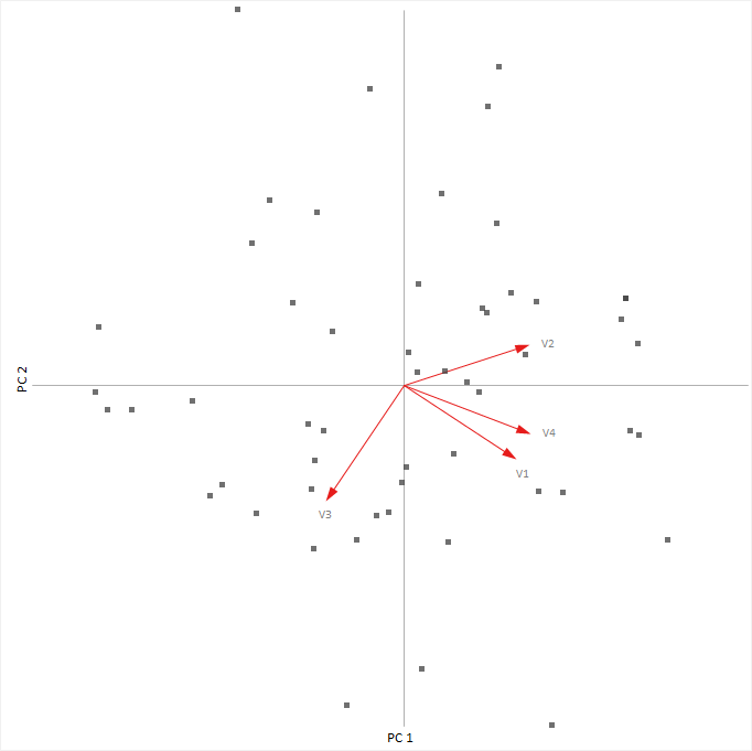
The classical biplot (Gabriel 1971) plots points representing the observations and vectors representing the variables.
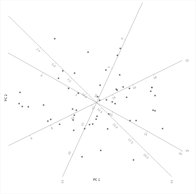
A more recent innovation, the PCA biplot (Gower & Hand 1996), represents the variables with calibrated axes and observations as points allowing you to project the observations onto the axes to make an approximation of the original values of the variables.
A monoplot plots information on the observations or the variables in a multidimensional dataset.
A monoplot can only represent either of the following characteristics - distance between observations, or relationships between variables. In contrast, a joint biplot can represent both characteristics.
A 2-dimensional monoplot represents the information contained in two of the principal components. It is an approximation of the original multidimensional space.
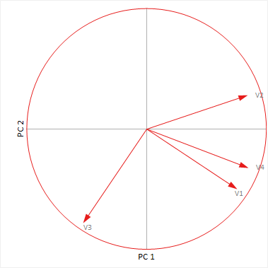
The correlation monoplot plots vectors pointing away from the origin to represent the original variables. The angle between the vectors is an approximation of the correlation between the variables. A small angle indicates the variables are positively correlated, an angle of 90 degrees indicates the variables are not correlated, and an angle close to 180 degrees indicates the variables are negatively correlated. The length of the line and its closeness to the circle indicate how well the plot represents the variable. It is, therefore, unwise to make inferences about relationships involving variables with poor representation.
The covariance monoplot plots vectors pointing away from the origin to represent the original variables. The length of the line represents the variance of the variable, and the inner product between the vectors represents the covariance.
A biplot simultaneously shows information on the observations and the variables in a multidimensional dataset.
A correlation monoplot shows the relationship between many variables in a multidimensional dataset.


