Pareto analysis with two-way comparative charts One-way and two-way comparative Pareto charts — break down defects by shift, operator, machine, or product line to identify not just what is failing, but where and why. Merge, reorder, and colour bars to focus on the vital few.

See what’s failing, and where

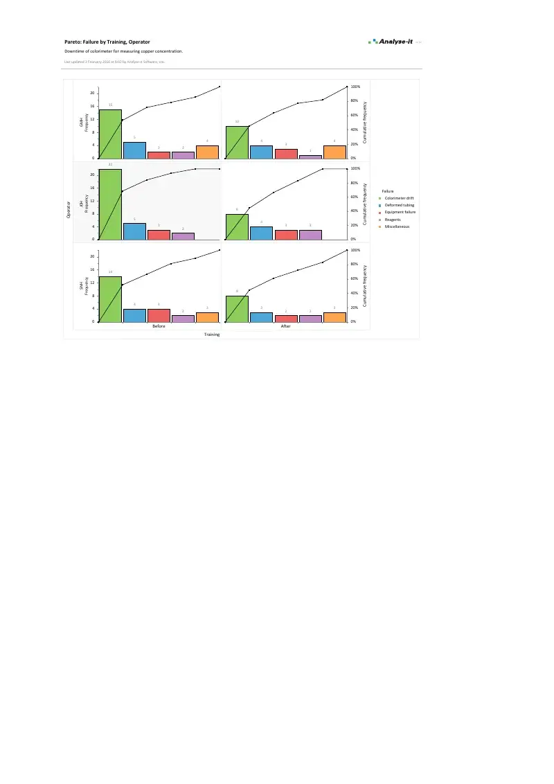
A standard Pareto chart ranks defect categories by frequency and draws a cumulative percentage line. That identifies the vital few — but it doesn’t tell you why they’re happening. The same defect type may be concentrated on one shift, one machine, or one operator. Without a second dimension, you know what to focus on but not where to investigate.

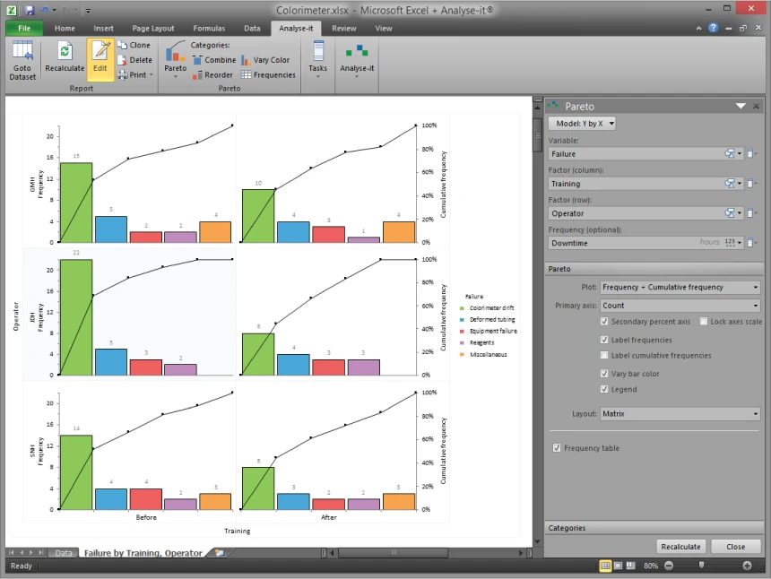
Two-way comparative Pareto charts add that dimension, breaking each defect category down by a second factor so the pattern behind the numbers becomes visible. Build both one-way and two-way charts directly from your defect log or inspection data. Merge small categories to keep the chart focused, reorder bars when frequency ranking doesn’t match the story you need to tell, and colour bars to draw attention to the categories that matter most.

Although we only scratch the surface of Analyse-it’s capabilities, we have a very high volume of use for the statistics we need. It’s saved us time and the reports look professional.
Michael Savage
Chemistry Supervisor
Baptist Hospital East

What’s included

Identify the vital few defect categories

Standard Pareto chart with bars ranked by frequency and a cumulative percentage line. The 80/20 line shows at a glance which categories account for most occurrences — such as the three defect types responsible for 80% of rejects on a production line.

Break down defects by a second factor

Two-way comparative Pareto charts split each defect category by a second variable — operator, shift, machine, product line, time period, or any factor in the data. See whether a dominant defect type is evenly distributed across shifts or concentrated on one, whether one operator accounts for a disproportionate share, or whether a change between periods reduced the right category.

Focus the chart on what matters

Merge low-frequency categories into an “Other” bar to reduce clutter — a chart with twenty categories is harder to act on than one with five plus Other. Reorder bars to group related defect types together rather than defaulting to frequency ranking. Colour bars to draw attention to priority areas or distinguish subgroups in a comparative chart.

Connect to the rest of the improvement workflow

Identify the top defect with Pareto, then set up a control chart on the same data to track whether it improves over time. Run a capability analysis to quantify how much room for improvement exists against the specification. Use hypothesis tests and regression from the included Standard edition to confirm root causes and measure the effect of changes.

Example analyses

See Pareto output in detail — comparative charts by operator and training status, with merged categories and colour coding.

Pareto Example 1 Comparative Pareto
Colorimeter failures by operator and training status.
Two-way comparative Pareto by operator and training, plus two one-way Pareto charts showing defect category ranking before and after training.

Part of the Quality Control & Improvement edition

Pareto analysis is one part of the complete SPC and improvement toolkit. The Quality Control & Improvement edition also includes Shewhart, CUSUM, and EWMA control charts with detection rules, phases, and stratification, and process capability analysis (Cp, Cpk, Pp, Ppk, Cpm, Z-benchmark), plus the full Standard edition with hypothesis tests, ANOVA, and regression. See everything in the Quality Control & Improvement edition →

Validated, reliable, trusted for over 30 years

Validated calculations Every statistic tested against published datasets and thousands of internal test-cases. No reliance on Excel’s built-in functions — Analyse-it handles all calculations internally. See how we develop and validate Analyse-it →
Data stays on your PC No cloud processing, no uploads, no third-party access. Your data never leaves your computer — essential when working with proprietary process data, customer specifications, or regulated production records.
Standard Excel workbooks Charts and results are ordinary Excel workbooks. Share with colleagues, send to auditors or customers, archive for quality records — no Analyse-it licence required to view.
No formulas to break Results contain no formulas, so they can’t be accidentally edited or corrupted. The control chart you reported will be exactly what you find when you reopen the workbook.

Technical details

Pareto charts

  • Pareto chart with cumulative percentage line
  • 1-way comparative Pareto chart
  • 2-way comparative Pareto chart

Chart customisation

  • Merge bars to reduce clutter of small-frequency categories
  • Reorder bars to highlight specific problems
  • Vary colour of bars to distinguish categories or subgroups