Diagnostic accuracy software for clinical research ROC curves with DeLong AUC comparison for up to 10 tests, sensitivity and specificity with confidence intervals, decision threshold optimisation, qualitative test evaluation and cost-based analysis.

Every feature from all five editions for 15 days, no sign-up.
Medical edition from US$ 340 a year · 30-day money-back guarantee.
Microsoft Excel with the Analyse-it tab selected, showing a diagnostic performance report for OxLDL and LDL: both ROC curves on one chart against the no-discrimination line, the AUC table with DeLong 95% confidence intervals and Z tests, and the Diagnostic Performance task pane open on ROC Curve with the AUC estimator list dropped open. Handwritten notes: Runs inside Excel: every analysis is on the Analyse-it tab; ROC, AUC, decision thresholds, likelihood ratios, predictive values: one Diagnostic Accuracy group; Both ROC curves on one chart; AUC for each test, with its DeLong 95% CI; AUC estimator, and its CI method; The report is an ordinary Excel worksheet: share it, archive it, open it on any PC with Excel.

Evaluate whether a test can support clinical decisions

Excel has no ROC curve. A 2×2 table built with COUNTIFS gives the counts at one threshold and stops. No area under the curve, no confidence interval, no comparison between tests, no view of how sensitivity and specificity trade off as the threshold moves. A diagnostic test is only useful if it discriminates reliably between patients with and without the condition. A test that looks adequate on AUC alone may fail at the threshold that matters clinically.

How well does the test discriminate? Does a new biomarker outperform the test clinicians already use, or match it closely enough to replace it? Where should the threshold sit when a missed diagnosis costs more than a false positive? Analyse-it evaluates quantitative tests with ROC curves and qualitative tests against the true state, and compares up to 10 tests at once. The result is the sensitivity, specificity and predictive values a screening, staging or referral decision needs.

Empirical ROC curves, AUC with DeLong confidence intervals

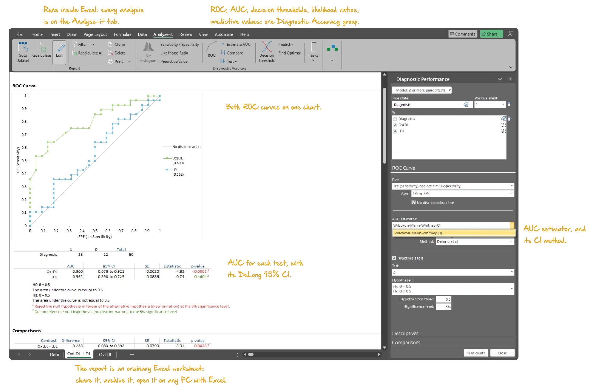
The ROC curve shows how well a quantitative test separates patients with the condition from those without at every threshold, not just one. Empirical ROC curves for a single test, up to 10 paired tests or up to 10 independent tests or groups, each plotted against the no-discrimination line. Wilcoxon-Mann-Whitney AUC with DeLong-DeLong-Clarke-Pearson confidence intervals and a Z test that the area is better than chance. Predict the false positive fraction at a fixed sensitivity, sensitivity at a fixed false positive fraction or both at a fixed threshold.

  • 1 test, up to 10 paired tests or up to 10 independent tests/groups
  • Empirical (non-parametric) ROC curves
  • ROC curve with the no-discrimination line
  • Wilcoxon-Mann-Whitney AUC with DeLong-DeLong-Clarke-Pearson CI
  • Z test that the AUC is better than chance
  • Predict FPF at fixed sensitivity, sensitivity at fixed FPF or sensitivity/FPF at fixed threshold
Microsoft Excel showing the ROC Curve section of a diagnostic performance report: ROC curves for OxLDL and LDL, and the AUC table with DeLong 95% confidence intervals, SE, Z statistic and p-value for each test, with the task pane open on ROC Curve. Handwritten notes: ROC curve for each test; AUC with DeLong 95% CI, Z test and p-value; AUC estimator, CI and method.
ROC curves for OxLDL and LDL on one chart, and the AUC of each test with its DeLong 95% confidence interval, standard error, Z statistic and p-value.

DeLong comparison of AUC: equality, equivalence or non-inferiority

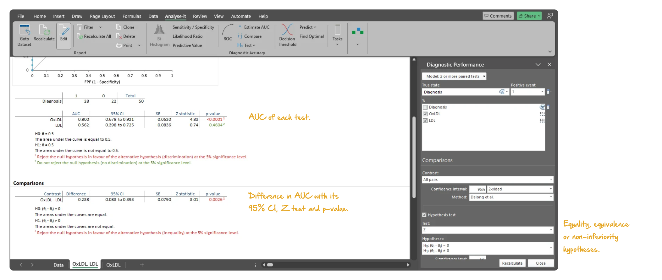
A new test is judged against the one clinicians already use, not against chance. Overlay the ROC curves of up to 10 tests on one plot and compare their AUCs with the DeLong test. Test for equality, for equivalence or for non-inferiority when the new test only needs to match the established one. Compare every pair of tests, or each new test against the established one, with the difference in AUC and its confidence interval alongside the decision.
  • Compare DeLong AUC difference — equality, equivalence or non-inferiority
  • Comparisons for all pairs of tests or each against a control
  • Overlaid ROC curves for test comparison
Microsoft Excel showing a diagnostic performance report: the AUC table for OxLDL and LDL and beneath it the Comparisons table with the difference in AUC, its DeLong 95% confidence interval, Z statistic and p-value, with the task pane open on Comparisons. Handwritten notes: AUC of each test; Difference in AUC with its 95% CI, Z test and p-value; Equality, equivalence or non-inferiority hypotheses.
The AUC of OxLDL and LDL and the DeLong comparison of the two areas: the difference in AUC, its 95% confidence interval and the Z test for equality.

Decision plot and optimal threshold by Youden, closest-to-(0,1) or cost

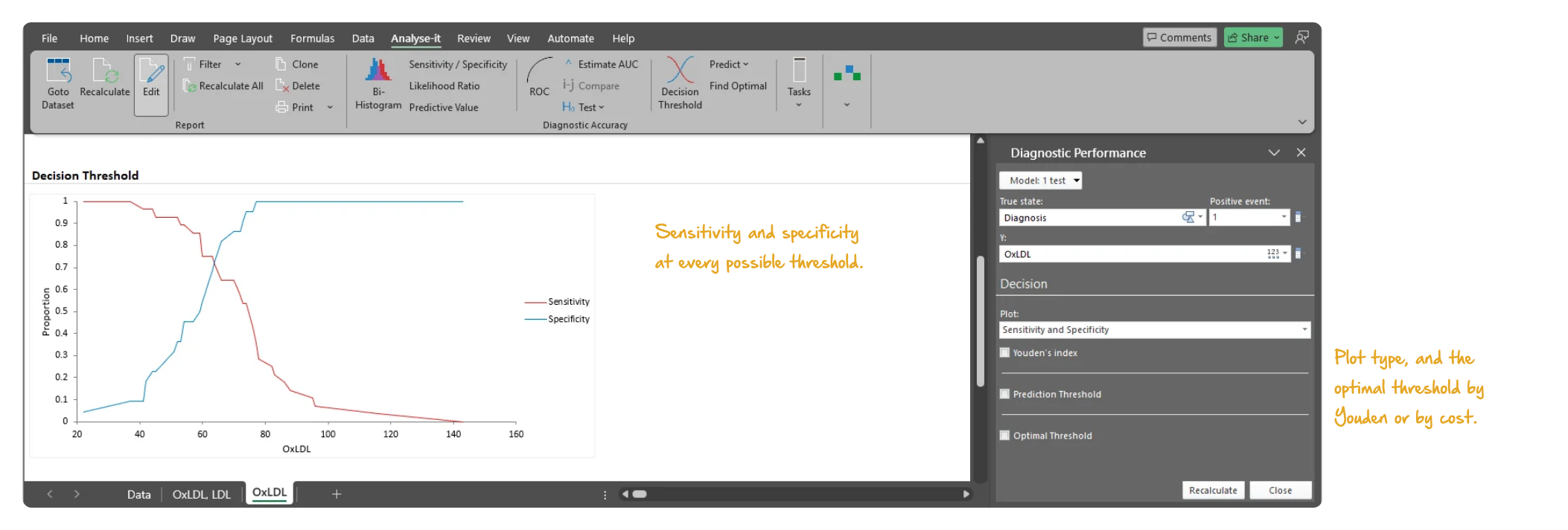
Set the threshold too low and the clinic sees too many false positives; set it too high and disease is missed. The decision plot shows sensitivity and specificity, likelihood ratios, predictive values or cost across every possible threshold, so the trade-off is visible before a cut-off is chosen. The optimal threshold is chosen by Youden index, by the point closest to (0,1) on the ROC curve or by cost. Weight a missed cancer diagnosis at 10× the cost of a false positive biopsy referral, for example.
  • Sensitivity/specificity, likelihood ratios, predictive values or cost vs threshold
  • Youden, closest-to-(0,1), cost-based
Microsoft Excel showing the Decision Threshold section of a diagnostic performance report for OxLDL: sensitivity and specificity plotted against every threshold, with the task pane open on the Decision section and its plot type, Youden index and optimal threshold options. Handwritten notes: Sensitivity and specificity at every possible threshold; Plot type, and the optimal threshold by Youden or by cost.
Decision plot for OxLDL: sensitivity and specificity at every threshold, with the plot type and the optimal threshold options in the pane.

Sensitivity, specificity, likelihood ratios and predictive values with CIs

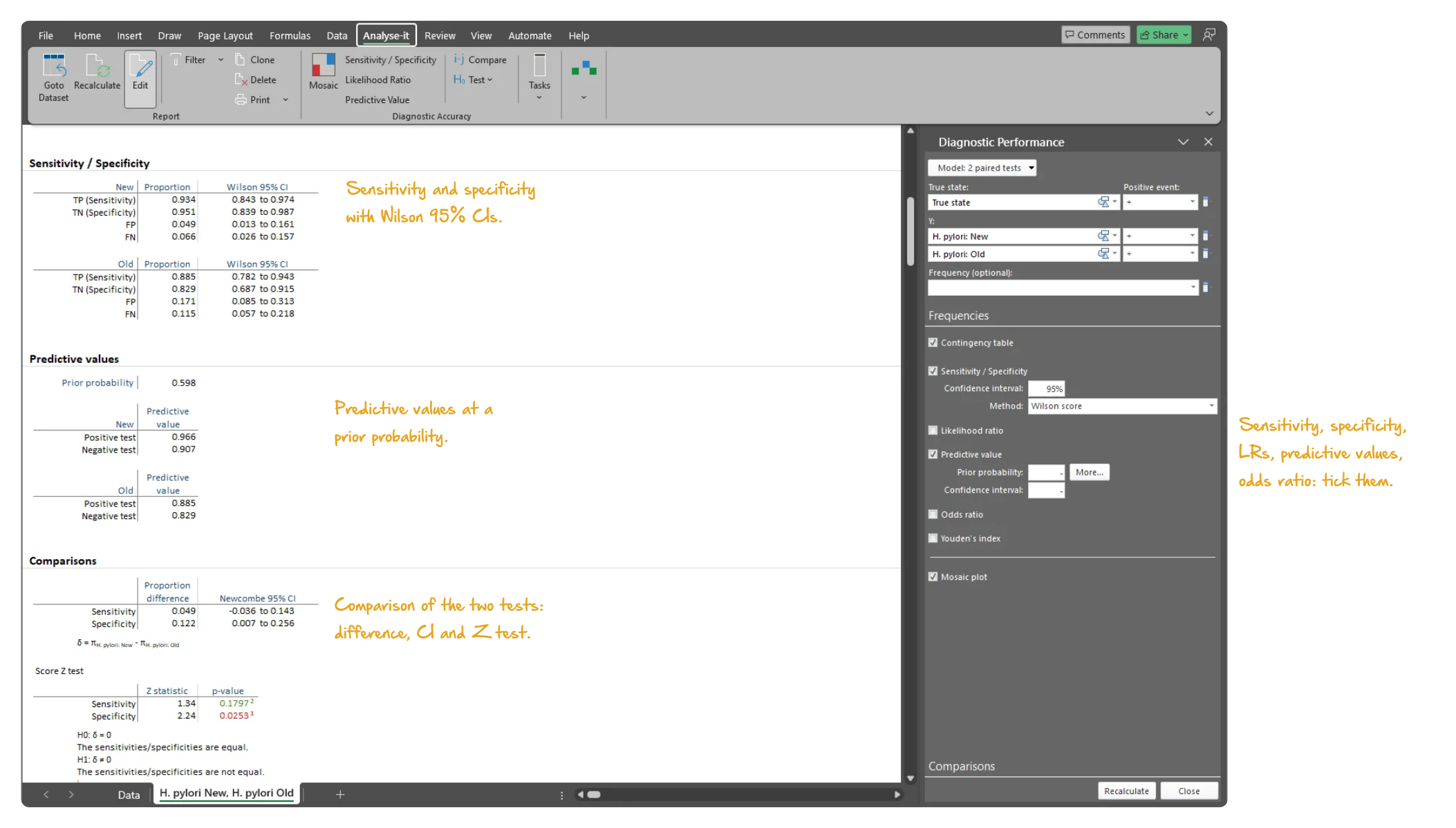
Sensitivity and specificity at the chosen threshold are the figures a paper, a guideline or a screening protocol quotes. Sensitivity and specificity with Clopper-Pearson exact or Wilson score confidence intervals, positive and negative likelihood ratios, diagnostic odds ratio and Youden index. Positive and negative predictive values at any prevalence — 5% for population screening, say, against 40% in a specialist referral clinic. The TP, TN, FP and FN counts behind them are reported, and the bi-histogram and dot plot show the separation between positive and negative cases.
  • Number of TP, TN, FP, FN
  • Sensitivity, specificity with Clopper-Pearson exact or Wilson score CI
  • Positive and negative likelihood ratios
  • Positive and negative predictive values
  • Predictive values at multiple prior probabilities (prevalences) new in v5.51
  • Diagnostic odds ratio and Youden index
  • Bi-histogram and dot plot of positive/negative outcomes
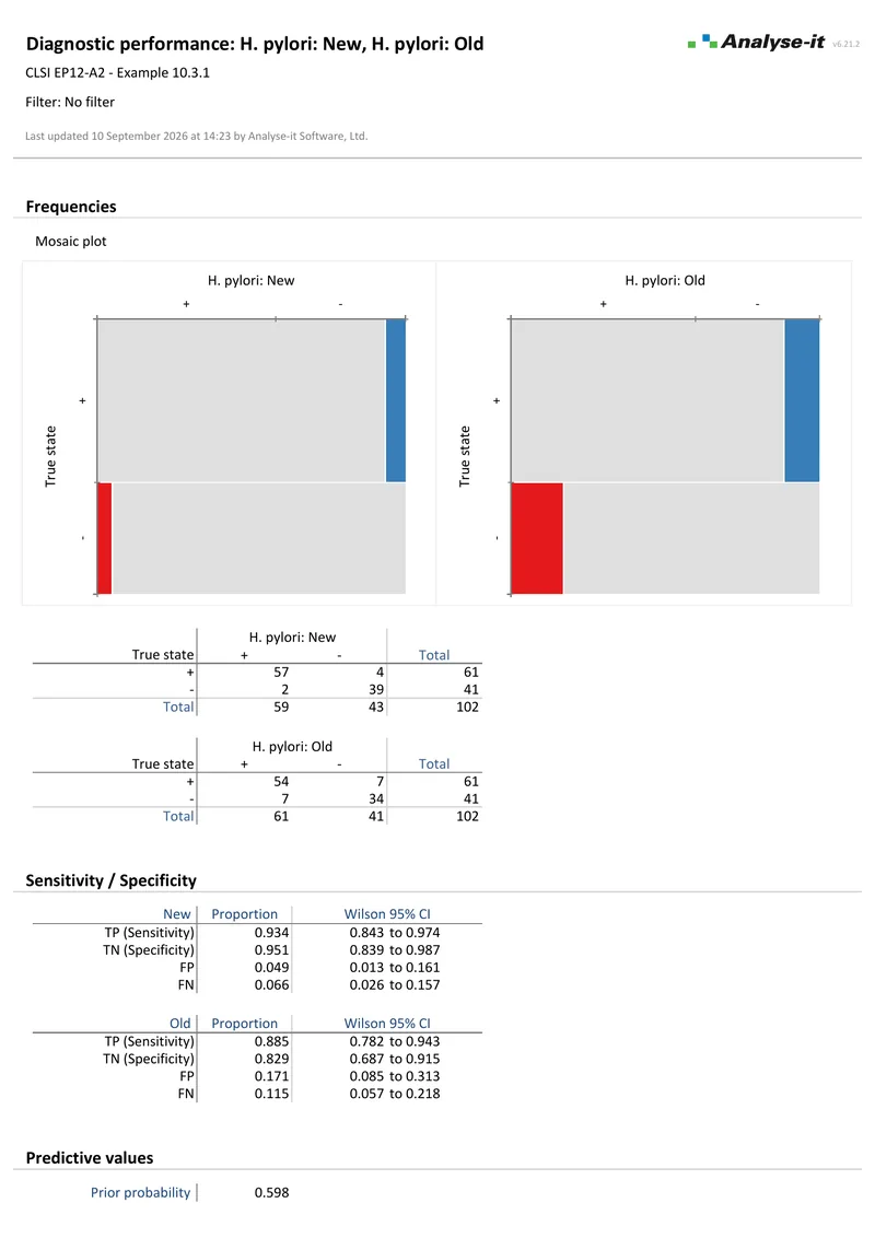
Microsoft Excel showing the Sensitivity / Specificity section of a diagnostic performance report for two H. pylori tests: sensitivity, specificity, false positive and false negative proportions with Wilson 95% confidence intervals, the predictive values, and the Comparisons table with Newcombe confidence intervals and a score Z test, with the task pane open on the accuracy options. Handwritten notes: Sensitivity and specificity with Wilson 95% CIs; Predictive values at a prior probability; Comparison of the two tests: difference, CI and Z test; Sensitivity, specificity, LRs, predictive values, odds ratio: tick them.
Sensitivity, specificity, false positive and false negative proportions of the new and old H. pylori tests from EP12-A2, with Wilson 95% confidence intervals. The predictive values and the comparison of the two tests follow.

Qualitative tests: sensitivity, specificity, McNemar, Fisher exact and score Z tests

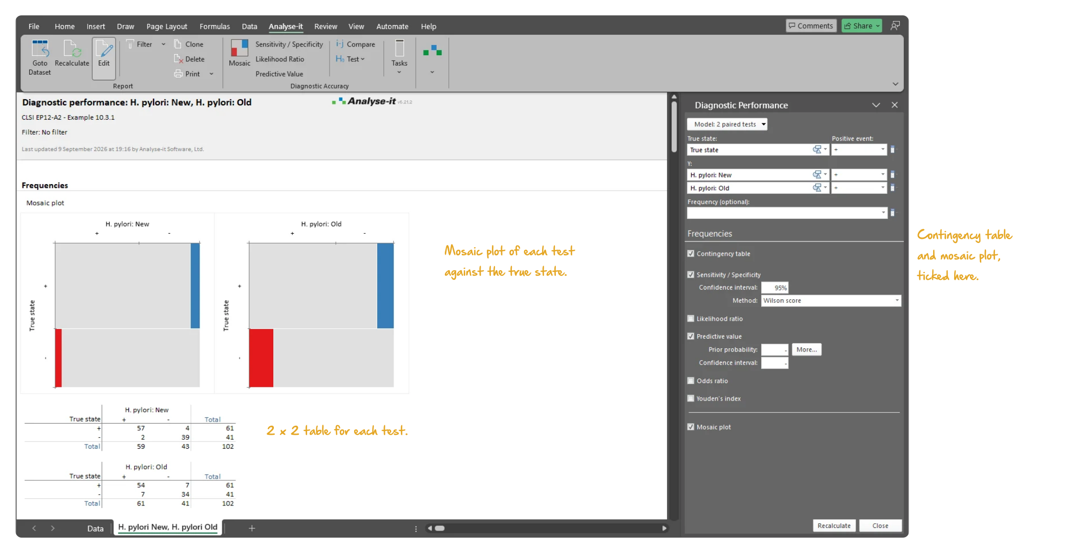
When the result is positive or negative rather than a value, performance is a proportion, and the confidence interval on that proportion is the evidence. Sensitivity and specificity with Clopper-Pearson exact or Wilson score intervals, likelihood ratios, predictive values, diagnostic odds ratio and Youden index. One test, two paired tests or two independent tests or groups. Agreement between two methods with no known true state — PPA and NPA, kappa and weighted kappa — is part of method agreement. Compare sensitivity and specificity between two tests with Newcombe, Tango or Miettinen-Nurminen score intervals and the McNemar-Mosteller exact, Fisher exact or score Z test. A mosaic plot shows the outcomes.
  • 1 test, 2 paired tests or 2 independent tests/groups
  • Sensitivity, specificity with Clopper-Pearson exact or Wilson score CI
  • Positive and negative likelihood ratios with Miettinen-Nurminen score CI
  • Predictive values with Mercaldo-Wald logit CI
  • Diagnostic odds ratio and Youden index
  • Difference between sensitivity/specificity with Newcombe score CI, plus Tango score CI for paired tests and Miettinen-Nurminen score CI for independent tests
  • Equivalence and non-inferiority tests for sensitivity/specificity new in v5.65
  • McNemar-Mosteller exact, Fisher exact and score Z test
  • Mosaic plot of outcomes (qualitative tests)
Microsoft Excel showing a diagnostic performance report for two qualitative H. pylori tests: mosaic plots of each test against the true state, and the 2 x 2 contingency tables with true and false positives and negatives, with the task pane open on Frequencies. Handwritten notes: Mosaic plot of each test against the true state; 2 x 2 table for each test; Contingency table and mosaic plot, ticked here.
The new and old H. pylori qualitative tests from EP12-A2 Example 10.3.1: mosaic plots of each against the true state, and the 2 × 2 tables beneath.

Example analyses

See diagnostic accuracy results in detail — ROC curves, AUC comparison, decision plots and qualitative test evaluation — using example datasets you can download and follow along with.

EP24 A2 Example 1 2 pages EP24-A2 — Appendix D
OxLDL and LDL diagnostic accuracy.
50 subjects, 28 of them with the condition. ROC curves for both markers with AUC, CIs and a test against 0.5 — OxLDL 0.80, LDL 0.56 — and a DeLong comparison of the two curves. A second analysis adds the bi-histogram and decision threshold plot for OxLDL alone.
EP12 A2 Example 1 2 pages EP12-A2 — Example 10.3.1
H. pylori, two qualitative tests against a known state.
102 subjects. Mosaic plots, sensitivity and specificity with Wilson 95% CIs and predictive values at the observed prior. The difference between the two tests with Newcombe CIs and a score Z test.

Part of the Medical edition

Diagnostic accuracy evaluation is one part of the Medical edition, alongside Bland-Altman agreement, reference intervals and survival analysis. The edition also includes the full Standard edition for hypothesis testing, regression and descriptive statistics.

Related guides in the Learn section: ROC curves and AUC, sensitivity, specificity and predictive values, likelihood ratios, and PPA and NPA. Further guides cover choosing a cut-off, comparing two tests with DeLong and performance studies for an IVD 510(k).

For the rest of a method validation programme — precision, linearity, detection limits, bias at clinical decision points, regression-based method comparison and reference-interval transference — see the Method Validation edition.

Software you can trust

Validated calculations you can defend at peer review Every calculation is performed by Analyse-it — no Excel formulas, no third-party functions. Results are validated against published datasets and thousands of internal test cases before every release. How Analyse-it is developed and validated →
Patient data stays on your PC Analyse-it runs entirely within Microsoft Excel on your PC. No cloud processing, no data transmission. Patient data and research data stay within your facility under your own data governance controls.
Standard Excel workbooks anyone can open Every analysis is an ordinary .xlsx workbook. Share with co-authors, attach to a manuscript submission, archive for publication queries. No proprietary format, no licence required to view results. Co-authors and reviewers see exactly what you see.
Results that cannot be accidentally broken Analysis output contains computed values, not formulas. Nothing to accidentally overwrite, no cell references to break, no formula errors to introduce. The results you published are exactly what you will find when you reopen the workbook months or years later, when a reviewer asks.

Free trial and pricing

Try it on your own data first. The 15-day trial is every feature from all five editions, with no sign-up and no licence key — install it and start straight away.

Medical edition: US$ 340 per year or US$ 815 for a perpetual licence. Every purchase carries a 30-day money-back guarantee. Need a quote for purchasing? Add the licence to the cart and save it as a PDF quote.