1. Tutorials
  2. Distribution tutorial

Distribution tutorial

Learn how to describe the distribution of a variable, make inferences about the population parameters, and exclude observations from analysis.

Simon Newcomb measured the time required for light to travel from his laboratory on the Potomac River to a mirror at the base of the Washington Monument and back, a total distance of about 7400 meters. The data are used to estimate the speed of light. For more information see DASL Story: Estimating the Speed of Light

In this tutorial you will perform the following tasks:

Plotting the distribution of the data

Before summarizing data with descriptive statistics or making inferences about parameters it is important to look at the data. It is hard to see any patterns by looking at a list of hundreds of numbers. Equally, a single descriptive statistic in isolation can be misleading and give the wrong impression of the data. A plot of the data is therefore essential.

  1. Open the file tutorials\Speed of Light.xlsx.
  2. Click a cell in the dataset.
  3. On the Analyse-it ribbon tab, in the Statistical Analyses group, click Distribution and then click Mean and Central Moments.
    The analysis task pane opens. A histogram, univariate plot, and descriptive statistics are added to the analysis task pane.
  4. In the Y variable list box, Select Speed.
  5. Click Calculate.
    The results are calculated and the analysis report opens.

The histogram of the data shows a normal distribution except for two outliers.

frequency histogram

Estimating the population mean

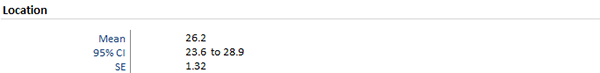
It is often not enough to simply describe a set of data. Instead you want to make inferences about the parameters of the population the sample of data is drawn from. An inference may be an estimate of a parameter, or a hypothesis test if a parameter is equal to a specific value.

  1. On the Analyse-it ribbon tab, in the Distribution group, click Estimate Parameter > Mean.

    The location estimator is added to the analysis task pane.

  2. Click Recalculate.
    The results are recalculated and the analysis report updates.

The mean estimate is 26.2 and a 95% confidence interval estimate 23.6 to 28.9.

mean estimate with confidence interval

Excluding outliers

Some statistics can be badly affected by outliers in the data, while others are robust. It is often worth considering how the results are affected by such observations.

  1. On the Analyse-it ribbon tab, in the Report group, click Goto Dataset.

    The dataset worksheet is displayed.

  2. Click in cell A34 containing the value -44.
  3. On the Analyse-it ribbon tab, in the Dataset group, click Include / Exclude.

    The value is enclosed in square brackets [] indicating it will be excluded from further analysis.

  4. Repeat steps 2 and 3 to exclude the value -2 (cell A58).
  5. Click on the Speed worksheet tab.
  6. On the Analyse-it ribbon tab, in the Report group, click Recalculate.

    The results are recalculated without the outliers and the analysis report updated.

After excluding the outliers the mean estimate has changed from 26.2 to 27.8 and the confidence interval is narrower.

Changing the histogram classes

Sometimes it is necessary to make changes to individual plots or tables on an analysis report before it is ready for publication.

  1. On the Analyse-it ribbon tab, in the Report group, click Edit.
    The analysis task pane opens.
  2. On the Distributionanalysis task pane, click the Frequency Distribution panel.

    The options for the histogram are displayed.

  3. In the Start at edit box, enter 10.
  4. In the Classes edit box, enter8.
  5. In the Width edit box, enter 5.
  6. Select Normal distribution curve.
  7. Click Recalculate.
    The results are recalculated and the analysis report updates.

The histogram now has better class intervals and the Normal distribution curve shows that the distribution is roughly normal.

histogram normal

Tutorials v6.15