Learn how to characterize the linearity of a measurement procedure for product performance characteristics, for FDA 510k submissions and product marketing.
In this tutorial you will use the CLSI EP06-A procedure to establish the linearity.
Estimate the linearity of the measurement procedure.
The scatter plot shows a simple visual assessment of the linearity of the measurement procedure over the measuring interval. The red line shows the linear fit, and the green line shows the best non-linear (2nd or 3rd order polynomial) fit.
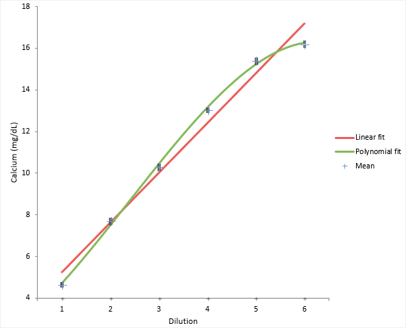
You should observe the scatter of the points to ensure there are no obvious problems. No individual points stand out as atypical of the bulk of the data. The precision table shows the precision to be constant across the measuring interval at an average 0.12mg/dL which is typical of that expected for the measurement procedure.
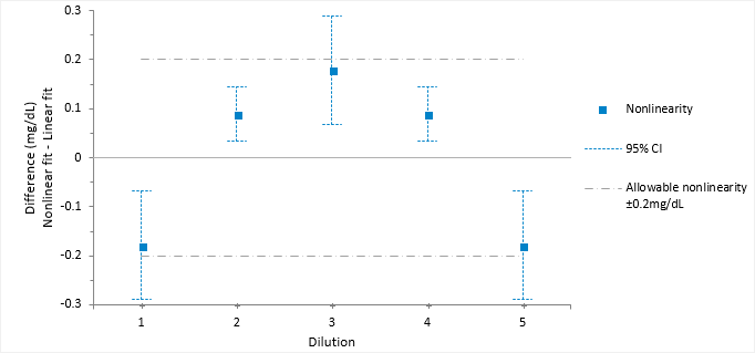
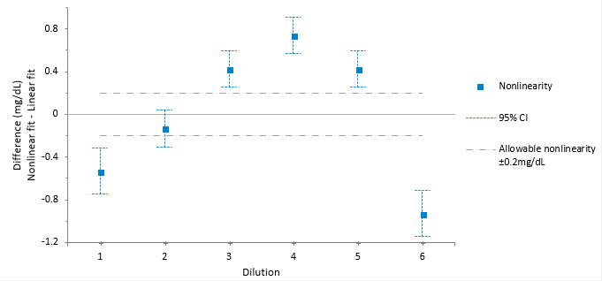
The linearity plot shows the difference between the linear and nonlinear fit across the measuring interval. Five out of the six points are outside the criteria for allowable nonlinear error.
Reduce the measuring interval to find the interval where the fit is linear.
Sometimes it is possible to reduce the measuring interval to a smaller range that is still useful.
The linearity plot differences now lie within the allowable nonlinearity of 0.2 mg/dL. Therefore, the method is declared as linear within 0.2mg/dL between the reduced interval 4.65 and 15.4 mg/dL.