Descriptive statistics and distribution analysis Summary statistics, histograms, box plots, Q-Q plots, normality tests, one-sample hypothesis tests and frequency analysis — the starting point of every analysis.

Every feature from all five editions for 15 days.
Standard edition from US$ 155 a year · 30-day money-back guarantee.
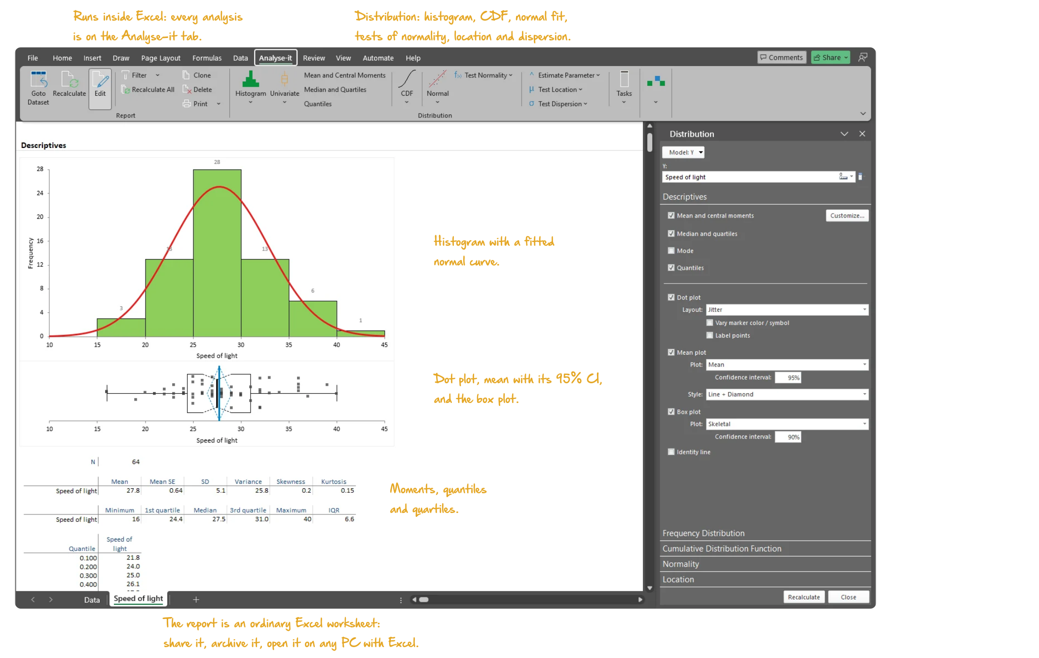
Microsoft Excel with the Analyse-it tab selected, showing the Descriptives section of a distribution report for Newcomb's speed of light measurements: the frequency histogram with the box plot beneath it, the tables of N, mean, SD, skewness, kurtosis, quartiles and IQR, and the Distribution task pane open. Handwritten notes: Runs inside Excel: every analysis is on the Analyse-it tab; Distribution: histogram, CDF, normal fit, tests of normality, location and dispersion; Histogram with a fitted normal curve; Dot plot, mean with its 95% CI, and the box plot; Moments, quantiles and quartiles; The report is an ordinary Excel worksheet: share it, archive it, open it on any PC with Excel.

Understand your data before you model it

Excel’s Descriptive Statistics tool produces a table of the mean, standard deviation, skewness and kurtosis and stops. No Q-Q plot, no normality test, no one-sample test against a hypothesised value, no confidence interval on the median. Every analysis starts with the distribution of the data, and what it shows decides which test or model is appropriate — skipping this step is how wrong conclusions happen.

What does the distribution look like? Is it symmetric or skewed? Are there outliers pulling the mean away from the median? Is it normal enough for a parametric test, or should you use a non-parametric alternative? Descriptive statistics, distribution plots, normality assessment and one-sample tests belong in the same workflow, for continuous and discrete variables alike.

Mean, SD, CV%, skewness, kurtosis, quantiles, geometric and harmonic mean

Location, spread and shape decide which test or model is appropriate, so characterise them together before you model. Mean, median, SD, CV%, skewness, kurtosis, quantiles, geometric and harmonic mean are reported in one output. See immediately whether the distribution is symmetric, how spread out it is and whether the tails are heavier or lighter than normal.

  • Sum, Mean, Mean SE, Variance, SD, CV%, Skewness, Kurtosis
  • Geometric Mean, Harmonic Mean
  • Median, Minimum, Maximum, Range, 1st and 3rd quartiles, IQR
  • Quantiles
  • Mean and median absolute deviation (MAD) new in v5.30
  • Mode

Histogram, frequency polygon, dot plot, box plot, mean plot and CDF plot

Summary statistics compress the data; the plots show what the numbers leave out. A histogram shows the shape, a box plot the median, quartiles and outliers, and a dot plot every observation. A CDF plot shows the cumulative distribution with a Kolmogorov-Smirnov confidence band. Each plot answers a different question — use whichever combination the data require.

  • Histogram with optional normal overlay
  • Frequency distribution table by class interval: frequency, relative frequency, density, cumulative
  • Frequency polygon
  • Dot plot — jittered, aligned, spread; vary symbol/colour
  • Skeletal box plot, Tukey outlier box plot, Quantile box plot
  • Mean error bar plot, Mean confidence diamond plot
  • CDF plot with optional Kolmogorov-Smirnov confidence band

Shapiro-Wilk, Anderson-Darling, Kolmogorov-Smirnov and the normal Q-Q plot

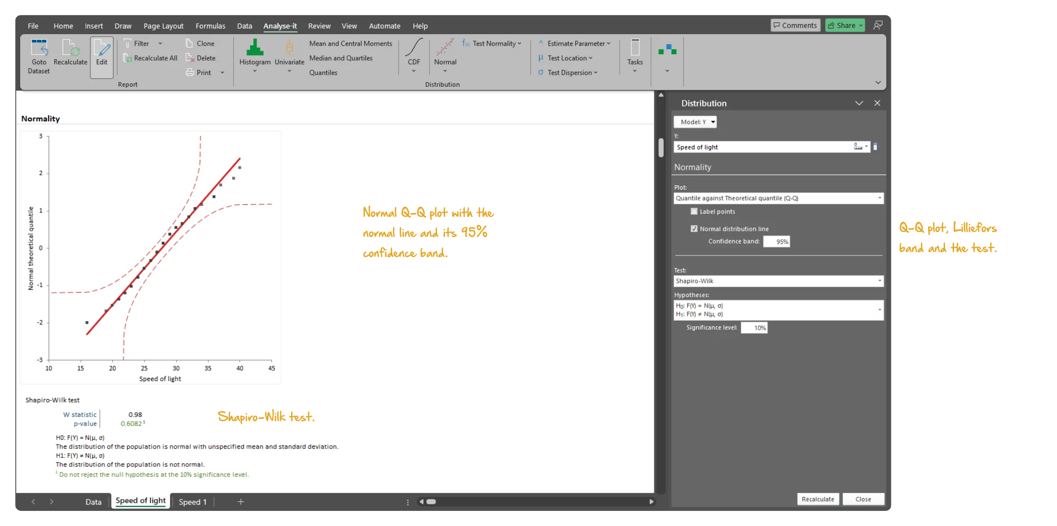
A parametric test assumes a normal population, so check that assumption before you choose one. The normal Q-Q plot with its Lilliefors confidence band shows visually where the data depart from normality; Shapiro-Wilk, Anderson-Darling and Kolmogorov-Smirnov make it a formal test. If the distribution is not normal, transform the variable within the analysis and reassess — or switch to a non-parametric test.
  • Shapiro-Wilk test
  • Anderson-Darling test
  • Kolmogorov-Smirnov test
  • Normal Q-Q plot with optional Lilliefors confidence band
  • Transform variable
Microsoft Excel showing the Normality section of the speed of light distribution report: the normal Q-Q plot of the data against normal theoretical quantiles, the Shapiro-Wilk test with its W statistic, p-value, hypotheses and conclusion, and the Distribution task pane open on Normality. Handwritten notes: Normal Q-Q plot with the normal line and its 95% confidence band; Shapiro-Wilk test; Q-Q plot, Lilliefors band and the test.
Normality of the speed of light data: the normal Q-Q plot and the Shapiro-Wilk test, with the Normality section of the task pane.

One-sample t-test, Wilcoxon, sign test and χ² test for variance

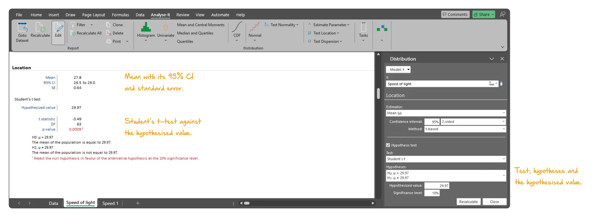
Does the mean differ from a target value? Student’s one-sample t-test answers when normality holds, the Wilcoxon or sign test when it does not, and a Z test when the population SD is known. Mean and median are estimated with confidence intervals; the Hodges-Lehmann pseudo-median with a Tukey CI gives a robust location estimate. When dispersion is the question, a χ² test and confidence interval for the variance answer it.
  • Z test for mean with known population SD
  • Student’s one-sample t-test for mean
  • Wilcoxon test for mean/median
  • Sign test for the median
  • TOST equivalence test for the mean new in v5.40
  • Mean with t-based or Z-based CI
  • Median with Thompson-Savur CI
  • Hodges-Lehmann pseudo-median with Tukey CI
  • χ² test for variance
  • Variance with χ²-based CI
Microsoft Excel showing the Location section of the speed of light distribution report: the mean with its 95% confidence interval and standard error, and Student's one-sample t-test against the hypothesised value with the t statistic, degrees of freedom, p-value, hypotheses and conclusion, and the Distribution task pane open on Location. Handwritten notes: Mean with its 95% CI and standard error; Student's t-test against the hypothesised value; Test, hypotheses and the hypothesised value.
One-sample t-test of the mean speed of light against a hypothesised value: the mean with its 95% CI, the test statistic, p-value and conclusion.

Frequency tables, bar plots, binomial, score Z, Pearson χ² and G² tests

A categorical variable needs a different summary: how often each category occurs, and whether the proportions match what was expected. Frequency tables give the frequency, cumulative, relative and cumulative relative frequency; bar plots with a cumulative frequency line and pie plots show them. Binomial exact and score Z tests handle a single proportion, and Pearson χ² and likelihood ratio G² tests compare a multinomial distribution with hypothesised proportions. Each proportion is estimated with a Clopper-Pearson exact or Wilson score CI.

  • Frequency table (frequency, cumulative, relative, cumulative relative)
  • Frequency bar plot with optional cumulative line
  • Frequency pie (whole-to-part) plot
  • Binomial exact test for proportions
  • Score Z test for binomial proportions
  • Pearson χ² and G² test for multinomial proportions
  • Proportion with Clopper-Pearson exact or Wilson score CI
  • Odds with confidence interval
Microsoft Excel showing the Frequencies section of a discrete distribution report for the eye colour of 592 people: the bar plot of relative frequency for brown, blue, hazel and green, the pie plot beneath it, the frequency table, and the Distribution task pane open. Handwritten notes: Frequency bar chart with the cumulative relative frequency line; Whole-to-part pie chart, sectors labelled; Plot: bar or pie, with the cumulative line.
Eye colour of 592 people: the bar plot of relative frequency and the pie plot from the discrete distribution analysis, with the task pane open.

Example analyses

See descriptive statistics and distribution analysis in detail — summary statistics, histograms, Q-Q plots, normality tests and one-sample tests.

Distribution 1 4 pages Continuous distribution
Newcomb’s speed of light, 64 observations.
Descriptive statistics, frequency histogram with custom classes, box and dot plot, cumulative distribution plot, normal Q-Q plot, Shapiro-Wilk normality test and a one-sample t-test against a hypothesised 29.97. A second analysis shows the frequency distribution on its own.
Distribution 2 2 pages Discrete distribution
Hair and eye colour, 592 observations.
Frequency table with relative and cumulative frequency, a frequency plot and a whole-to-part plot and a Pearson χ² test of the observed proportions against a hypothesised distribution.

Part of the Standard edition

Descriptive statistics are one part of a complete statistical analysis toolkit. The Standard edition also includes ANOVA and ANCOVA, simple and multiple regression, logistic regression, PCA and factor analysis, hypothesis testing, correlation and categorical data analysis. See everything in the Standard edition →

Learn what to do when the distribution is not tidy: testing normality and what to do when it fails and the assumptions and costs of non-parametric tests.

Software you can trust

Validated calculations Every statistic tested against the NIST Statistical Reference Datasets, published datasets and thousands of internal test cases. No reliance on Excel’s built-in functions. How Analyse-it is developed and validated →
Data stays on your PC No cloud processing, no uploads, no third-party access. Your data never leaves your computer — essential when working with sensitive, confidential or patient-identifiable data.
Standard Excel workbooks Analyses are ordinary Excel workbooks that you can share with colleagues, archive for audit and open on any machine with Excel — no Analyse-it licence required.
No formulas to break Results contain no formulas, so there is nothing to overwrite and no cell reference to break. The results you reported will be exactly what you find when you reopen the workbook.

Free trial and pricing

Try it on your own data first. The 15-day trial is every feature from all five editions — install it and start straight away.

Standard edition: US$ 155 per year or US$ 395 for a perpetual licence. Every purchase carries a 30-day money-back guarantee. Need a quote for purchasing? Add the licence to the cart and save it as a PDF quote.