Principal component analysis and factor analysis PCA with biplots, monoplots, and colour-mapped coefficient matrices — common factor analysis with 12 rotation methods — Cronbach’s alpha for internal consistency.

Every feature from all five editions for 15 days, no sign-up.
Standard edition from US$ 155 a year · 30-day money-back guarantee.
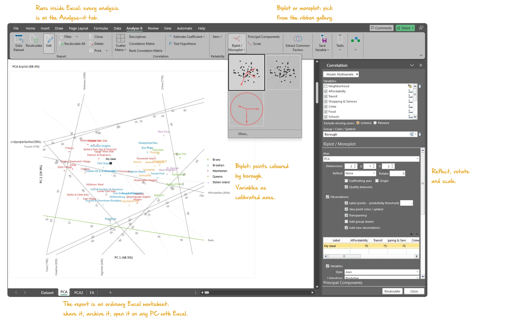
Microsoft Excel with the Analyse-it tab selected, showing a principal component analysis report: the Gower-Hand biplot of New York neighbourhoods on twelve liveability variables, points coloured by borough, variables labelled with the share of their variance shown, the Biplot / Monoplot gallery open on the ribbon, and the Correlation task pane open on the Biplot / Monoplot section. Handwritten notes: Runs inside Excel: every analysis is on the Analyse-it tab; Biplot or monoplot: pick from the ribbon gallery; Biplot: points coloured by borough; Variables as calibrated axes; Reflect, rotate and scale; The report is an ordinary Excel worksheet: share it, archive it, open it on any PC with Excel.

Make multivariate data interpretable

Excel’s Analysis ToolPak produces a correlation matrix and stops. No principal components, no biplot, no rotation, no factor analysis, no reliability coefficient. With many variables the important structure is hidden by the sheer volume of data. PCA reduces that complexity to a few components that capture most of the variation. The hard part is not extracting the components. It is understanding what they mean.

Which variables move together? Do the groups separate on the first component, or is one observation pulling the solution? Is there a latent construct behind the items, and does the scale measure it consistently?

Gabriel and Gower-Hand biplots; predict new observations and variables

A biplot shows the structure a loading table cannot — which variables move together, which observations are unusual, whether groups separate. Choose the classic Gabriel biplot, variables as vectors and observations as points, or the Gower & Hand biplot with both as points. Reflect, rotate and scale until the view makes sense, and colour observations by a factor to see group separation. Predict new observations and variables against the fitted components.
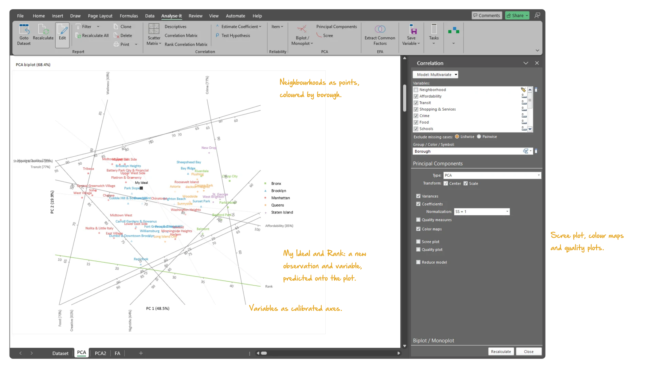
  • Classic Gabriel biplot (variables as vectors, observations as points)
  • Gower-Hand biplot (variables and observations as points)
  • Reflect, rotate and scale biplot
  • Predict new observations / variables
Microsoft Excel showing the Gower-Hand biplot of a principal component analysis: fifty New York neighbourhoods as points coloured by borough, the twelve variables as calibrated axes labelled with the share of their variance shown, the new observation My Ideal and the new variable Rank predicted onto the plot, with the task pane open on Principal Components. Handwritten notes: Neighbourhoods as points, coloured by borough; Variables as calibrated axes; My Ideal and Rank: a new observation and variable, predicted onto the plot; Scree plot, colour maps and quality plots.
The Gower-Hand biplot of 50 NYC neighbourhoods on 12 liveability variables, coloured by borough, with the task pane open.

Scree plot, colour-mapped coefficient matrix and correlation monoplot

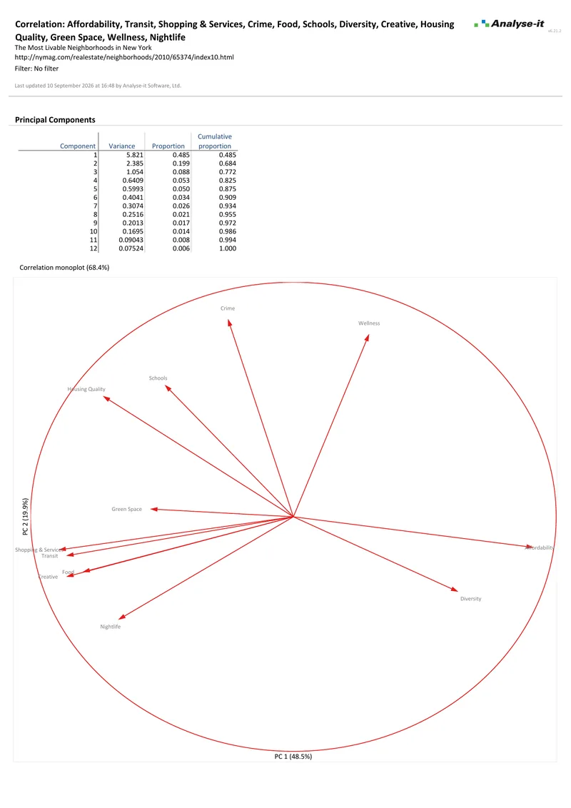
Choosing how many components to keep, and naming them, needs more than a table of numbers. Eigenvalues, the proportion of variance explained and the scree plot show how much each component carries. The coefficient matrix colour map highlights which variables load strongly on which components — the pattern is visible immediately, even with many variables. The correlation monoplot shows the variable relationships alone when the biplot is too crowded.
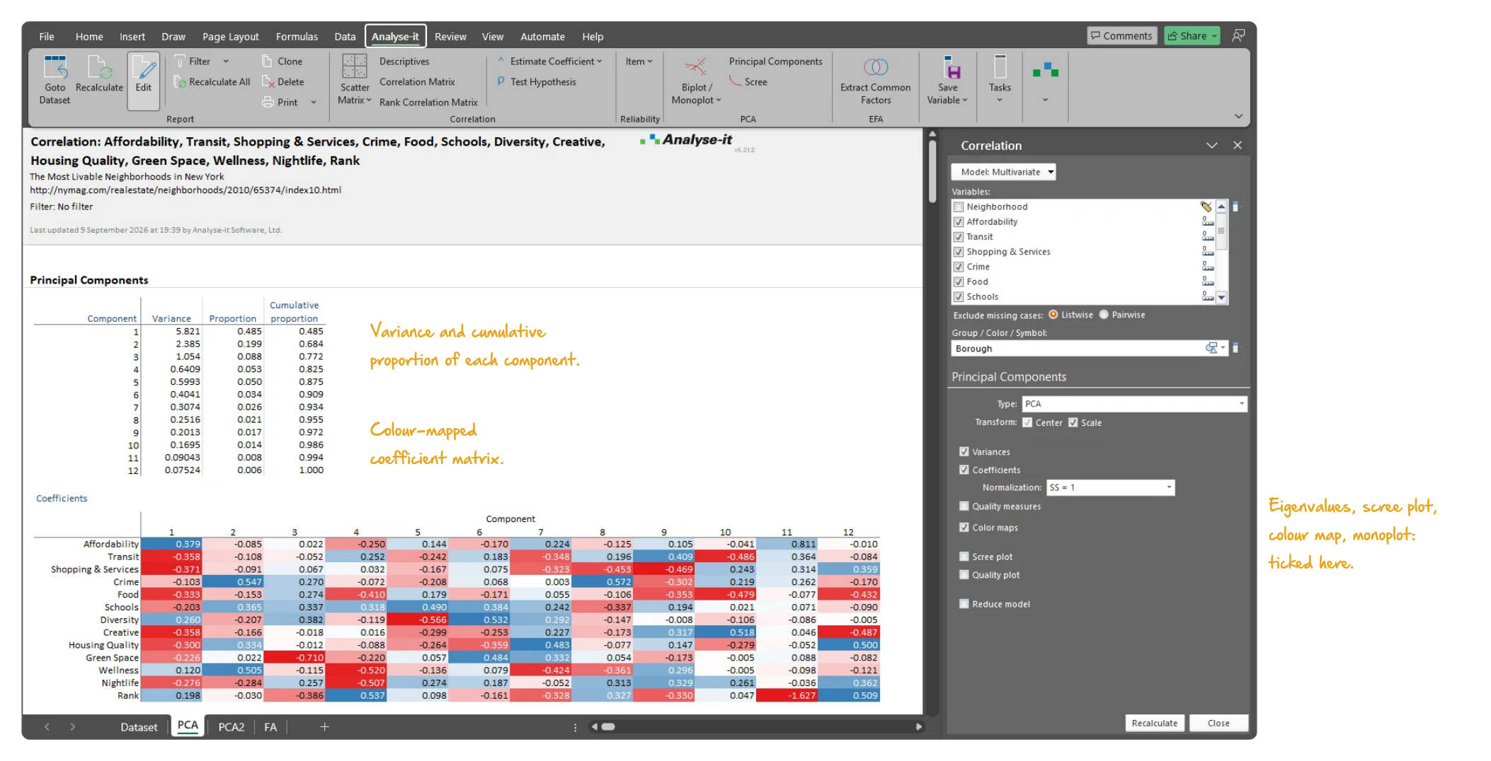
  • Eigenvalues / Eigenvectors
  • Scree plot
  • Coefficient matrix with colour map
  • Correlation monoplot
  • Vary vector colours on the monoplot new in v6.01
Microsoft Excel showing the Principal Components section of a PCA report: the Variances table with the variance, proportion and cumulative proportion of each of twelve components, and the colour-mapped coefficient matrix beneath it, with the task pane open on Principal Components. Handwritten notes: Variance and cumulative proportion of each component; Colour-mapped coefficient matrix; Eigenvalues, scree plot, colour map, monoplot: ticked here.
The variances of the 12 components — PC1 48.5%, PC2 19.9%, 68.4% in the first two — and the colour-mapped coefficient matrix.

Scatter plot matrix, correlation colour map, Pearson, Spearman and Kendall

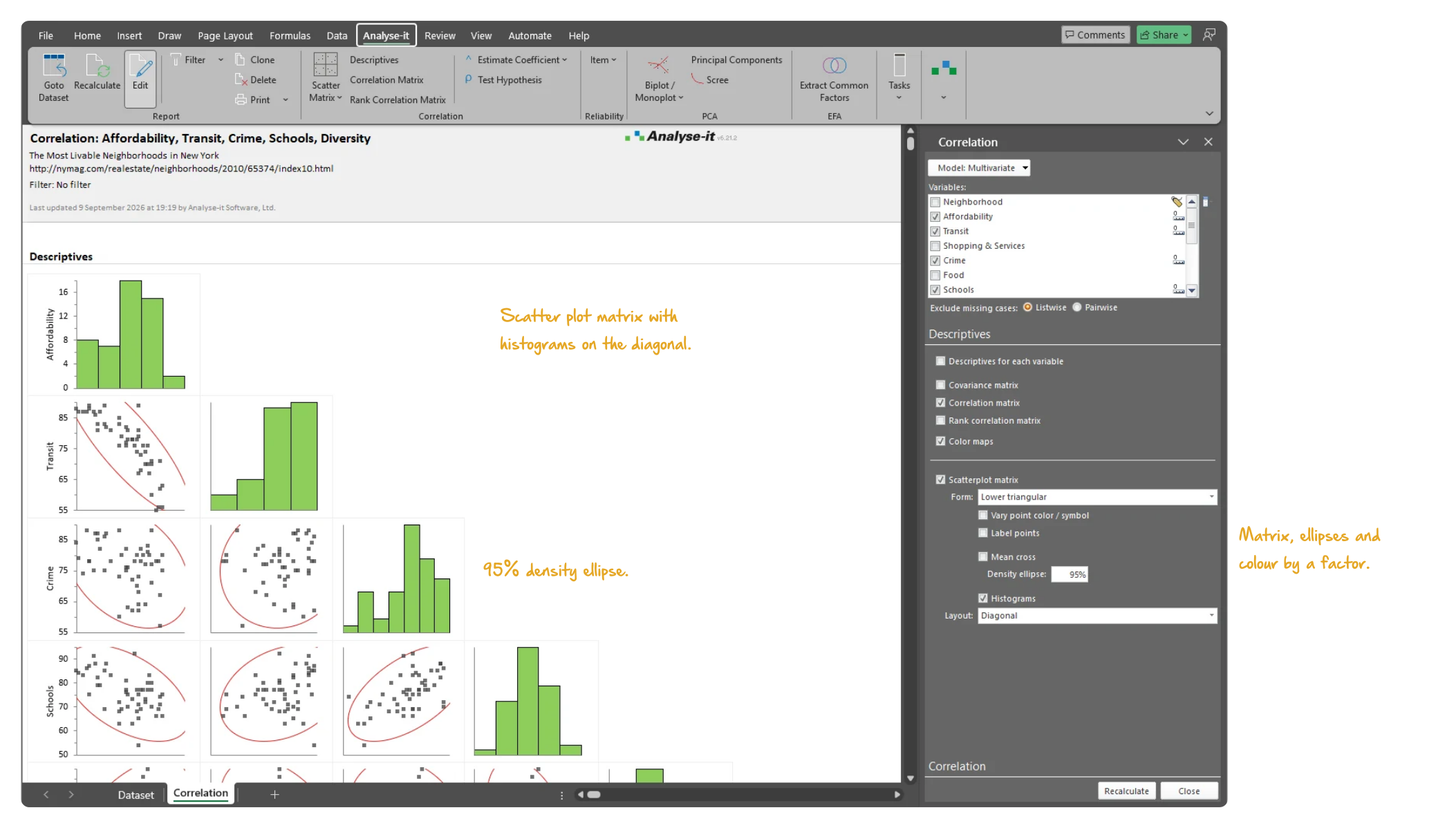
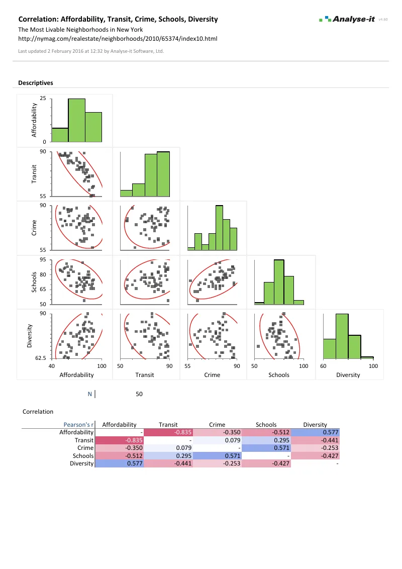
Before committing to PCA, see the data. Scatter plot matrices show every pairwise relationship, with distribution histograms on the diagonal, and colouring by a factor shows whether the relationships hold across subgroups. The colour-mapped correlation matrix shows the strength and direction of every association at a glance. Pearson, Spearman and Kendall coefficients come with confidence intervals, and with tests for linear and monotonic association.

  • Scatter plot
  • Scatter plot matrix
  • Density ellipses and histograms on the scatter plot matrix
  • Vary points by colour based on a factor
  • Correlation matrix with colour map on coefficients
  • Covariance matrix
  • Rank correlation matrix; square, upper or lower triangular layout
  • Pearson r with Fisher’s Z CI
  • Spearman rs with Fisher’s Z CI
  • Kendall τ with Samara-Randles CI
  • Pearson test for linear association
  • Kendall test for monotonic association
Microsoft Excel showing the Descriptives section of a correlation report for five liveability variables: the scatter plot matrix with a 95% density ellipse on every panel and histograms on the diagonal, with the task pane open on the scatter plot matrix options. Handwritten notes: Scatter plot matrix with histograms on the diagonal; 95% density ellipse; Matrix, ellipses and colour by a factor.
Five of the liveability variables: the scatter plot matrix with a 95% density ellipse on every panel and histograms on the diagonal.

Common factor analysis with Varimax, Oblimin and ten other rotations

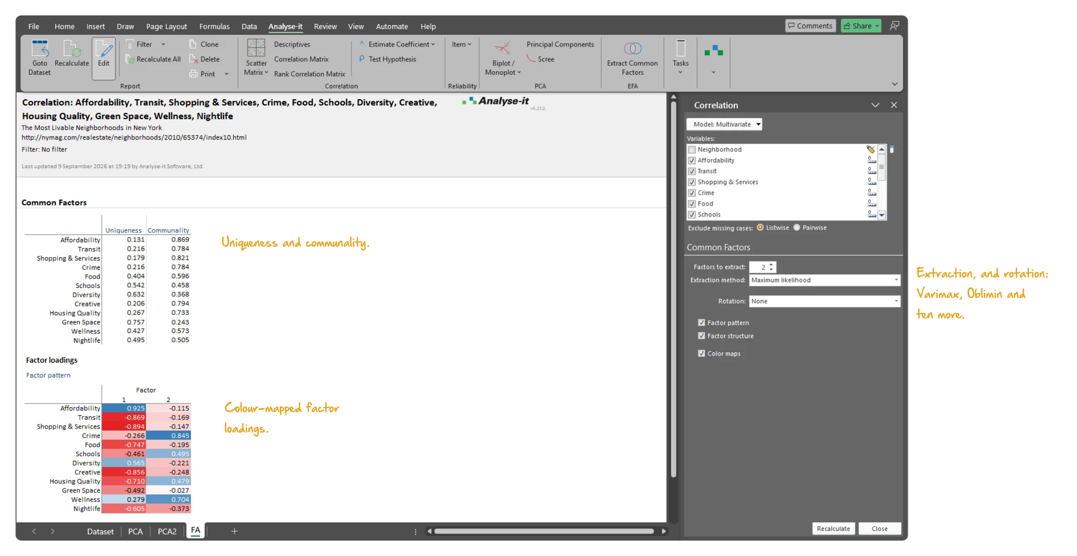
When the goal is latent constructs rather than dimensionality reduction, common factor analysis with maximum likelihood extraction gives the underlying structure. Twelve orthogonal and oblique rotation methods — Varimax, Oblimin and ten others — rotate to the most interpretable solution. Factor pattern and structure matrices with colour maps show the loading pattern at a glance.

  • Maximum likelihood factor extraction
  • Factor pattern / structure matrices with colour map
  • 12 factor orthogonal/oblique rotations including Varimax, Oblimin
Microsoft Excel showing a common factor analysis report: the uniqueness and communality of twelve variables, and the colour-mapped factor pattern matrix of loadings on two factors, with the task pane open on the extraction and rotation options. Handwritten notes: Uniqueness and communality; Colour-mapped factor loadings; Extraction, and rotation: Varimax, Oblimin and ten more.
Common factor analysis of the 12 liveability variables: the factor loadings, with the task pane open.

Cronbach’s alpha and deleted-item alpha for scale reliability

A questionnaire, checklist or measurement instrument is only useful if its items measure the same thing. Cronbach’s alpha, standardised and unstandardised, tells you whether the items in a scale are internally consistent. The deleted alpha for each item shows exactly which items weaken the scale and which strengthen it — essential when developing or refining the instrument.

  • Cronbach’s alpha (standardised and unstandardised)
  • Deleted Cronbach’s alpha for each item

Example analyses

See PCA and factor analysis results in detail — biplots, colour-mapped coefficient matrices, and scree plots.

Multivariate 3 pages PCA and factor analysis
New York neighbourhood liveability, 12 variables.
50 neighbourhoods. Principal components with eigenvalues and coefficients and a biplot labelled by borough, a correlation monoplot, and a common factor analysis reporting uniqueness, communality and factor loadings. Two components carry 68.4% of the variance.
Correlation 2 pages Correlation matrix
New York neighbourhood liveability, 5 variables.
50 observations. Pearson r matrix with a colour map, a scatter plot matrix, and every pairwise coefficient with a 95% CI.

Part of the Standard edition

PCA and factor analysis are one part of a complete statistical analysis toolkit. The Standard edition also includes ANOVA and ANCOVA, simple and multiple regression, logistic regression, descriptive statistics, hypothesis testing, correlation, and categorical data analysis. See everything in the Standard edition →

For the ideas behind the output, read principal component analysis explained: variance, loadings, scores, scree plots and biplots without matrix algebra.

Validated, reliable, trusted for nearly 30 years

Validated calculations Every statistic tested against the NIST Statistical Reference Datasets, published datasets and thousands of internal test cases. No reliance on Excel’s built-in functions. See how we develop and validate Analyse-it →
Data stays on your PC No cloud processing, no uploads, no third-party access. Your data never leaves your computer — essential when working with sensitive, confidential, or patient-identifiable data.
Standard Excel workbooks Analyses are ordinary Excel workbooks that you can share with colleagues, archive for audit, and open on any machine with Excel — no Analyse-it licence required.
No formulas to break Results contain no formulas, so they cannot be accidentally edited or corrupted. The results you reported will be exactly what you find when you reopen the workbook.

Free trial and pricing

Try it on your own data first. The 15-day trial is every feature from all five editions, with no sign-up and no licence key — install it and start straight away.

Standard edition from US$ 155 per year, or US$ 395 for a perpetual licence. Every purchase carries a 30-day money-back guarantee. Need a quote for purchasing? Add the licence to the cart and save it as a PDF quote.