Plotting bivariate data
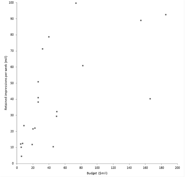
The scatter plot is a fundamental tool for looking at bivariate data. It shows the important characteristics of the data and can be used to decide what model may describe the relationship between the variables.
- Open the file tutorials\TV Ad Yield.xlsx.
- Click a cell in the dataset.
-
On the Analyse-it ribbon tab, in the
Dataset group, click
Dataset.
The dataset task pane is displayed.
- Select Labels in first column.
-
Click Apply.
The dataset task pane is closed.
-
On the Analyse-it ribbon tab, in the
Statistical Analyses group, click
Fit
Model drop-down list,
and then
click Scatter.
The analysis task pane opens.A scatter plot is added to the analysis task pane.
- In the Y variable list, select Retained impressions per week.
- In the X variable list, select Budget.
-
Click Calculate.
The results are calculated and the analysis report opens.
The scatter plot suggests the relationship between advertising yield and spend is not a straight line. It appears the yield increases sharply at lower spend and levels out as spending increases.

Next topic: Fitting a simple regression model