Learn how to apply techniques to identify the most important quality-related problems.
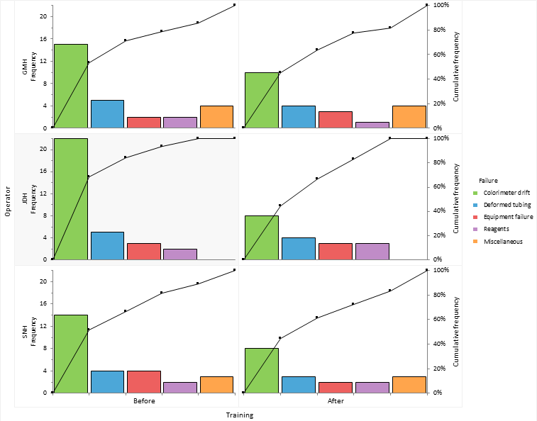
To illustrate the concepts, we will use data on the amount of downtime caused by problems in an automated colorimeter for measuring copper concentration. Three operators recorded the amount of downtime they each experienced during a 2-week period of operating the process.
In this tutorial you will perform the following tasks:
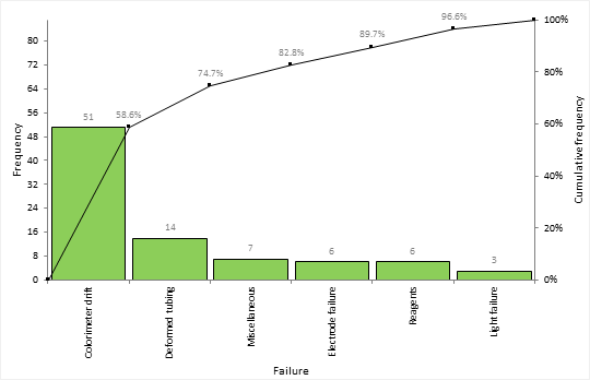
An important first step in quality improvement is identifying the most frequent occurring problems.
The Pareto plot bars show the amount of downtime spent fixing each failure sorted into descending order. A cumulative line shows the cumulative percentage of downtime.
It is often beneficial to dig deeper into the problems to find other factors that may be causing the issues.
The Pareto plots show the amount of downtime stratified by the operator of the machine.
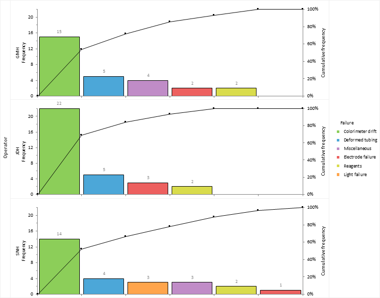
Operator JDH spends more time dealing with colorimeter drift than the other operators. It is decided to implement increased operator training in re-calibrating the machine to try reduce the downtime.
Sometimes a few tweaks to highlight the vital few problems and hide the trivial many can lead to increased clarity of the plots.
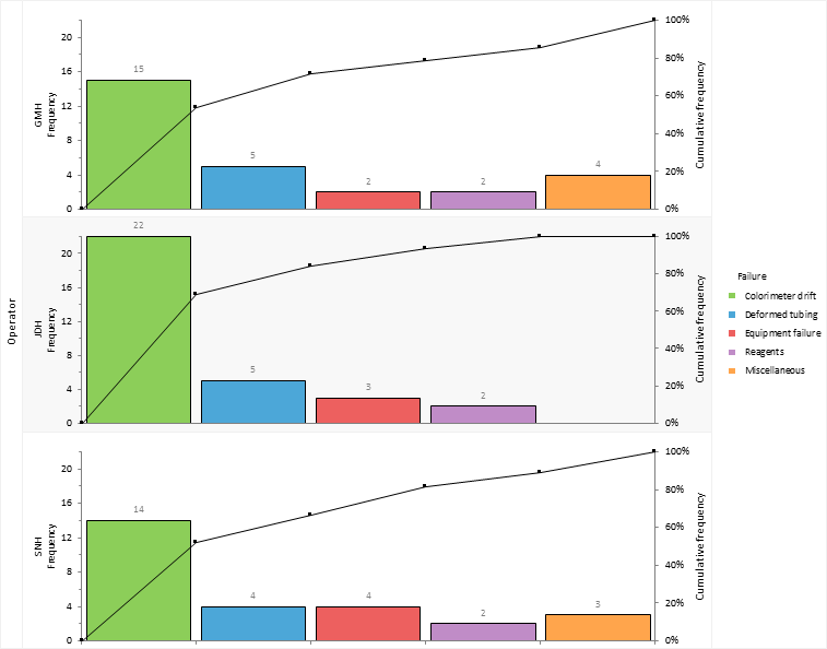
Miscellaneous problems are moved to the end of the Pareto plot. This is a sensible choice as this category comprises of all sorts of small unclassified issues that aren't of interest given the small amount of time they take up.
Problems are sorted into the same order as operator JDH who had the most total downtime making it easier to compare the plots.
Electrode failure and bulb failure are merged together into a new category named Equipment failure. These issues don't account for much downtime and resolving the problems isn't something achievable in-house without consultation with the manufacturer of the colorimeter.
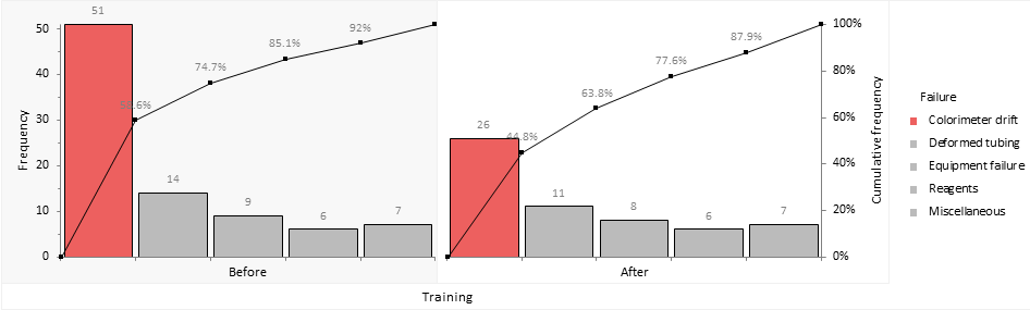
After a process improvement programme is put in place it is important to monitor the results.
Implementing a training plan has reduced the amount of downtime dealing with the colorimeter drift issue. And the worst performing operator is now the best.
It's always good to share the knowledge with other teams and management as successful improvements can encourage other improvements and keep management on-board.
Training reduced the downtime due to colorimeter drift from 51 hours (60% of downtime) over a six week period to just 26 hours (45%) in the six week period following a new training programme.