
1. Tutorials
  2. Process control charts tutorial

Control Charts in Excel: Worked ExampleLearn how to apply process control charts to identify special-cause variation and improve processes.

To illustrate the concepts, we will use data on the copper concentration in a plating process. Copper concentration in a plating pool is controlled by an automated colorimeter that takes readings and adjusts the concentration as required. To verify the correct functioning of a new colorimeter system, copper concentration is measured manually six times per shift. Six operators regularly perform the shifts.

In this tutorial you will perform the following tasks:

Bringing a process under control

Process control charts identify special-causes of variation that need to eliminated to bring the process under control, so the results are predictable and can be used to determine the ability of a process to meet customer specifications.

  1. Open the file tutorials\Copper.xlsx.

    The worksheet is open with some of the data hidden. We will use the additional hidden data later in this tutorial.

  2. On the Analyse-it ribbon tab, in the Statistical Analyses group, click Process Control, and then click Xbar-R.
    The analysis task pane opens.
  3. In the Process drop-down list, select Copper.
  4. In the Sample size group, select the Subgroup by identifier variable option.
  5. In the Id drop-down list, select Date.
  6. Click Calculate.
    The results are calculated and the analysis report opens.

During the installation period of a new automated colorimeter for controlling the copper content in the plating process control charts can be used to identify special-causes of variation that need to eliminated to make the process perform predictably. The Xbar and R charts plot the mean and range of the copper concentration in the plating pool respectively.
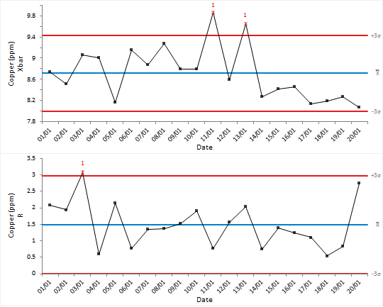
Xbar-R control chart
Inspecting the plots you can see special-cause variation is present in the process:
  • There is a point dated the 03/01 on the R chart with high variation.
  • There are 2 further points dated the 11/01 and 13/02 on the Xbar chart.

Identifying stratification

When data are collected under a variety of different conditions the meaning of the data can be hard to see. Stratification within a process can lead to hidden underlying patterns.

  1. On the Analyse-it ribbon tab, in the Process Control group, click Stratification.
    In the analysis task pane, the Control Chart panel is displayed.
  2. In the Color / Symbol drop-down list, select Operator.
  3. Click Recalculate.

Control chart points are plotted using a symbol and color depending on the operator. It is easy to see that the operator SNH was responsible when the out-of-control signals occurred.
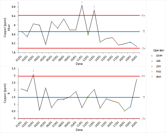
Stratified Xbar-R control chart

After investigating the causes of the out-of-control condition we document them in the worksheet alongside the data.

Identifying special-causes of variation

Special-causes of variation need to be identified and eliminated from the process.

  1. On the Analyse-it ribbon tab, in the Process Control group, click Labels.
    In the analysis task pane, the Control Chart panel is displayed.
  2. In the Label drop-down list, select Cause.
  3. Click Recalculate.

Points on the control chart are labelled with the reason for the special-cause variation. After discussion of the causes of problems with the team, and increased training, procedures or modifications are put in place to ensure they are eliminated.
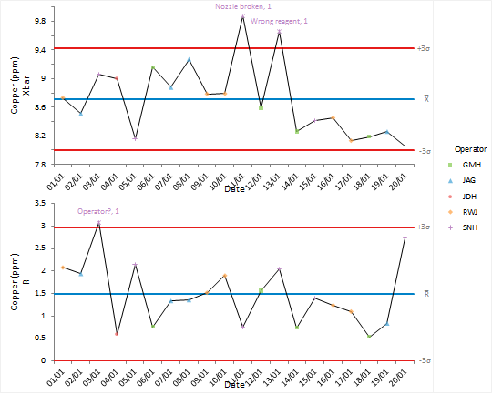
Xbar-R control chart

Identifying shifts (and other patterns)

Effective use of control charts requires periodic revision of control limits when changes to the process cause a reduction in variability or shift to a new operating point.

  1. On the Analyse-it ribbon tab, in the Process Control group, click Apply Rules, and then click Montgomery.
    In the analysis task pane, the Control Chart panel is displayed.
  2. In the Rules grid, clear the check boxes next to rules 4,6, 7 and 8.
  3. Click Recalculate.

The standard Shewhart control limits are good at detecting large shifts but are not sensitive to smaller shifts. Applying advanced out-of-control rules has identified a shift to a new process mean towards the end of the installation period suggesting that the process was moving to a new phase.
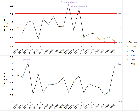
Xbar-R control chart with Nelson rules

Revising control limits

After changes in a process it is necessary to revise the control limits.

  1. On the Analyse-it ribbon tab, in the Report group, click Goto dataset.
  2. On the worksheet, alongside the Phase column, click the drop-down arrow, then select the OQ check box, and click OK.

    The data is filtered to the IQ and OQ phases.

  3. On the Analyse-it ribbon tab, click Return to analysis.
  4. On the Analyse-it ribbon tab, in the Process Control group, click Phases.
    In the analysis task pane, the By drop-down list is displayed.
  5. In the By drop-down list, select Phase.
  6. On the Control Chart panel, select the Show process parameters check box.
  7. Click Recalculate.

New control limits are computed for the new phase of the process. You can see the limits are much narrower and no-special cause variation is present.
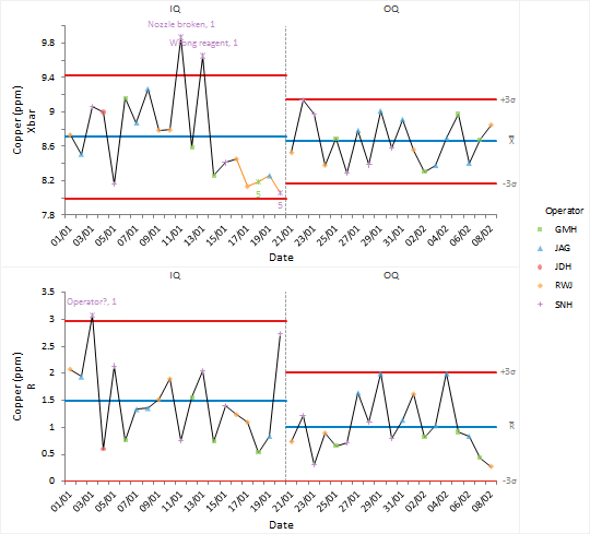
Xbar-R control chart with process phases

Monitoring future production

Once a reliable set of control limits are determined they can be used to monitor future production.

  1. On the Analyse-it ribbon tab, in the Report group, click Goto dataset.
  2. On the Analyse-it ribbon tab, in the Dataset group, click Filter.

    The filter is removed from the dataset and the additional data after the improvements were implemented is shown.

  3. On the Analyse-it ribbon tab, click Return to analysis.
  4. Select the Known process parameters check box.
  5. Select the Vary for each process change option.
  6. In the Parameters grid, alongside the Production phase, in the Mean edit box, type 8.647, and in the SD edit box, type 0.429.
  7. Clear the Advanced out-of-control rules check box.
  8. On the Analyse-it ribbon tab, in the Process Control group, click EWMA.
    In the analysis task pane, a new panel Control Chart (Moving Average) is added.
  9. Click Recalculate.

Control limits for the production phase are computed based on the process mean and standard deviation computed during the OQ stage.
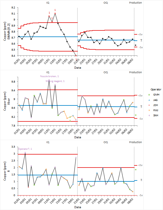
Xbar-R control chart with process phases

The EWMA control chart is more sensitive to detecting small shifts in the process mean than the Shewhart control chart and is an alternative to the advanced control rules. Small drifts in the process mean may indicate a drift in the calibration of the automated colorimeter that is used to control the amount of copper in the plating pool.

Tutorials v6.20.0