Adding additional variables
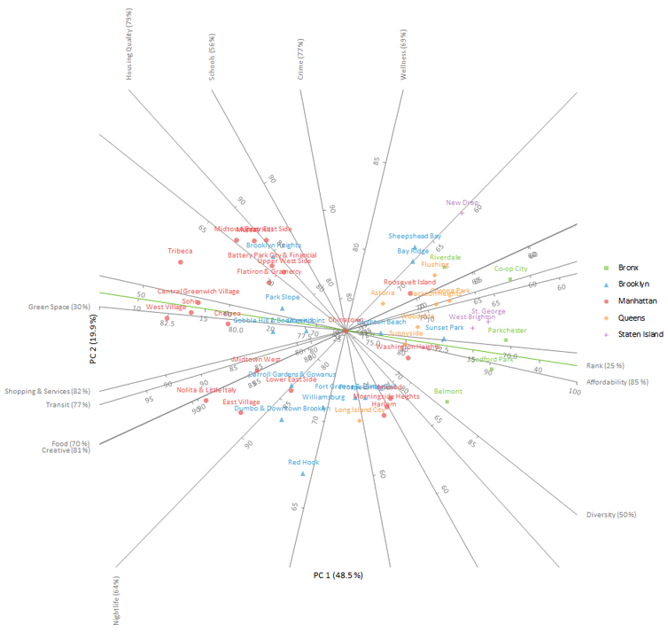
Sometimes there are additional variables that were not included in the PCA because they are a combination of the other variables. It can still be useful to add these variables to the plot as additional axes to help interpretation.
- On the Biplot task pane, click Add new variables.
- In the Additional variables list, select Rank.
-
Click Recalculate.
The results are calculated and the analysis report opens.

The plot shows the additional axis named rank (colored green in the plot). Due to its poor representation, only 25% of variation in the original variable is explained by the first two principal components, we will not pursue interpreting it any further. This is not surprising, given it is a weighted average of the other scores that have varying degrees of correlation between them.
Next topic: Adding additional observations