Reducing the dimensionality of the data
Due to the large number of variables in the dataset, it is hard to comprehend all of the relationships between the variables using a scatter plot or correlation matrix. Using a data reduction technique such as principal components analysis (PCA) reduces the dimensionality of the dataset whilst retaining as much of the variability in the data as possible. The first few principal components retain most of the variation in the original variables, and, to make interpretation simpler, they can be used to describe the relationships between the original variables and similarities between observations.
PCA is a mathematical technique that reduces dimensionality by creating a new set of variables called principal components. The first principal component is a linear combination of the original variables and explains as much variation as possible in the original data. Each subsequent component explains as much of the remaining variation as possible under the condition that it is uncorrelated with the previous components.
The variances table shows the amount of variance in the original data explained by each principal component (also called the eigenvalues). Because the data was standardized, a principal component with a variance of 1 indicates that the component accounts for variation equivalent to one of the original variables. Also, the sum of all the variances equals the number of original variables.
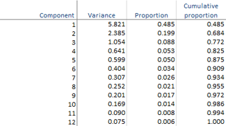
There are many ad-hoc rules regarding the number of components to retain to adequately describe the data. According to the table, the first two principal components account for nearly 70% of the variance in the original 12 variables, whilst the first three components account for nearly 80%.
The coefficients table shows the linear combinations that make each principal component, and the color map shows the structure of the components. Absolute values near zero indicate that a variable contributes little to the component, whereas larger absolute values indicate variables that contribute more to the component. The sign of the coefficients is irrelevant and may even differ when the analysis is performed on different computers.
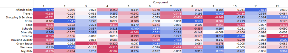
There is not necessarily a simple interpretable structure to the principal components because they are created to maximize the amount of variance whilst remaining uncorrelated with the other components. By trying to interpret the coefficients in the table, we can see that the first component is an average of many different variables; the second component represents mainly crime, wellness, and, to a lesser extent, schools and housing quality; and the third component – although it still has some reasonable sized contribution from other variables – represents mainly green space.