Statistics add-in software for statistical analysis in Excel
  • Tutorials
  • Correlation / PCA tutorial

Understanding the relationship between variables (revisited)

Rather than using a scatter plot or correlation matrix, a two-dimensional correlation monoplot of the coefficients of the first two principal components can visualize the relationships between the variables.

The correlation monoplot shows vectors pointing away from the origin to represent the original variables.

The angle between the vectors is an approximation of the correlation between the variables. A small angle indicates the variables are positively correlated, an angle of 90 degrees indicates the variables are not correlated, and an angle close to 180 degrees indicates the variables are negatively correlated.

The length of the line and its closeness to the circle indicate how well the variable is represented in the plot. It is therefore unwise to make inferences about relationships involving variables that are poorly represented.

  1. On the Analyse-it ribbon tab, in the PCA group, click Biplot / Monoplot, and then click Correlation Monoplot.
    The Biplot / Monoplot task is added to the analysis task pane.
  2. Click Recalculate.
    The results are calculated and the analysis report opens.

Although the first two principal components only account for 70% of the variance in the original dataset, they still provide a useful approximation of the relationships between the variables.

Correlation monoplot

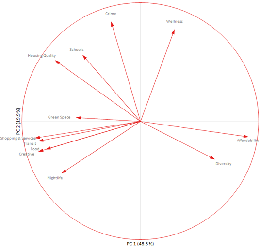
The relationships between the variables described earlier using the scatter plots are easier to visualize in the monoplot. The negative correlation between affordability and transit is represented by the lines being almost 180 degrees to each other.

Green space is not very well represented as indicated by the short length of its vector. This variable was mostly associated with the third principal component, which is not represented in the two-dimensional plot.

Next topic: Understanding the similarities between observations

  •  Tutorials
  •  Distribution tutorial
  •  Correlation / PCA tutorial
  •  Understanding the relationship between variables
  •  Reducing the dimensionality of the data
  •  Understanding the relationship between variables (revisited)
  •  Understanding the similarities between observations
  •  Grouping the observations
  •  Adding additional variables
  •  Adding additional observations
  •  Publishing the plot
  •  Compare groups means tutorial
  •  Association in 2-way contingency tables tutorial
  •  Simple linear regression tutorial
  •  Bland-Altman method comparison tutorial
  •  Estimating the precision of a measurement procedure (CLSI EP05-A3)
  •  Evaluating the linearity of a measurement procedure (CLSI EP06-A)
  •  Verifying the precision of a measurement procedure against a performance claim and estimating the bias (CLSI EP15-A3)
  •  Pareto charts tutorial
  •  Process control charts tutorial
  •  Process capability tutorial


Version 6.15
Published 18-Apr-2023
statistics software, statistical software for Excel
  • Products
  • Store 
  • Support
  • Blog
  • About us
  • Download trial
  •  Search
  •  Sign in
  •  Contact us
Analyse-it editions
  • Standard edition
  • Medical edition
  • Method Validation edition
  • Quality Control & Improvement edition
  • Ultimate edition

  • Blog  
  • About us
  • Contact us  
  • Privacy policy


Copyright 2026 Analyse-it Software, Ltd, Leeds, United Kingdom .
We use essential cookies to run the site, and optional analytics to improve the experience for visitors. For more information see our Privacy policy.