Understanding the similarities between observations
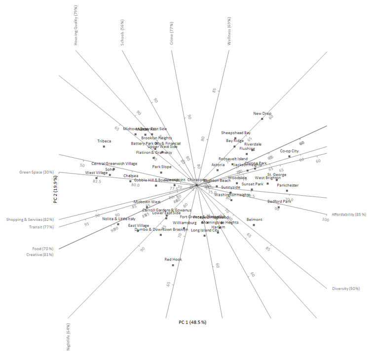
Until now, we have been interested in understanding the relationships between the variables, but often the interest is on the similarity between neighborhoods or groups of neighborhoods. Whilst it is possible to label and color the points on the scatter plots relating to neighborhoods, it is not easy to interpret them when each neighborhood is represented on 60 or more plots. It is easier to first reduce the dimensionality of the data using principal components, and then use a biplot that simultaneously plots information on the observations and the variables.
The classical biplot popularized by Gabriel represents the variables using vectors and observations as points whereas a more recent innovation developed by Gower & Hand represents the variables using calibrated axes allowing the observations represented as points to be projected onto the axes and an approximation made. A full monograph titled Understanding Biplots by Gower, Gardener-Lubbe and LeRoux is an excellent book to learn more about biplots.
- Open the file tutorials\New York Neighborhoods.xlsx.
- Click a cell in the dataset.
-
On the Analyse-it ribbon tab, in the
Statistical Analyses group, click
Multivariate, click Biplot,
and then click PCA Biplot.
The analysis task pane opens.
- In the Y variables list box, select Affordability, Transit, Shopping & Services, Crime, Food, Schools, Diversity, Creative, Housing Quality, Green Space, Wellness, Nightlife.
- Select Label points.
-
Click Calculate.
The results are calculated and the analysis report opens.
The biplot shows the two-dimensional approximation to the original multidimensional space. It represents 70% of the original variation in the data. Each point on the biplot represents a neighborhood and each axis represents a variable.

The distance between points represents the similarity between them, points close to each other are neighborhoods with similar profiles, and points far away have dissimilar profiles.
Any point on the plot can be projected orthogonally onto the axes to show the approximate value of that variable. For example, Bedford Park (center right of the plot) scores around 90 on affordability, 65 on housing quality, and 70 on food. The true values were 89, 60, and 62 respectively, so the approximation is fairly accurate for these variables and this neighborhood.
