Statistics add-in software for statistical analysis in Excel
  • Tutorials
  • Correlation / PCA tutorial

Publishing the plot

Once the plot is constructed, there are many additional options that can be used to tweak its appearance.

The quality of the representation of the axis (known as the predictivity and shown in brackets at the end of each axis label) indicates how much of the variance in the original variable is explained in the plot. Some of the variables – such as green space, schools and diversity – are poorly represented in a two-dimensional PCA biplot, which means projections of points onto those axes aren’t very accurate. Likewise, some neighborhoods may not be well represented by the two-dimensional approximation.

Another issue is that the axes cross over the data points, which makes them difficult to see.

  1. In the Rotate edit box, enter -.

    The plot will be rotated so the axis that is best represented will be horizontal.

  2. Select Transparency.

    Points that are poorly approximated will be more transparent.

  3. Select Visibility and in the Predictivity threshold edit box, enter 0.6.

    Axes which are poorly represented will be hidden.

  4. Select Adjust axes.
  5. In the Offset X edit boxes, enter Crime = 4, Wellness = -4.5, Nightlife = 4.1
  6. In the Offset Y edit boxes, enter Transit = 4, Shopping & Services = 4, Food = -3.3, Creative = -3.6, Housing Quality = -4.3, Rank = -4.
  7. Click Recalculate.
    The results are calculated and the analysis report opens.
PCA biplot

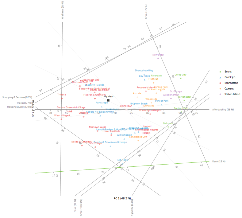
The plot is rotated so that the axis that is best represented (affordability) is horizontal. Other axes are offset to the edge of the plot, which makes the points easier to see.

Points are filled with a lighter transparency the poorer the representation. Axes that represent less than 60% of the variation in the variable are hidden, which eliminates the risk of interpreting the projections onto them.

  •  Tutorials
  •  Distribution tutorial
  •  Correlation / PCA tutorial
  •  Understanding the relationship between variables
  •  Reducing the dimensionality of the data
  •  Understanding the relationship between variables (revisited)
  •  Understanding the similarities between observations
  •  Grouping the observations
  •  Adding additional variables
  •  Adding additional observations
  •  Publishing the plot
  •  Compare groups means tutorial
  •  Association in 2-way contingency tables tutorial
  •  Simple linear regression tutorial
  •  Bland-Altman method comparison tutorial
  •  Estimating the precision of a measurement procedure (CLSI EP05-A3)
  •  Evaluating the linearity of a measurement procedure (CLSI EP06-A)
  •  Verifying the precision of a measurement procedure against a performance claim and estimating the bias (CLSI EP15-A3)
  •  Pareto charts tutorial
  •  Process control charts tutorial
  •  Process capability tutorial


Version 6.15
Published 18-Apr-2023
statistics software, statistical software for Excel
  • Products
  • Store 
  • Support
  • Blog
  • About us
  • Download trial
  •  Search
  •  Sign in
  •  Contact us
Analyse-it editions
  • Standard edition
  • Medical edition
  • Method Validation edition
  • Quality Control & Improvement edition
  • Ultimate edition

  • Blog  
  • About us
  • Contact us  
  • Privacy policy


Copyright 2026 Analyse-it Software, Ltd, Leeds, United Kingdom .
We use essential cookies to run the site, and optional analytics to improve the experience for visitors. For more information see our Privacy policy.