
To illustrate the concepts, we will use data from a New York magazine article that examines the most livable neighborhoods in New York. In the original article, written by Nate Silver, neighborhoods were scored using 12 factors. Then, the scores for each factor were combined into an overall score and ranking for each neighborhood. For more information, see NY magazine story “ The Most Livable Neighborhoods in New York”and Junk Charts story “ The scatter plot matrix: a great tool”.
If you prefer you can watch a video of this tutorial.
In this tutorial you will perform the following tasks:
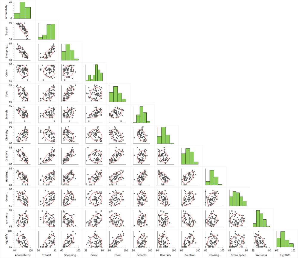
When analyzing many variables, scatter plots and correlation coefficients can quickly uncover patterns and reduce a large amount of data to a subset of interesting relationships.
Correlation describes the strength of relationship between two variables. A correlation coefficient ranges from -1 to +1. +1 indicates a perfect positive linear relationship, and -1 indicates a perfect negative linear relationship. Zero indicates the variables are uncorrelated and there is no linear relationship. Normally the correlation coefficient lies somewhere between these values.
The scatter plot matrix shows plots for all of the pairs of variables, and each plot shows the relationship between a pair of variables. The red ellipse contains the middle 75% of the neighborhoods and indicates whether the two variables are positively, negatively, or not correlated.
The correlation matrix shows the correlation coefficient for each pair of variables. Positively correlated variables are blue and negatively correlated variables are red, with the intensity dependent on the magnitude of the correlation.

Due to the large number of variables in the dataset, it is hard to comprehend all of the relationships between the variables using a scatter plot or correlation matrix. Using a data reduction technique such as principal components analysis (PCA) reduces the dimensionality of the dataset whilst retaining as much of the variability in the data as possible. The first few principal components retain most of the variation in the original variables, and, to make interpretation simpler, they can be used to describe the relationships between the original variables and similarities between observations.
PCA is a mathematical technique that reduces dimensionality by creating a new set of variables called principal components. The first principal component is a linear combination of the original variables and explains as much variation as possible in the original data. Each subsequent component explains as much of the remaining variation as possible under the condition that it is uncorrelated with the previous components.
The variances table shows the amount of variance in the original data explained by each principal component (also called the eigenvalues). Because the data was standardized, a principal component with a variance of 1 indicates that the component accounts for variation equivalent to one of the original variables. Also, the sum of all the variances equals the number of original variables.
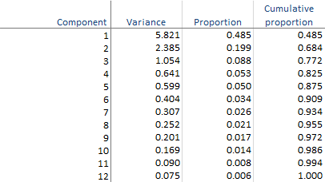
There are many ad-hoc rules regarding the number of components to retain to adequately describe the data. According to the table, the first two principal components account for nearly 70% of the variance in the original 12 variables, whilst the first three components account for nearly 80%.
The coefficients table shows the linear combinations that make each principal component, and the color map shows the structure of the components. Absolute values near zero indicate that a variable contributes little to the component, whereas larger absolute values indicate variables that contribute more to the component. The sign of the coefficients is irrelevant and may even differ when the analysis is performed on different computers.

There is not necessarily a simple interpretable structure to the principal components because they are created to maximize the amount of variance whilst remaining uncorrelated with the other components. By trying to interpret the coefficients in the table, we can see that the first component is an average of many different variables; the second component represents mainly crime, wellness, and, to a lesser extent, schools and housing quality; and the third component – although it still has some reasonable sized contribution from other variables – represents mainly green space.
Rather than using a scatter plot or correlation matrix, a two-dimensional correlation monoplot of the coefficients of the first two principal components can visualize the relationships between the variables.
The correlation monoplot shows vectors pointing away from the origin to represent the original variables.
The angle between the vectors is an approximation of the correlation between the variables. A small angle indicates the variables are positively correlated, an angle of 90 degrees indicates the variables are not correlated, and an angle close to 180 degrees indicates the variables are negatively correlated.
The length of the line and its closeness to the circle indicate how well the variable is represented in the plot. It is therefore unwise to make inferences about relationships involving variables that are poorly represented.
Although the first two principal components only account for 70% of the variance in the original dataset, they still provide a useful approximation of the relationships between the variables.
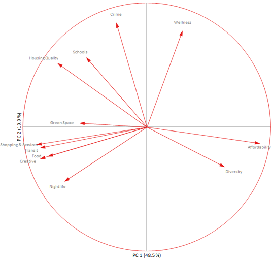
The relationships between the variables described earlier using the scatter plots are easier to visualize in the monoplot. The negative correlation between affordability and transit is represented by the lines being almost 180 degrees to each other.
Green space is not very well represented as indicated by the short length of its vector. This variable was mostly associated with the third principal component, which is not represented in the two-dimensional plot.
Until now, we have been interested in understanding the relationships between the variables, but often the interest is on the similarity between neighborhoods or groups of neighborhoods. Whilst it is possible to label and color the points on the scatter plots relating to neighborhoods, it is not easy to interpret them when each neighborhood is represented on 60 or more plots. It is easier to first reduce the dimensionality of the data using principal components, and then use a biplot that simultaneously plots information on the observations and the variables.
The classical biplot popularized by Gabriel represents the variables using vectors and observations as points whereas a more recent innovation developed by Gower & Hand represents the variables using calibrated axes allowing the observations represented as points to be projected onto the axes and an approximation made. A full monograph titled Understanding Biplots by Gower, Gardener-Lubbe and LeRoux is an excellent book to learn more about biplots.
The biplot shows the two-dimensional approximation to the original multidimensional space. It represents 70% of the original variation in the data. Each point on the biplot represents a neighborhood and each axis represents a variable.
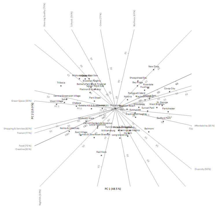
The distance between points represents the similarity between them, points close to each other are neighborhoods with similar profiles, and points far away have dissimilar profiles.
Any point on the plot can be projected orthogonally onto the axes to show the approximate value of that variable. For example, Bedford Park (center right of the plot) scores around 90 on affordability, 65 on housing quality, and 70 on food. The true values were 89, 60, and 62 respectively, so the approximation is fairly accurate for these variables and this neighborhood.
Rather than focusing on individual neighborhoods, we may group the neighborhoods by the borough they are located in and plot the points using different symbols and colors.
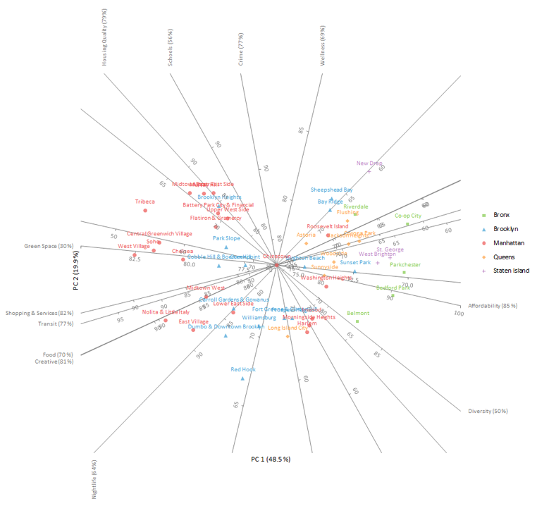
It is easy to see that the neighborhoods in The Bronx are more affordable than those in Manhattan and that they have lower scores for shopping & services, transit, food and creative. The axes are labelled on the edge with higher values for convenience.
Sometimes there are additional variables that were not included in the PCA because they are a combination of the other variables. It can still be useful to add these variables to the plot as additional axes to help interpretation.
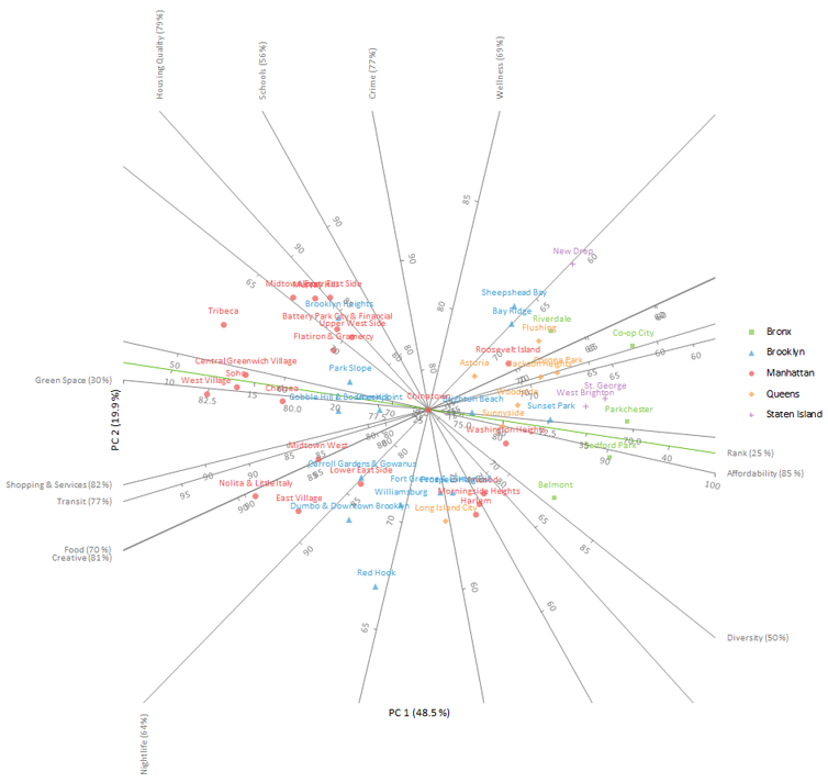
The plot shows the additional axis named rank (colored green in the plot). Due to its poor representation, only 25% of variation in the original variable is explained by the first two principal components, we will not pursue interpreting it any further. This is not surprising, given it is a weighted average of the other scores that have varying degrees of correlation between them.
If we have our own priorities regarding what constitutes our ideal neighborhood, this can be plotted to determine a list of neighborhoods closely matching those criteria.
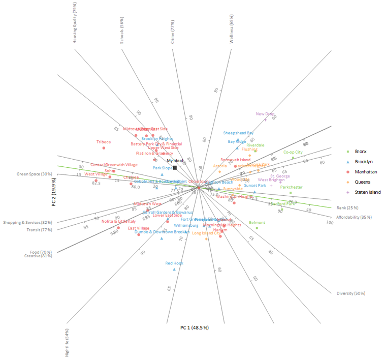
Our ideal neighborhood is interpolated onto the plot and labelled “My Ideal” (left and above the center of the plot). Neighborhoods that closely match those priorities will surround that point. Namely, these neighborhoods are Park Slope, Upper West Side, and the Flatiron District & Gramercy.
Once the plot is constructed, there are many additional options that can be used to tweak its appearance.
The quality of the representation of the axis (known as the predictivity and shown in brackets at the end of each axis label) indicates how much of the variance in the original variable is explained in the plot. Some of the variables – such as green space, schools and diversity – are poorly represented in a two-dimensional PCA biplot, which means projections of points onto those axes aren’t very accurate. Likewise, some neighborhoods may not be well represented by the two-dimensional approximation.
Another issue is that the axes cross over the data points, which makes them difficult to see.
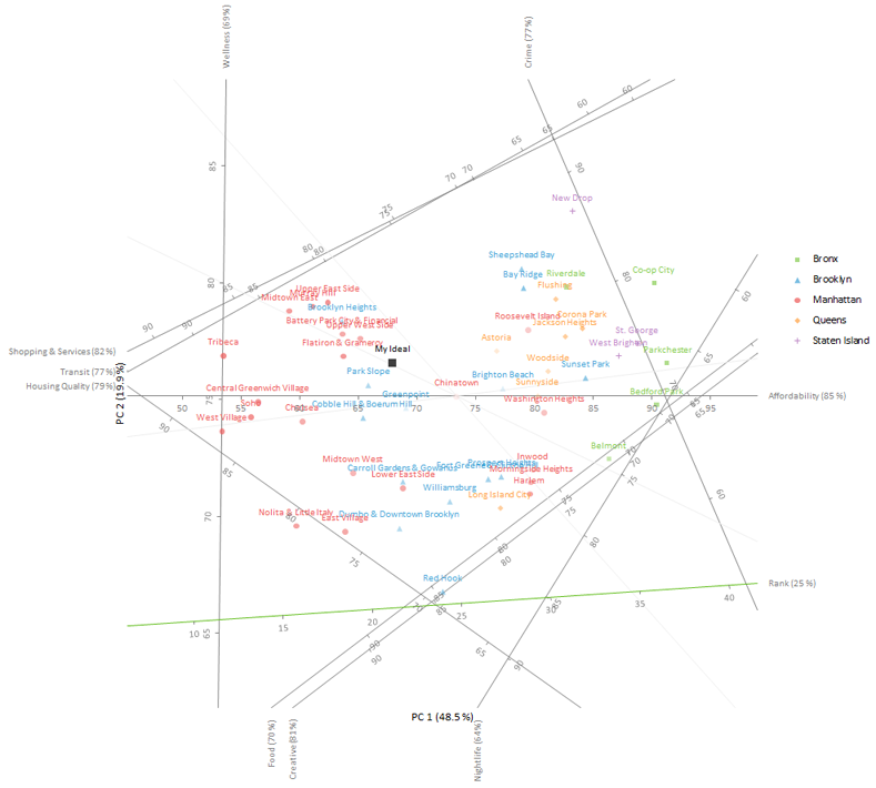
The plot is rotated so that the axis that is best represented (affordability) is horizontal. Other axes are offset to the edge of the plot, which makes the points easier to see.
Points are filled with a lighter transparency the poorer the representation. Axes that represent less than 60% of the variation in the variable are hidden, which eliminates the risk of interpreting the projections onto them.