
A linear model describes the relationship between a continuous response variable and one or more explanatory variables using a linear function.
Simple regression models describe the relationship between a single predictor variable and a response variable.
| Name | Model | Purpose |
|---|---|---|
| Line | Y=b0+b1x | Fit a straight line. |
| Polynomial | Y=b0+b1x+b1x2.... | Fit a polynomial curve. Polynomials are useful when the function is smooth, a polynomial of a high enough degree estimates any smooth function. Polynomials are used as approximations and rarely represent a physical model. |
| Logarithmic | Y=b0+ b1Log(x) | Fit a logarithmic function curve. |
| Exponential | Y=a*b1x | Fit an exponential function curve. |
| Power | Y=a*xb1 | Fit a power function curve. |
Fit a simple linear regression model to describe the relationship between single a single predictor variable and a response variable.
Advanced models describe the relationship between a response variable and multiple predictor terms.
An advanced model is built from simple terms, polynomial terms and their interactions.
Some common forms of advanced models are:
| Type | Description |
|---|---|
| Simple regression | A single quantitative simple term (X). |
| Multiple regression | Two or more quantitative simple terms (X, Z) |
| Polynomial | A series of polynomial terms of the nth degree (X, X², X³...). |
| One-way ANOVA | A single categorical term (A). |
| Two-way ANOVA | Two categorical terms (A, B). |
| Two-way ANOVA with interaction | Two categorical terms and their interaction (A, B, A*B). |
| Fully factorial ANOVA | All the simple categorical terms and all the crossed interaction terms (A, B, C, A*B, A*C, B*C, A*B*C). |
| ANCOVA | One or more categorical terms and one or more quantitative terms (A, X) or (A, X, A*X). |
Fit a multiple linear regression model to describe the relationship between many quantitative predictor variables and a response variable.
Test if there is a difference between population means when a response variable is classified by one or more categorical variables (factors).
Test if there is a difference between population means when a response variable is classified by two or more categorical variables (factors).
Test if there is a difference between population means when a response variable is classified by one or more categorical variables (factors) while adjusting for the effect of one or more quantitative variables (covariates).
Fit an advanced linear model to describe the relationship between many predictor variables and a response variable.
A scatter plot shows the relationship between variables.
The scatter plot identifies the relationship that best describes the data, whether a straight line, polynomial or some other function.
A scatter plot matrix shows the relationship between each predictor and the response, and the relationship between each pair of predictors. You can use the matrix to identify the relationship between variables, to identify where additional terms such as polynomials or interactions are needed, and to see if transformations are needed to make the predictors or response linear. The scatter plot matrix does not convey the joint relationship between each predictor and the response since it does not take into account the effect on the response of the other variables in the model. Effect leverage and residual plots fulfill this purpose after fitting the model.
R² and similar statistics measure how much variability is explained by the model.
R² is the proportion of variability in the response explained by the model. It is 1 when the model fits the data perfectly, though it can only attain this value when all sets of predictors are different. Zero indicates the model fits no better than the mean of the response. You should not use R² when the model does not include a constant term, as the interpretation is undefined.
For models with more than a single term, R² can be deceptive as it increases as you add more parameters to the model, eventually reaching saturation at 1 when the number of parameters equals the number of observations. Adjusted R² is a modification of R² that adjusts for the number of parameters in the model. It only increases when the terms added to the model improve the fit more than would be expected by chance. It is preferred when building and comparing models with a different number of parameters.
For example, if you fit a straight-line model, and then add a quadratic term to the model, the value of R² increases. If you continued to add more the polynomial terms until there are as many parameters as the number of observations, then the R² value would be 1. The adjusted R² statistic is designed to take into account the number of parameters in the model and ensures that adding the new term has some useful purpose rather than simply due to the number of parameters approaching saturation.
In cases where each set of predictor values are not unique, it may be impossible for the R² statistic to reach 1. A statistic called the maximum attainable R² indicates the maximum value that R² can achieve even if the model fitted perfectly. It is related to the pure error discussed in the lack of fit test.
The root mean square error (RMSE) of the fit, is an estimate of the standard deviation of the true unknown random error (it is the square root of the residual mean square). If the model fitted is not the correct model, the estimate is larger than the true random error, as it includes the error due to lack of fit of the model as well as the random errors.
Parameter estimates (also called coefficients) are the change in the response associated with a one-unit change of the predictor, all other predictors being held constant.
The unknown model parameters are estimated using least-squares estimation.
A coefficient describes the size of the contribution of that predictor; a near-zero coefficient indicates that variable has little influence on the response. The sign of the coefficient indicates the direction of the relationship, although the sign can change if more terms are added to the model, so the interpretation is not particularly useful. A confidence interval expresses the uncertainty in the estimate, under the assumption of normally distributed errors. Due to the central limit theorem, violation of the normality assumption is not a problem if the sample size is moderate.
For example, a coefficient for Height of 0.75, in a simple model for the response Weight (kg) with predictor Height (cm), could be expressed as 0.75 kg per cm which indicates a 0.75 kg weight increase per 1 cm in height.
When a predictor is a logarithm transformation of the original variable, the coefficient is the rate of change in the response per 1 unit change in the log of the predictor. Commonly base 2 log and base 10 log are used as transforms. For base 2 log the coefficient can be interpreted as the rate of change in the response when for a doubling of the predictor value. For base 10 log the coefficient can be interpreted as the rate of change in the response when the predictor is multiplied by 10, or as the % change in the response per % change in the predictor.
Analyse-it uses effect coding for nominal terms (also known as the mean deviation coding). The sum of the parameter estimates for a categorical term using effect coding is equal to 0.
Analyse-it uses reference coding for ordinal terms. The first level is used as the baseline or reference level.
A standardized parameter estimate (commonly known as standardized beta coefficient) removes the unit of measurement of predictor and response variables. They represent the change in standard deviations of the response for 1 standard deviation change of the predictor. You can use them to compare the relative effects of predictors measured on different scales.
VIF, the variance inflation factor, represents the increase in the variance of the parameter estimate due to correlation (collinearity) between predictors. Collinearity between the predictors can lead to unstable parameter estimates. As a rule of thumb, VIF should be close to the minimum value of 1, indicating no collinearity. When VIF is greater than 5, there is high collinearity between predictors.
A t-test formally tests the null hypothesis that the parameter is equal to 0, against the alternative hypothesis that it is not equal to 0. When the p-value is small, you can reject the null hypothesis and conclude that the parameter is not equal to 0 and it does contribute to the model.
When a parameter is not deemed to contribute statistically to the model, you can consider removing it. However, you should be cautious of removing terms that are known to contribute by some underlying mechanism, regardless of the statistical significance of a hypothesis test, and recognize that removing a term can alter the effect of other terms.
An F-test formally tests the hypothesis of whether the model fits the data better than no model.
It is common to test whether the model fits the data better than a null model that just fits the mean of the response. An analysis of variance table partitions the total variance in the response variable into the variation after fitting the full model (called the model error, or residual), the variation after fitting the null model, and the reduction by fitting the full model compared to the null model.
An F-test formally tests whether the reduction is statistically significant. The null hypothesis states that all the parameters except the intercept are zero against the alternative that at least one parameter is not equal to zero. When the p-value is small, you can reject the null hypothesis and conclude that at least one parameter is not zero.
An analysis of variance (ANOVA) table shows the sources of variation.
| Abbreviation | Description |
|---|---|
| SS | Sum of squares, the sum of the squared deviations from the expected value. |
| DF | Degrees of freedom, the number of values that are free to vary. |
| MS | Mean square, the sum of squares divided by the degrees of freedom. |
| F | F-statistic, the ratio of two mean squares that forms the basis of a hypothesis test. |
| p-value | p-value, the probability of obtaining an F statistic at least as extreme as that observed when the null hypothesis is true. |
A predicted against actual plot shows the effect of the model and compares it against the null model.
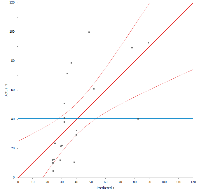
For a good fit, the points should be close to the fitted line, with narrow confidence bands. Points on the left or right of the plot, furthest from the mean, have the most leverage and effectively try to pull the fitted line toward the point. Points that are vertically distant from the line represent possible outliers. Both types of points can adversely affect the fit.
The plot is also a visualization of the ANOVA table, except each observation is shown so you can gain much more insight than just the hypothesis test. The confidence interval around the full model line portrays the F-test that all the parameters except the intercept are zero. When the confidence interval does not include the horizontal null model line, the hypothesis test is significant.
An F-test or X2-test formally tests how well the model fits the data.
When the model fitted is correct the residual (model error) mean square provides and unbiased estimate of the true variance. If the model is wrong, then the mean square is larger than the true variance. It is possible to test for lack of fit by comparing the model error mean square to the true variance.
When the true variance is known, a X2-squared test formally tests whether the model error is equal to the hypothesized value.
When the true variance is unknown, and there are multiple observations for each set of predictor values, an F-test formally tests whether there is a difference between pure error and the model error. The pure error is the pooled variance calculated for all unique sets of predictor values. It makes no assumptions about the model but does assume that the variance is the same for each set of predictor values. An analysis of variance table shows the pure error, model error, and the difference between them called the lack of fit.
The null hypothesis states that the model error mean square is equal to the hypothesized value/pure error, against the alternative that it is greater than. When the test p-value is small, you can reject the null hypothesis and conclude that there is a lack of fit.
An F-test formally tests whether a term contributes to the model.
In most modeling analyses the aim is a model that describes the relationship using as few terms as possible. It is therefore of interest to look at each term in the model to decide if the term is providing any useful information.
An analysis of variance table shows the reduction in error by including each term. An F-test for each term is a formal hypothesis test to determine if the term provides useful information to the model. The null hypothesis states that the term does not contribute to the model, against the alternative hypothesis that it does. When the p-value is small, you can reject the null hypothesis and conclude that the term does contribute to the model.
When a term is not deemed to contribute statistically to the model, you may consider removing it. However, you should be cautious of removing terms that are known to contribute by some underlying mechanism, regardless of the statistical significance of a hypothesis test, and recognize that removing a term can alter the effect of other terms.
| Test | Purpose |
|---|---|
| Partial | Measures the effect of the term adjusted for all other terms in the model. The sum of squares in the ANOVA table is known as the Type III sum of squares. A partial F-test is equivalent to testing if all the parameter estimates for the term are equal to zero. |
| Sequential | Measures the effect of the term adjusting only for the previous terms included in the model. The sum of squares in the ANOVA table is known as the Type I sum of squares. A sequential F-test is often useful when fitting a polynomial regression. |
An effect leverage plot, also known as added variable plot or partial regression leverage plot, shows the unique effect of a term in the model.
A horizontal line shows the constrained model without the term; a slanted line shows the unconstrained model with the term. The plot shows the unique effect of adding a term to a model assuming the model contains all the other terms and the influence of each point on the effect of term hypothesis test. Points further from the horizontal line than the slanted line effectively try to make the hypothesis test more significant, and those closer to the horizontal than the slanted line try to make the hypothesis test less significant. When the confidence band fully encompasses the horizontal line, you can conclude the term does not contribute to the model. It is equivalent to a non-significant F-test for the partial effect of the term.
You can also use the plot to identify cases that are likely to influence the parameter estimates. Points furthest from the intersection of the horizontal and slanted lines have high leverage, and effectively try to pull the line towards them. A high leverage point that is distant from the bulk of the points can have a large influence the parameter estimates for the term.
Finally, you can use the plot to spot near collinearity between terms. When the terms are collinear, the points collapse toward a vertical line.
Effect means are least-squares estimates predicted by the model for each combination of levels in a categorical term, adjusted for the other model effects.
Least-squares means are predictions made at specific values of the predictors. For each categorical variable in the term, the value is the combination of levels. For all other variables that are not part of the term, the values are neutral values. The neutral value for a quantitative variable is the mean. The neutral value of a nominal variable is the average over all levels which is equivalent to values of 0 for each dummy predictor variable in an effect coding scheme. The neutral value of an ordinal variable is the reference level.
Plot the main effects and interactions to interpret the means.
Multiple comparisons make simultaneous inferences about a set of parameters.
When making inferences about more than one parameter (such as comparing many means, or the differences between many means), you must use multiple comparison procedures to make inferences about the parameters of interest. The problem when making multiple comparisons using individual tests such as Student's t-test applied to each comparison is the chance of a type I error increases with the number of comparisons. If you use a 5% significance level with a hypothesis test to decide if two groups are significantly different, there is a 5% probability of observing a significant difference that is simply due to chance (a type I error). If you made 20 such comparisons, the probability that one or more of the comparisons is statistically significant simply due to chance increases to 64%. With 50 comparisons, the chance increases to 92%. Another problem is the dependencies among the parameters of interest also alter the significance level. Therefore, you must use multiple comparison procedures to maintain the simultaneous probability close to the nominal significance level (typically 5%).
Multiple comparison procedures are classified by the strength of inference that can be made and the error rate controlled. A test of homogeneity controls the probability of falsely declaring any pair to be different when in fact all are the same. A stronger level of inference is confident inequalities and confident directions which control the probability of falsely declaring any pair to be different regardless of the values of the others. An even stronger level is a set of simultaneous confidence intervals that guarantees that the simultaneous coverage probability of the intervals is at least 100(1-alpha)% and also have the advantage of quantifying the possible effect size rather than producing just a p-value. A higher strength inference can be used to make an inference of a lesser strength but not vice-versa. Therefore, a confidence interval can be used to perform a confidence directions/inequalities inference, but a test of homogeneity cannot make a confidence direction/inequalities inference.
The most well known multiple comparison procedures, Bonferroni and Šidák, are not multiple comparison procedures per se. Rather they are an inequality useful in producing easy to compute multiple comparison methods of various types. In most scenarios, there are more powerful procedures available. A useful application of Bonferroni inequality is when there are a small number of pre-planned comparisons. In these cases, you can use the standard hypothesis test or confidence interval with the significance level (alpha) set to the Bonferroni inequality (alpha divided by the number of comparisons).
A side effect of maintaining the significance level is a lowering of the power of the test. Different procedures have been developed to maintain the power as high as possible depending on the strength of inference required and the number of comparisons to be made. All contrasts comparisons allow for any possible contrast; all pairs forms the k*(k-1)/2 pairwise contrasts, whereas with best forms k contrasts each with the best of the others, and against control forms k-1 contrasts each against the control group. You should choose the appropriate contrasts of interest before you perform the analysis, if you decide after inspecting the data, then you should only use all contrasts comparison procedures.
Methods of controlling the Type I error and dependencies between point estimates when making multiple comparisons between effect means in a linear model.
| Procedure | Purpose / Assumptions |
|---|---|
| Student's t (Fisher's LSD) | Compare the means of each pair of groups using the Student's t method. When making all pairwise comparisons this procedure is also known as unprotected Fisher's LSD, or when only performed following significant ANOVA F -test known as protected Fisher's LSD. Controls the Type I error rate individually for each contrast. |
| Tukey-Kramer | Compare the means of all pairs of groups using the Tukey-Kramer method. Controls the error rate simultaneously for all k(k+1)/2 contrasts. |
| Hsu | Compare the means of all groups against the best of the other groups using the Hsu
method. Controls the error rate simultaneously for all k contrasts. |
| Dunnett | Compare the means of all groups against a control using the Dunnett
method. Controls the error rate simultaneously for all k-1 contrasts. |
| Scheffé | Compare the means of all groups against all other groups using the Scheffé F
method. Controls the error rate simultaneously for all possible contrasts. |
| Bonferroni | Not a multiple comparisons method. It is an inequality useful in producing easy to compute multiple comparisons. In most scenarios, there are more powerful procedures such as Tukey, Dunnett, Hsu. A useful application of Bonferroni inequality is when there are a small number of pre-planned comparisons. In this case, use the Student's t (LSD) method with the significance level (alpha) set to the Bonferroni inequality (alpha divided by the number of comparisons). In this scenario, it is usually less conservative than using Scheffé all contrast comparisons. |
Compare the effect means to make inferences about the differences between them.
A residual plot shows the difference between the observed response and the fitted response values.
The ideal residual plot, called the null residual plot, shows a random scatter of points forming an approximately constant width band around the identity line.
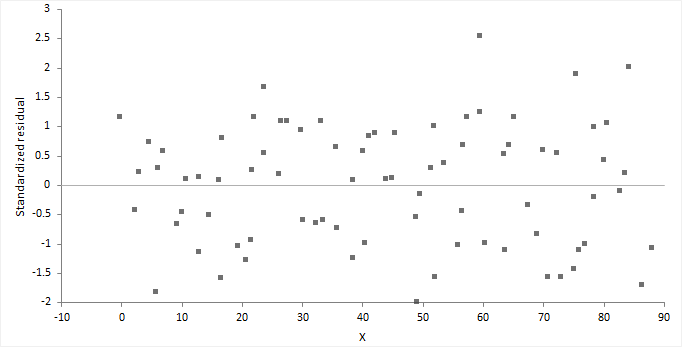
It is important to check the fit of the model and assumptions – constant variance, normality, and independence of the errors, using the residual plot, along with normal, sequence, and lag plot.
| Assumption | How to check |
|---|---|
| Model function is linear | The points form a pattern when the model function is incorrect. You might be able to transform variables or add polynomial and interaction terms to remove the pattern. |
| Constant variance | If the points tend to form an increasing, decreasing or non-constant width band, then the variance is not constant. You should consider transforming the response variable or incorporating weights into the model. When variance increases as a percentage of the response, you can use a log transform, although you should ensure it does not produce a poorly fitting model. Even with non-constant variance, the parameter estimates remain unbiased if somewhat inefficient. However, the hypothesis tests and confidence intervals are inaccurate. |
| Normality | Examine the normal plot of the residuals to identify non-normality. Violation of the normality assumption only becomes an issue with small sample sizes. For large sample sizes, the assumption is less important due to the central limit theorem, and the fact that the F- and t-tests used for hypothesis tests and forming confidence intervals are quite robust to modest departures from normality. |
| Independence | When the order of the cases in the dataset is the order in which they occurred: Examine a sequence plot of the residuals against the order to identify any dependency between the residual and time. Examine a lag-1 plot of each residual against the previous residual to identify a serial correlation, where observations are not independent, and there is a correlation between an observation and the previous observation. Time-series analysis may be more suitable to model data where serial correlation is present. |
For a model with many terms, it can be difficult to identify specific problems using the residual plot. A non-null residual plot indicates that there are problems with the model, but not necessarily what these are.
Normality is the assumption that the underlying residuals are normally distributed, or approximately so.
While a residual plot, or normal plot of the residuals can identify non-normality, you can formally test the hypothesis using the Shapiro-Wilk or similar test.
The null hypothesis states that the residuals are normally distributed, against the alternative hypothesis that they are not normally-distributed. If the test p-value is less than the predefined significance level, you can reject the null hypothesis and conclude the residuals are not from a normal distribution. If the p-value is greater than the predefined significance level, you cannot reject the null hypothesis.
Violation of the normality assumption only becomes an issue with small sample sizes. For large sample sizes, the assumption is less important due to the central limit theorem, and the fact that the F- and t-tests used for hypothesis tests and forming confidence intervals are quite robust to modest departures from normality.
Autocorrelation occurs when the residuals are not independent of each other. That is, when the value of e[i+1] is not independent from e[i].
While a residual plot, or lag-1 plot allows you to visually check for autocorrelation, you can formally test the hypothesis using the Durbin-Watson test. The Durbin-Watson statistic is used to detect the presence of autocorrelation at lag 1 (or higher) in the residuals from a regression. The value of the test statistic lies between 0 and 4, small values indicate successive residuals are positively correlated. If the Durbin-Watson statistic is much less than 2, there is evidence of positive autocorrelation, if much greater than 2 evidence of negative autocorrelation.
Plot the residuals to check the fit and assumptions of the model.
An influence plot shows the outlyingness, leverage, and influence of each case.
The plot shows the residual on the vertical axis, leverage on the horizontal axis, and the point size is the square root of Cook's D statistic, a measure of the influence of the point.
Outliers are cases that do not correspond to the model fitted to the bulk of the data. You can identify outliers as those cases with a large residual (usually greater than approximately +/- 2), though not all cases with a large residual are outliers and not all outliers are bad. Some of the most interesting cases may be outliers.
Leverage is the potential for a case to have an influence on the model. You can identify points with high leverage as those furthest to the right. A point with high leverage may not have much influence on the model if it fits the overall model without that case.
Influence combines the leverage and residual of a case to measure how the parameter estimates would change if that case were excluded. Points with a large residual and high leverage have the most influence. They can have an adverse effect on (perturb) the model if they are changed or excluded, making the model less robust. Sometimes a small group of influential points can have an unduly large impact on the fit of the model.
Plot measures to identify cases with large outliers, high leverage, or major influence on the fitted model.
Points highlighted in red are deemed to be potentially influential to the fitted model.
Prediction is the use of the model to predict the population mean or value of an individual future observation, at specific values of the predictors. Inverse prediction deals with the problem of predicting the value of a predictor for a given value of the response variable.
When making predictions, it is important that the data used to fit the model is similar to future populations to which you want to apply the prediction. You should be careful of making predictions outside the range of the observed data. Assumptions met for the observed data may not be met outside the range. Non-constant variance can cause confidence intervals for the predicted values to become unrealistically narrow or so large as to be useless. Alternatively, a different fit function may better describe the unobserved data outside the range.
When making multiple predictions of the population mean at different sets of predictor values the confidence intervals can be simultaneous or individual. A simultaneous interval ensures you achieve the confidence level simultaneously for all predictions, whereas individual intervals only ensure confidence for the individual prediction. With individual inferences, the chance of at least one interval not including the true value increases with the number of predictions.
Predict the value of the mean at specific values of the predictors, or the value of an individual future observation.
Predict the values of the predictors at a specific value or values of the response variable.
You can only make inverse predictions when fitting a simple regression model.
Save the values computed by the analysis back to the dataset for further analysis.
Fit model analysis study requirements and dataset layout.
Use a column for each predictor variable (Height, Sex) and a column for the response variable (Weight); each row has the values of the variables for a case (Subject).
| Subject (optional) | Height | Sex | Weight |
|---|---|---|---|
| 1 | 175 | M | 65 |
| 2 | 180 | M | 70 |
| 3 | 160 | F | 90 |
| 4 | 190 | F | 55 |
| 5 | 180 | M | 100 |
| 6 | 150 | F | 55 |
| 7 | 140 | M | 75 |
| 8 | 160 | M | 80 |
| 9 | 165 | F | 80 |
| 10 | 180 | M | 95 |
| … | … | … | … |


