6-Nov-2008 Normal quantile & probability plots
In a previous post, Testing the assumption of Normality, we explained the tests provided in Analyse-it to determine if a sample has normal distribution. In that post, we mentioned that although hypothesis tests are useful you should not solely rely on them. You should always look at the histogram and, maybe more importantly, the normal plot.
The beauty of the normal plot is that it is designed specifically for judging normality. The plot is very easy to interpret and lets you see where the sample deviates from normality.
Interpreting the normal plot
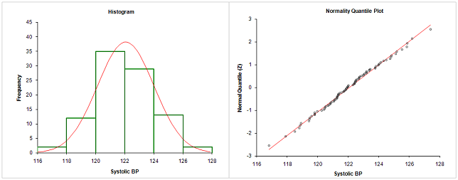
As an example, let’s look at the distribution of systolic blood pressure, for a random group of healthy patients. Analyse-it creates the histogram (left) and normal plot (right) below:

Looking at the histogram, you can see the sample is approximately normally distributed. The bar heights for 120-122 and 122-124 make the distribution look slightly skewed, so it’s not perfectly clear.
The normal plot is clearer. It shows the observations on the X axis plotted against the expected normal score (Z-score) on the Y axis. It’s not necessary to understand what an expected normal score is, nor how it’s calculated, to interpret the plot. All you need to do is check is that the points roughly follow the red-line. The red-line shows the ideal normal distribution with mean and standard-deviation of the sample. If the points roughly follow the line – as they do in this case – the sample has normal distribution.
And that’s the real beauty of the normal plot compared to the histogram – it's very easy to interpret. Visually, the human eye can better judge the points against a straight-line. And, unlike the histogram, there’s less ambiguity. You don’t have to try judge histogram bar-heights against the normal overlay curve.
Variations on the normal plot
Analyse-it creates what is technically called a Normal Quantile plot. Quantile is just another word for a normal or Z-score and refers to what’s shown on the Y axis (in the case of Analyse-it).
There are actually four variations of the normal plot, or eight since depending on preference the X and Y axes are often swapped:
- Normal quantile plot. Observations plotted against expected normal score (Z-score, known as quantiles)
- Normal quantile-quantile plot (also known as normal QQ plot). Normal score (Z-score, known as quantiles) of the observations plotted against expected normal score (Z-score, known as quantiles)
- Normal probability plot. Observations plotted against expected CDF (cumulative area under the normal curve, known as probability)
- Normal probability-probability plot (also known as normal PP plot). CDF (cumulative area under the normal curve, known as probability) of the observations plotted against expected CDF (cumulative area under the normal curve, known as probability)
By their nature, normal plots based on probability fail to emphasise non-normality in extreme observations – in the tails of the distribution – as well as quantile based normal plots. Generally, probability/P-P plots are better to spot non-normality around the mean, and normal quantile/Q-Q plots to spot non-normality in the tails.
Thankfully, whichever of variation of the normal plot you’re faced with, interpretation is the same. If the sample is normal you should see the points roughly follow a straight-line.
In future posts we’ll show cases of skewed and peaked distributions, and explain how you can identify these problems from the histogram and normal plot.

Comments
Thanks.
Comments are now closed.