
A continuous distribution describes a variable that can take on any numeric value (for example, weight, age, or height).
Descriptive statistics provide information about the central location (central tendency), dispersion (variability or spread), and shape of the distribution.
| Statistic | Purpose |
|---|---|
| N | The number of non-missing values in a set of data. |
| Sum | The sum of the values in a set of data. |
| Mean | Measure the central tendency using the arithmetic mean. |
| Harmonic mean | Measure the central tendency using the reciprocal of the arithmetic mean of the reciprocals. Useful when the values are rates and ratios. |
| Geometric mean | Measure the central tendency using the product of the values. Useful when the values are percentages. |
| Variance | Measure the amount of variation using the squared deviation of a variable from its mean. |
| Standard deviation | Measure the amount of variation using the square root of the variance. |
| CV% / RSD | Measure the spread relative to its expected value (standard deviation divided by the mean). Also known as the coefficient of variation or relative standard deviation. |
| Skewness | Measure the "sideness" or symmetry of the distribution. Skewness can be positive or negative. Negative skew indicates that the tail on the left side of the distribution is longer or fatter than the right side. Positive skew indicates the converse, the tail on the right side is longer or fatter than the left side. A value of zero indicates the tails on both sides balance; this is the case for symmetric distributions, but also for asymmetric distributions where a short fat tail balances out a long thin tail. Uses the Fisher-Pearson standardized moment coefficient G1 definition of sample skewness. |
| Kurtosis | Measure the "tailedness" of the distribution. That is, whether the tails are heavy or light. Excess kurtosis is the kurtosis minus 3 and provides a comparison to the normal distribution. Positive excess kurtosis (called leptokurtic) indicates the distribution has fatter tails than a normal distribution. Negative excess kurtosis (called platykurtic) indicates the distribution has thinner tails than a normal distribution. Uses the G2 definition of the sample excess kurtosis |
| Median | Measure the central tendency using the middle value in a set of data. |
| Minimum | Smallest value in a set of data. |
| Maximum | Largest value in a set of data. |
| Range | The difference between the maximum and minimum. |
| 1st quartile | The middle value between the smallest value and median in a set of data. |
| 3rd quartile | The middle value between the median and largest value in a set of data. |
| Interquartile range | Measure the spread between the 1st and 3rd quartile. |
| Mode | The value that appears the most in a set of data. |
| Quantiles | A set of values that divide the range of the distribution into contiguous intervals defined by probabilities. |
For normally distributed data, the mean and standard deviation provide the best measures of central location and dispersion.
For data with a non-normal or highly-skewed distribution, or data with extreme values, the median and the first and third quartiles provide better measures of central location and dispersion. When the distribution of the data is symmetric, the inter-quartile range (IQR) is a useful measure of dispersion. Quantiles further describe the distribution of the data, providing an interval containing a specified proportion (for example, 95%) of the data or by breaking the data into intervals each containing a proportion of the data (for example, deciles each containing 10% of the data).
Use univariate descriptive statistics to describe a quantitative variable.
A univariate plot shows the data and summarizes its distribution.
A dot plot, also known as a strip plot, shows the individual observations.
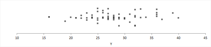
A dot plot gives an indication of the spread of the data and can highlight clustering or extreme values.
A box plot shows the five-number summary of the data – the minimum, first quartile, median, third quartile, and maximum. An outlier box plot is a variation of the skeletal box plot that also identifies possible outliers.
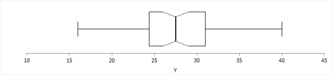
A skeletal box plot shows the median as a line, a box from the 1st to 3rd quartiles, and whiskers with end caps extending to the minimum and maximum. Optional notches in the box represent the confidence interval around the median.
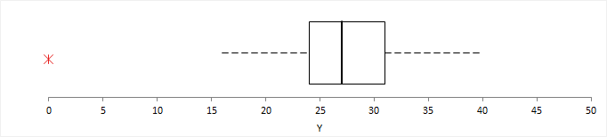
An outlier box plot is a variation of the skeletal box plot, but instead of extending to the minimum and maximum, the whiskers extend to the furthest observation within 1.5 x IQR from the quartiles. Possible near outliers (orange plus symbol) are identified as observations further than 1.5 x IQR from the quartiles, and possible far outliers (red asterisk symbol) as observations further than 3.0 x IQR from the quartiles. You should investigate each possible outlier before deciding whether to exclude it, as even in normally distributed data, an outlier box plot identifies approximately 0.7% of observations as possible outliers.
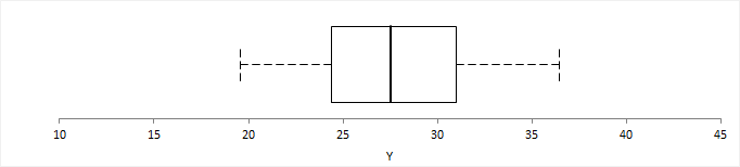
A quantile box plot is a variation on the skeletal box plot and shows the whiskers extending to specific quantiles rather than the minimum and maximum value.
A mean plot shows the mean and standard deviation of the data.
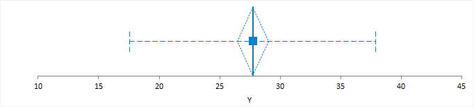
A line or dot represents the mean. A standard error or confidence interval measures uncertainty in the mean and is represented as either an error bar or diamond.
An optional error bar or band represents the standard deviation. The standard deviation gives the impression that the data is from a normal distribution centered at the mean value, with most of the data within two standard deviations of the mean. Therefore, the data should be approximately normally distributed. If the distribution is skewed, the plot is likely to mislead.
Plot a dot plot, box plot, or mean plot to visualize the distribution of a single quantitative variable.
A frequency distribution reduces a large amount of data into a more easily understandable form.
A cumulative distribution function (CDF) plot shows the empirical cumulative distribution function of the data.
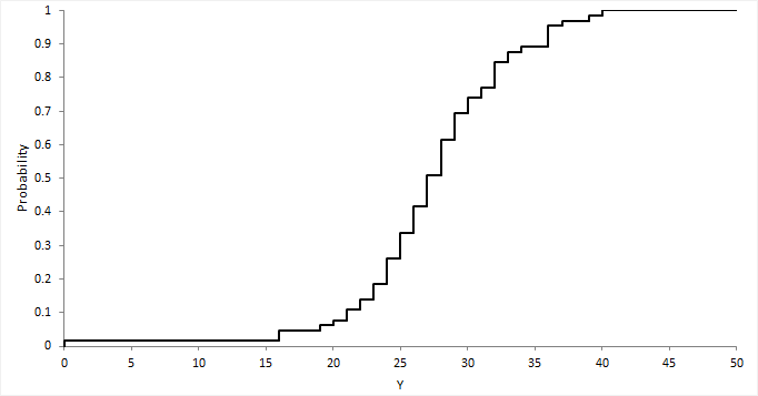
The empirical CDF is the proportion of values less than or equal to X. It is an increasing step function that has a vertical jump of 1/N at each value of X equal to an observed value. CDF plots are useful for comparing the distribution of different sets of data.
Plot a CDF to visualize the shape of the distribution of a quantitative variable.
A histogram shows the distribution of the data to assess the central tendency, variability, and shape.
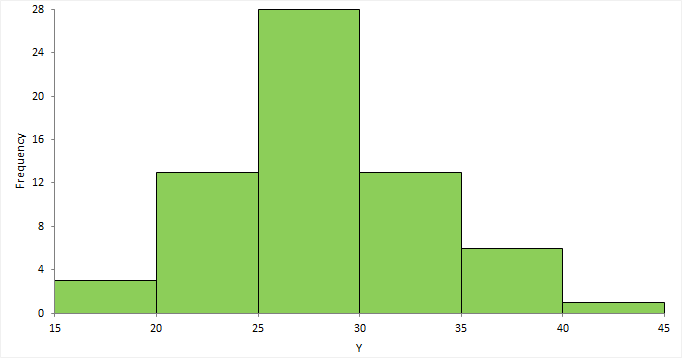
A histogram for a quantitative variable divides the range of the values into discrete classes, and then counts the number of observations falling into each class interval. The area of each bar in the histogram is proportional to the frequency in the class. When the class widths are equal, the height of the bar is also proportional to the frequency in the class.
Choosing the number of classes to use can be difficult as there is no "best," and different class widths can reveal or hide features of the data. Scott's and Freedman-Diaconis' rules provide a default starting point, though sometimes particular class intervals make sense for a particular problem.
The histogram reveals if the distribution of the data is normal, skewed (shifted to the left or right), bimodal (has more than one peak) and so on. Skewed data can sometimes be transformed to normal using a transformation. Bi-modality often indicates that there is more than one underlying population in the data. Individual bars distanced from the bulk of the data can indicate the presence of an outlier.
Plot a histogram to visualize the distribution of a quantitative variable.
Normality is the assumption that the underlying random variable is normally distributed, or approximately so.
In some cases, the normality of the data itself may be important in describing a process that generated the data. However, in many cases, it is hypothesis tests and parameter estimators that rely on the assumption of normality, although many are robust against moderate departures in normality due to the central limit theorem.
A normal (or Gaussian) distribution is a continuous probability distribution that has a bell-shaped probability density function. It is the most prominent probability distribution in used statistics.
Normal distributions are a family of distributions with the same general symmetric bell-shaped curve, with more values concentrated in the middle than in the tails. Two parameters describe a normal distribution, the mean, and standard deviation. The mean is the central location (the peak), and the standard deviation is the dispersion (the spread). Skewness and excess kurtosis are zero for a normal distribution.
The normal distribution is the basis of much statistical theory. Statistical tests and estimators based on the normal distribution are often more powerful than their non-parametric equivalents. When the distribution assumption can be met they are preferred, as the increased power lets you use a smaller sample size to detect the same difference.
A normal probability plot, or more specifically a quantile-quantile (Q-Q) plot, shows the distribution of the data against the expected normal distribution.
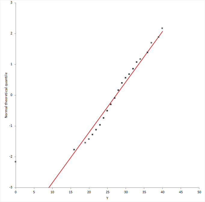
For normally distributed data, observations should lie approximately on a straight line. If the data is non-normal, the points form a curve that deviates markedly from a straight line. Possible outliers are points at the ends of the line, distanced from the bulk of the observations.
Plot a Normal (Q-Q) plot to subjectively assess the normality of a quantitative variable.
A hypothesis test formally tests if the population the sample represents is normally-distributed.
The null hypothesis states that the population is normally distributed, against the alternative hypothesis that it is not normally-distributed. If the test p-value is less than the predefined significance level, you can reject the null hypothesis and conclude the data are not from a population with a normal distribution. If the p-value is greater than the predefined significance level, you cannot reject the null hypothesis.
Note that small deviations from normality can produce a statistically significant p-value when the sample size is large, and conversely it can be impossible to detect non-normality with a small sample. You should always examine the normal plot and use your judgment, rather than rely solely on the hypothesis test. Many statistical tests and estimators are robust against moderate departures in normality due to the central limit theorem.
Tests for normality of a distribution and the type of non-normality detected.
| Test | Purpose |
|---|---|
| Shapiro-Wilk | Test if the distribution is normal. A powerful test that detects most departures from normality when the sample size ≤ 5000. |
| Anderson-Darling | Test if the distribution is normal. A powerful test that detects most departures from normality. |
| Kolmogorov-Smirnov | Test if the distribution is normal. Mainly of historical interest and for educational use only. |
Test if a distribution is normal.
Due to central limit theory, the assumption of normality implied in many statistical tests and estimators is not a problem.
The normal distribution is the basis of much statistical theory. Hypothesis tests and interval estimators based on the normal distribution are often more powerful than their non-parametric equivalents. When the distribution assumption can be met they are preferred as the increased power means a smaller sample size can be used to detect the same difference.
However, violation of the assumption is often not a problem, due to the central limit theorem. The central limit theorem states that the sample means of moderately large samples are often well-approximated by a normal distribution even if the data are not normally distributed. For many samples, the test statistic often approaches a normal distribution for non-skewed data when the sample size is as small as 30, and for moderately skewed data when the sample size is larger than 100. The downside in such situations is a reduction in statistical power, and there may be more powerful non-parametric tests.
Sometimes a transformation such as a logarithm can remove the skewness and allow you to use powerful tests based on the normality assumption.
Inferences about the parameters of a distribution are made using a random sample of data drawn from the population of interest.
Estimation is the process of making inferences from a sample about an unknown population parameter. An estimator is a statistic that is used to infer the value of an unknown parameter.
A point estimate is the best estimate, in some sense, of the parameter based on a sample. It should be obvious that any point estimate is not absolutely accurate. It is an estimate based on only a single random sample. If repeated random samples were taken from the population, the point estimate would be expected to vary from sample to sample.
A confidence interval is an estimate constructed on the basis that a specified proportion of the confidence intervals include the true parameter in repeated sampling. How frequently the confidence interval contains the parameter is determined by the confidence level. 95% is commonly used and means that in repeated sampling 95% of the confidence intervals include the parameter. 99% is sometimes used when more confidence is needed and means that in repeated sampling 99% of the intervals include the true parameter. It is unusual to use a confidence level of less than 90% as too many intervals would fail to include the parameter. Likewise, confidence levels larger than 99% are not used often because the intervals become wider the higher the confidence level and therefore require large sample sizes to make usable intervals.
Many people misunderstand confidence intervals. A confidence interval does not predict with a given probability that the parameter lies within the interval. The problem arises because the word confidence is misinterpreted as implying probability. In frequentist statistics, probability statements cannot be made about parameters. Parameters are fixed, not random variables, and so a probability statement cannot be made about them. When a confidence interval has been constructed, it either does or does not include the parameter.
In recent years the use of confidence intervals has become more common. A confidence interval provides much more information than just a hypothesis test p-value. It indicates the uncertainty of an estimate of a parameter and allows you to consider the practical importance, rather than just statistical significance.
Confidence intervals and hypothesis tests are closely related. Most introductory textbooks discuss how confidence intervals are equivalent to a hypothesis test. When the 95% confidence interval contains the hypothesized value the hypothesis test is statistically significant at the 5% significance level, and when it does not contain the value the test is not significant. Likewise, with a 99% confidence interval and hypothesis test at the 1% significance level. A confidence interval can be considered as the set of parameter values consistent with the data at some specified level, as assessed by testing each possible value in turn.
Th relationship between hypothesis tests and confidence interval only holds when the estimator and the hypothesis test both use the same underlying evidence function. When a software package uses different evidence functions for the confidence interval and hypothesis test, the results can be inconsistent. The hypothesis test may be statistically significant, but the confidence interval may include the hypothesized value suggesting the result is not significant. Where possible the same underlying evidence function should be used to form the confidence interval and test the hypotheses. Be aware that not many statistical software packages follow this rule!
A scientist might study the difference in blood cholesterol between a new drug treatment and a placebo. Improvements in cholesterol greater than 20mg/dL would be considered practically important, and lead to a change in the treatment of patients, but smaller differences would not. The possible outcomes of the study in terms of a point-estimate, confidence interval estimate, and hypothesis test might be:
| Point estimate | 95% confidence interval | Hypothesis test (5% significance level) | Interpretation |
|---|---|---|---|
| 0 mg/dL | -5 to 5 mg/dL | Not significant | The confidence interval is within the range of no practical difference, 20mg/dL. There is clear evidence the treatment does not produce a difference of practical importance. |
| 10 mg/dL | -5 to 25 mg/dL | Not significant | Part of the confidence interval lies outside the range of no practical difference, 20mg/dL. Although the hypothesis test is not significant, there may be an important practical difference, though a larger sample size is required to make any sharper inferences. |
| 10 mg/dL | 5 to 15 mg/dL | Significant | The confidence interval excludes the null (zero) difference but still lies within the range of no practical difference, 20mg/dL. Although the hypothesis test is statistically significant, the difference is of no practical importance. |
| 30 mg/dL | 25 to 45 mg/dL | Significant | The confidence interval excludes the null difference and lies outside the range of no practical difference, 20mg/dL. The hypothesis test is statistically significant, and the difference is of practical importance. |
A parameter estimate is either a point or interval estimate of an unknown population parameter.
A point estimate is a single value that is the best estimate of the true unknown parameter; a confidence interval is a range of values and indicates the uncertainty of the estimate.
Estimators for the central location parameter and their properties and assumptions.
| Estimator | Purpose |
|---|---|
| Mean | Estimate the population mean using the sample mean estimator. |
| Median | Estimate the middle of the distribution using the sample median estimator. |
| Hodges-Lehmann pseudo-median | Estimate the population pseudo-median using the Hodges-Lehman pseudo-median
estimator. The pseudo-median is equivalent to the mean/median when the distribution is symmetric. |
Estimators for the dispersion parameter and their properties and assumptions.
| Estimator | Purpose |
|---|---|
| Standard deviation | Estimate the population standard deviation using the sample standard deviation
estimator. The sample standard deviation is a biased estimator of the population standard deviation. |
| Variance | Estimate the population variance using the sample variance estimator. The sample variance is an unbiased estimator of the population variance. |
Estimate the mean/median/variance of a distribution.
Hypothesis testing is the formal process of making inferences from a sample whether or not a statement about the population appears to be true.
A hypothesis test is a method of making decisions. You must state a null hypothesis and an alternative hypothesis to perform a hypothesis test. The null hypothesis states what the study is intending to reject and disprove. The alternative hypothesis is usually the negation of the null and states what the study is trying to prove.
When the hypotheses have been stated a statistical test calculates a test statistic and p-value. The p-value is the probability of obtaining a test statistic at least as extreme as that observed when the null hypothesis is true. It is a measure of evidence against the null hypothesis. When the p-value is small, the data are unlikely to have occurred if the null hypothesis is true so you can reject the null hypothesis and accept the alternative hypothesis. When the p-value is large you cannot reject the null hypothesis; there is insufficient evidence against it. It is not possible to prove the null hypothesis, only disprove it. The p-value does not allow you to make any statements about the probability of the null hypothesis been true, it is a statement based on the observing the data given the null hypothesis is true.
Often a fixed significance level (denoted by the lower case Greek symbol alpha) is used to decide whether the test is statistically significant or not. The significance level is the probability of rejecting the null hypothesis when it is true. When the p-value is less than the significance level, you can declare the test statistically significant. A 5% significance level is typical, which implies there is a 5% chance of wrongly rejecting the null hypothesis when in fact it is true. If more certainty is required, use a 1% significance level. Regardless, you should always report the p-value rather than just a statement of statistically significant, or not.
It is important to remember that a statistically significant test does not imply practically important. The difference might be so small as to be practically useless even though it was statistically significant. Alternatively, the sample size may have been so small that a hypothesis test was not powerful enough to detect anything but a huge difference as statistically significant. It is, therefore, essential that you always interpret the p-value together with a point and interval estimate of the parameter or effect size.
A hypothesis test formally tests if a population parameter is different to a hypothesized value.
The null hypothesis states that the parameter is equal to the hypothesized value, against the alternative hypothesis that it is not equal to (or less than, or greater than) the hypothesized value. When the test p-value is small, you can reject the null hypothesis and conclude the sample is not from a population with the parameter equal to the hypothesized value.
An equivalence hypothesis test formally tests if a population parameter is equivalent to a hypothesized value, that is, practically the same.
An typical parameter hypothesis test can never prove that the parameter is equal to the hypothesized value, it can only ever disprove the null hypothesis of equality. By contrast, an equivalence hypothesis test is of interest when the purpose is to prove that the parameter is equivalent to a hypothesized value, that is the difference is less than some small negligible effect size. An equivalence hypothesis test therefore constructs the null hypothesis of non-equivalence and the goal is to prove the parameter is the equivalent to the hypothesized value.
The null hypothesis states that the parameter is not equivalent to the hypothesized value, against the alternative hypothesis that it is equivalent within the equivalence interval. The hypothesis is tested as a composite of two one-sided t-tests (TOST), H01 tests the hypothesis that parameter is less than the lower bound of the equivalence interval, test H02 that the parameter is greater than the upper bounds of the equivalence interval. The p-value is the greater of the two one sided t-test p-values. When the test p-value is small, you can reject the null hypothesis and conclude the sample is from a population with the parameter practically equivalent to the hypothesized value.
Tests for the location parameter of a distribution and their properties and assumptions.
| Test | Purpose |
|---|---|
| Z | Test if the mean is equal to a hypothesized value when the population standard deviation is known. |
| Student's t | Test if the mean is equal to a hypothesized value. Assumes the population is normally distributed. Due to the central limit theorem, the test may still be useful when this assumption is not true if the sample size is moderate. However, the Wilcoxon test may be more powerful in this situation. |
| Wilcoxon | Test if the mean/median is equal to a hypothesized value. Assumes the population distribution is symmetric. The mean, median, and pseudo-median are equivalent when the distribution is symmetric. Therefore, the hypotheses can be stated in terms of any of these parameters. |
| Sign | Test if the median is equal to a hypothesized value. Has few assumptions, but lacks power compared to the Wilcoxon and Student's t test. |
| TOST (two-one-sided t-test) | Test if the mean is equivalent to a hypothesized value within the equivalence
bounds that specify the smallest effect size of interest. Assumes the population is normally distributed. Due to the central limit theorem, the test may still be useful when this assumption is not true if the sample size is moderate. |
Tests for the dispersion parameter of a distribution and their properties and assumptions.
| Test | Purpose |
|---|---|
| X² | Test if the variance/standard deviation is equal to a hypothesized value. Assumes the population is normally distributed. When this assumption is not true, you should be cautious of using the test, as it is extremely sensitive to deviations from normality. |
Test if the mean/median/variance of a distribution is different to the hypothesized value.
Test if the mean of a distribution is equivalent to the hypothesized value.
Distribution analysis study requirements and dataset layout.
Use a column for each variable (Height, Eye color); each row has the values of the variables for a case (Subject).
| Subject (optional) | Height | Eye color |
|---|---|---|
| 1 | 175 | Blue |
| 2 | 180 | Blue |
| 3 | 160 | Hazel |
| 4 | 190 | Green |
| 5 | 180 | Green |
| 6 | 150 | Brown |
| 7 | 140 | Blue |
| 8 | 160 | Brown |
| 9 | 165 | Green |
| 10 | 180 | Hazel |
| … | … | … |
Use a column for the variable (Eye color) and a column for the number of cases (Frequency); each row has the values of the variables and the frequency count.
| Eye color | Frequency |
|---|---|
| Brown | 221 |
| Blue | 215 |
| Hazel | 93 |
| Green | 64 |


