
Method comparison measures the closeness of agreement between the measured values of two methods.
A correlation coefficient measures the association between two methods.
The correlation coefficient is sometimes re-purposed as an adequate range test (CLSI, 2002) on the basis that the ratio of variation between subjects, relative to measurement variation, is an indicator of the quality of the data (Stöckl & Thienpont, 1998). When the correlation coefficient is greater than 0.975 the parameters of an ordinary linear regression are not significantly biased by the error in the X variable, and so linear regression is sometimes recommended. However, with the wide range of proper regression procedures available for analyzing method comparison studies, there is little need to use inappropriate models.
A scatter plot shows the relationship between two methods.
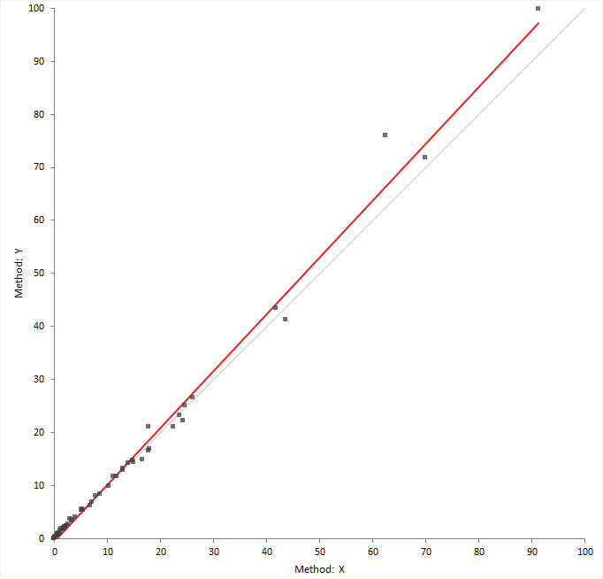
The scatter plot shows measured values of the reference or comparison method on the horizontal axis, against the test method on the vertical axis.
The relationship between the methods may indicate a constant, or proportional bias, and the variability in the measurements across the measuring interval. If the points form a constant-width band, the method has a constant standard deviation (constant SD). If the points form a band that is narrower at small values and wider at large values, there is a constant relationship between the standard deviation and value, and the method has constant a coefficient of variation (CV). Some measurement procedures exhibit constant SD in the low range and constant CV in the high range.
If both methods measure on the same scale, a gray identity line shows ideal agreement and is useful for comparing the relationship against.
Regression of Y on X describes the linear relationship between the methods.
Ordinary linear regression fits a line describing the relationship between two variables assuming the X variable is measured without error.
Ordinary linear regression finds the line of best fit by minimizing the sum of the vertical distances between the measured values and the regression line. It, therefore, assumes that the X variable is measured without error.
Weighted linear regression is similar to ordinary linear regression but weights each item to take account of the fact that some values have more measurement error than others. Typically, for methods that exhibit constant CV the higher values are less precise and so weights equal to 1 / X² are given to each observation.
Although the assumption that there is no error in the X variable is rarely the case in method comparison studies, ordinary and weighted linear regression are often used when the X method is a reference method. In such cases the slope and intercept estimates have little bias, but hypothesis tests and confidence intervals are inaccurate due to an underestimation of the standard errors (Linnet, 1993). We recommend the use of correct methods such as Deming regression.
Deming regression is an errors-in-variables model that fits a line describing the relationship between two variables. Unlike ordinary linear regression, it is suitable when there is measurement error in both variables.
Deming regression (Cornbleet & Gochman, 1979) finds the line of best fit by minimizing the sum of the distances between the measured values and the regression line, at an angle specified by the variance ratio. It assume both variables are measured with error. The variance ratio of the errors in the X / Y variable is required and assumed to be constant across the measuring interval. If you measure the items in replicate, the measurement error of each method is estimated from the data and the variance ratio calculated.
In the case where the variance ratio is equal to 1, Deming regression is equivalent to orthogonal regression. When only single measurements are made by each method and the ratio of variances is unknown, a variance ratio of 1 is sometimes used as a default. When the range of measurements is large compared to the measurement error this can be acceptable. However in cases where the range is small the estimates are biased and the standard error underestimated, leading to incorrect hypothesis tests and confidence intervals (Linnet, 1998).
Weighted Deming regression (Linnet, 1990) is a modification of Deming regression that assumes the ratio of the coefficient of variation (CV), rather than the ratio of variances, is constant across the measuring interval.
Confidence intervals for parameter estimates use a t-distribution and the standard errors are computed using a Jackknife procedure (Linnet, 1993).
Passing-Bablok regression fits a line describing the relationship between two variables. It is robust, non-parametric, and is not sensitive to outliers or the distribution of errors.
Passing-Bablok regression (Passing & Bablok, 1983) finds the line of best fit using a shifted median of all possible pairwise slopes between points. It does not make assumptions of the distribution of the measurement errors, and the variance of the measurement errors need not remain constant over the measuring interval though their ratio should remain proportional to β² (the slope squared, in many cases β ≈ 1).
There is a modification to the procedure for use when the methods measure on different scales, or where the purpose is to transform results from one method to another rather than to compare two methods for equality (Passing & Bablok, 1988).
Confidence intervals for parameter estimates are based on a normal approximation or bootstrap. Confidence curves around the regression line and at specific points on the line are obtained by bootstrap.
Fit a ordinary least square regression to estimate the relationship between a test method and a reference method when the reference method is measured without error.
Fit a Deming regression to estimate the relationship between a test method and a reference or comparative method when both variables are measured with error.
Fit a Passing-Bablok regression to estimate the relationship between a test method and a reference or comparative method.
Linearity is the assumption that the relationship between the methods is linear.
The regression procedures used in method comparison studies assume the relationship between the methods is linear. A CUSUM is a measure of the linearity, defined as a running sum of the number of observations above and below the fitted regression line. When the relationship is linear it is expected the points above and below the line are randomly scattered, and the CUSUM statistic is small. Clusters of points on one side of the regression line produce a large CUSUM statistic.
A formal hypothesis test for linearity is based on the largest CUSUM statistic and the Kolmogorov-Smirnov test. The null hypothesis states that the relationship is linear, against the alternative hypothesis that it is not linear. When the test p-value is small, you can reject the null hypothesis and conclude that the relationship is nonlinear.
A residual plot shows the difference between the measured values and the predicted values against the true values.
The residual plot shows disagreement between the data and the fitted model. The ideal residual plot (called the null residual plot) shows a random scatter of points forming an approximately constant width band around the identity line.
| Assumption | How to check |
|---|---|
| Model function is linear | The points will form a pattern when the model function is not linear. |
| Constant variance | If the points tend to form an increasing, decreasing, or non-constant width band, the variance is not constant and you should consider using weighted regression. |
| Normality | A histogram of the residuals should form a normal distribution. This is an assumption of linear regression. Deming regression with Jacknife standard errors is robust to this assumption. Passing-Bablok regression is non-parametric and this assumption does not apply. |
Inspect the residual and linearity plots to ensure the assumptions of the regression procedure are met before using the analysis results to make inferences.
Bias is a measure of a systematic measurement error, the component of measurement error that remains constant in replicate measurements on the same item. When measuring a method against a reference method using many items the average bias is an estimate of bias that is averaged over all the items.
Bias is the term used when a method is compared against a reference method. When the comparison is not against a reference method but instead another routine comparative laboratory method, it is simply an average difference between methods rather than an average bias. For clarify of writing we will use the term average bias.
The average bias is usually expressed as the constant and proportional bias from a regression procedure, or as a constant or proportional bias from the mean of the differences or relative differences. If there are other sources systematic errors present, such as nonlinearity or interferences, the average bias will be incorrect.
The average bias is an estimate of the true unknown average bias in a single study. If the study were repeated, the estimate would be expected to vary from study to study. Therefore, if a single estimate is compared directly to 0 or compared to the allowable bias the statement is only applicable to the single study. To make inferences about the true unknown bias you must perform a hypothesis test:
The null hypothesis states that the bias is equal to 0, against the alternative hypothesis that it is not equal zero. When the test p-value is small, you can reject the null hypothesis and conclude that the bias is different to zero.
It is important to remember that a statistically significant p-value tells you nothing about the practical importance of what was observed. For a large sample, the bias for a statistically significant hypothesis test may be so small as to be practically useless. Conversely, although there may some evidence of bias, the sample size may be too small for the test to reach statistical significance, and you may miss an opportunity to discover a true meaningful bias. Lack of evidence against the null hypothesis does not mean it has been proven to be true, the belief before you perform the study is that the null hypothesis is true and the purpose is to look for evidence against it. An equality test at the 5% significance level is equivalent to testing if the 95% confidence interval includes zero.
The null hypothesis states that the bias is outside an interval of practical equivalence, against the alternative hypothesis that the bias is within the interval considered practically equivalent. When the test p-value is small, you can reject the null hypothesis and conclude that the bias is practically equivalent, and within the specified interval.
An equivalence test is used to prove a bias requirement can be met. The null hypothesis states the methods are not equivalent and looks for evidence that they are in fact equivalent. An equivalence hypothesis test at the 5% significance level is the same as testing if the 90% confidence interval lies within the allowable bias interval.
Estimate the average bias (or average difference) at a decision level using the regression fit.
Test the commutability of reference materials or processed samples with unprocessed samples.
You must fit a Deming regression to perform this task.
The scatter plot shows the points in different colors depending on the type of sample. The fit is restricted to a unprocessed samples and the prediction band includes any additional samples that are commutable with the unprocessed samples. A table lists the additional samples and if they are commutable with the unprocessed samples.
A difference plot shows the differences in measurements between two methods, and any relationship between the differences and true values.
Bland and Altman (1983) popularized the use of the difference plot for assessing agreement between two methods. Although their use was to show the limits of agreement between two methods, the plot is also widely used for assessing the average bias (average difference) between two methods.
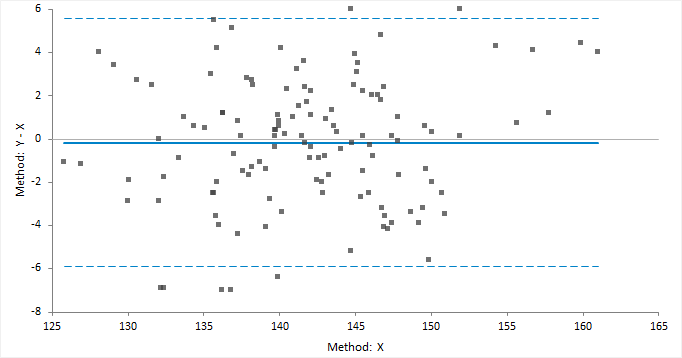
The classic difference plot shows the difference between the methods on the vertical axis, against the best estimate of the true value on the horizontal axis. When one method is a reference method, it is used as the best estimate of the true value and plotted on the horizontal axis (Krouwer, 2008). In other cases, using the average of the methods as the best estimate of the true value, to avoid an artificial relationship between the difference and magnitude (Bland & Altman, 1995).
A relative difference plot (Pollock et al., 1993) shows the relative differences on the vertical axis, against the best estimate of the true value on the horizontal axis. It is useful when the methods show variability related to increasing magnitude, that is where the points on a difference plot form a band starting narrow and becoming wider as X increases. Another alternative is to plot the ratio of the methods on the vertical axis, against the best estimate of the true value on the horizontal axis.
Regression of the differences on the true value describes the relationship between the methods.
Mean difference measures the constant relationship between the variables. An assumption is that the difference is not relative to magnitude across the measuring interval. If the differences are related to the magnitude, the relationship should be modeled by using relative differences or regressing the differences on the true value.
Plot a difference plot and estimate the average bias (average difference) between the methods.
Limits of agreement estimate the interval within which a proportion of the differences between measurements lie.
The limits of agreement includes both systematic (bias) and random error (precision), and provide a useful measure for comparing the likely differences between individual results measured by two methods. When one of the methods is a reference method, the limits of agreement can be used as a measure of the total error of a measurement procedure (Krouwer, 2002).
Limits of agreement can be derived using parametric method given the assumption of normality of the differences. or using non-parametric percentiles when such assumptions do not hold.
Plot a difference plot and limits of agreement.
A mountain plot shows the distribution of the differences between two methods. It is a complementary plot to the difference plot.

Krouwer and Monti (1995) devised the mountain plot (also known as a folded empirical cumulative distribution plot) as a complementary representation of the difference plot. It shows the distribution of the differences with an emphasis on the center and the tails of the distribution. You can use the plot to estimate the median of the differences, the central 95% interval, the range, and the percentage of observations outside the total allowable error bands.
The plot is simply the empirical cumulative distribution function of the differences folded around the median (that is, the plotted function = p where p < 0.5 otherwise 1-p). Unlike the histogram it is unaffected by choice of class intervals, however it should be noted that although the mountain plot looks like a frequency polygon it does not display the density function. It has recently been proven that the area under the plot is equal to the mean absolute deviation from the median (Xue and Titterington, 2010).
Plot a mountain plot to see the distribution of the differences between two methods.
Partition or reduce the measuring interval to fit different functions.
You may need to reduce the measuring interval if a shows nonlinearity at the ends of the measuring interval. Or, you may need to partition the measuring interval if the differences show constant relationship at small magnitude and proportional relationship at higher values.
The analysis creates a separate analysis report for each partition. You can quickly switch between analysis reports for each partition by selecting the partition in the partition grid.
Agreement measures summarize the similarity of the results of two binary or semi-quantitative methods.
Asymmetric agreement measures are dependent on the assignment of X and Y variables. They are often useful due to the natural interpretation as the proportion of the comparative method (X) results in which the new method (Y) results are the same.
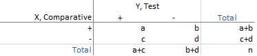
For a binary test, with positive/negative results, the results can be expressed as a 2x2 contingency table:
![]()
![]()
Symmetric agreement measures are not affected by interchanging the X and Y variable. These are useful in many other cases, such as comparing observers, laboratories, or other factors where neither is a natural comparator. There are various measures based on the mean of the proportions to which X agrees with Y, and Y agrees with X. The Kulczynski, Dice-Sørensen, and Ochiai are three such measures that use arithmetic, harmonic, and geometric mean of the proportions, respectively.
The harmonic mean weights the smaller proportion more heavily and produces the smallest value amongst the three measures. The geometric mean is the square root of Bangdiwala’s B statistic, which is the ratio of the observed agreement to maximum possible agreement in the agreement plot. The arithmetic mean has the greatest value. In most cases, of moderate to high agreement, there is very little to choose between the measures.
![]()
![]()
The overall proportion of agreement is the sum of the diagonal entries divided by the total.
A chance corrected agreement measure takes into account the possibility of agreement occurring by chance.
The Kappa coefficient is the most popular measure for chance corrected agreement between qualitative variables. It is the overall observed agreement corrected for the possibility of agreement occurring by chance. A weighted version of the statistic is useful for ordinal variables as it weights disagreements dependent on the degree of disagreement between observers. As the Kappa coefficient is an overall summary statistic, it should be accompanied by an agreement plot which can show more insight than an overall summary statistic.
Interpretation of the Kappa coefficient is difficult. The most popular set of criteria for assessing agreement Landis and Koch (1977), who characterized values < 0 as indicating no agreement and 0–0.20 as slight, 0.21–0.40 as fair, 0.41–0.60 as moderate, 0.61–0.80 as substantial, and 0.81–1 as almost perfect agreement. This set of guidelines is, however, by no means universally accepted. A substantial imbalance in the contingency table's marginal totals, either horizontally or vertically, results in a lower Kappa coefficient. And, it will be higher if the imbalance in the corresponding marginal totals is asymmetrical rather than symmetrical, or imperfectly rather than perfectly symmetrical.
An agreement plot shows the agreement between two binary or semi-quantitative methods.
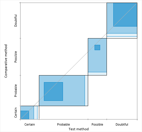
Bangdiwala (2013) devised the agreement plot as a complement to the kappa or B-statistics. It is invaluable for assessing agreement as it gives a visual impression that no summary statistic can convey.
The agreement plot is a visual representation of a k by k square contingency table. Each black rectangle represents the marginal totals of the rows and columns. Shaded boxes represent the agreement based on the diagonal cell frequencies; they are positioned inside the rectangles using the sum of the off-diagonal cell frequencies from the same row and column. The partial agreement in the off-diagonal cells can be represented similarly with decreased shading based on the distance from the diagonal. The visualization is affected by the order of the categories, and so the plot is only useful for ordinal or binary data. The plot can have the origin at the bottom-left corner, or at the top-left where it more clearly mimics the contingency table.
Perfect agreement is represented by rectangles that are all perfect squares, with corners on the diagonal identity line, and with shaded boxes equal to the rectangle. Lesser agreement is represented by the area of shaded boxes compared to the area of rectangles. The path of the rectangles, how they deviate from the 45-degree identity line, represents bias in the marginal totals.
Measure the agreement between a test method and a reference or comparative method when both variables are binary or semi-quantitative.
Method comparison study requirements and dataset layout.
Use a column for each method (Method 1, Method 2); each row has the measurement by each method for an item (Subject).
| Subject (optional) | Method 1 | Method 2 |
|---|---|---|
| 1 | 120 | 121 |
| 2 | 113 | 118 |
| 3 | 167 | 150 |
| 4 | 185 | 181 |
| 5 | 122 | 122 |
| … | … | … |
Use multiple columns for the replicates of each method (Method 1, Method 2); each row has the replicate measurements by each method for an item (Subject).
| Subject (optional) | Method 1 | Method 2 | ||
|---|---|---|---|---|
| 1 | 120 | 122 | 121 | 120 |
| 2 | 113 | 110 | 118 | 119 |
| 3 | 167 | 170 | 150 | 155 |
| 4 | 185 | 188 | 181 | 180 |
| 5 | 122 | 123 | 122 | 130 |
| … | … | … | … | … |
Use a column for each method (Method 1, Method 2); each row has the measurements by each methods for an item (Subject), with multiple rows for replicates of each item.
| Subject | Method 1 | Method 2 |
|---|---|---|
| 1 | 120 | 121 |
| 1 | 122 | 120 |
| 2 | 113 | 118 |
| 2 | 110 | 119 |
| 3 | 167 | 150 |
| 3 | 170 | 155 |
| 4 | 185 | 181 |
| 4 | 188 | 180 |
| 5 | 122 | 122 |
| 5 | 123 | 130 |
| … | … | … |
Use a column for the measurement variable (Measured value), a column for the method variable (Method), and a column for the item variable (Subject); each row has the measurement for a method for an item (Subject), with multiple rows for replicates of each item.
| Subject | Method | Measured value |
|---|---|---|
| 1 | X | 120 |
| 1 | X | 122 |
| 1 | Y | 121 |
| 1 | Y | 120 |
| 2 | X | 113 |
| 2 | X | 110 |
| 2 | Y | 118 |
| 2 | Y | 119 |
| 3 | X | 167 |
| 3 | X | 170 |
| 3 | Y | 150 |
| 3 | Y | 155 |
| 4 | X | 185 |
| 4 | X | 188 |
| 4 | Y | 181 |
| 4 | Y | 180 |
| 5 | X | 122 |
| 5 | X | 123 |
| 5 | Y | 122 |
| 5 | Y | 130 |
| … | … | … |
Method comparison study requirements and dataset layout for qualitative methods.
Use a column for the reference/comparative method, and a column for the test method; each row has the values of the variables for a case (Subject).
| Subject (optional) | Reference/Comparative method | Test method |
|---|---|---|
| 1 | + | + |
| 2 | - | - |
| 3 | + | + |
| 4 | - | - |
| 5 | - | - |
| 6 | - | - |
| 7 | + | + |
| 8 | + | - |
| 9 | - | - |
| 10 | - | - |
| … | … | … |
Use a column for the reference/comparative method, and a column for the test method and a column for the number of cases (Frequency); each row has the values of the variables and the frequency count.
| Reference / Comparative method | Test method | Count |
|---|---|---|
| + | + | 32 |
| + | - | 1 |
| - | + | 3 |
| - | - | 38 |


