
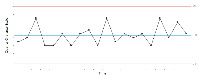
A Shewhart control chart detects changes in a process.
Variables control charts plot quality characteristics that are numerical (for example, weight, the diameter of a bearing, or temperature of the furnace).
There are two types of variables control charts: charts for data collected in subgroups, and charts for individual measurements. For sub-grouped data, the points represent a statistic of subgroups such as the mean, range, or standard deviation. For individual measurements, the points represent the individual observations or a statistic such as the moving range between successive observations.
An important concept for data collected in subgroups is that of a rational subgroup. A rational subgroup is a number of units produced under the same set of conditions. The measurements in each subgroup should be taken within a short period and should minimize the chances of special-cause variation occurring between the observations. That is, it should represent a snapshot of the process and the inherent common-cause variation.
Subgroups are often preferable when learning about a process as they can better estimate the process variability or detect smaller shifts in the process average. However, when monitoring a process, if the amount of time taken to collect enough observations to form a subgroup is too long, or the cost of sampling is expensive or destructive then the benefits may be negated.
An Xbar-R chart is a combination of control charts used to monitor the process variability (as the range) and average (as the mean) when measuring subgroups at regular intervals from a process.
An Xbar-S chart is a combination of control charts used to monitor the process variability (as the standard deviation) and average (as the mean) when measuring subgroups at regular intervals from a process.
An Xbar-chart is a type of control chart used to monitor the process mean when measuring subgroups at regular intervals from a process.
Each point on the chart represents the value of a subgroup mean.
The center line is the process mean. If unspecified, the process mean is the weighted mean of the subgroup means.
The observations are assumed to be independent, and the means normally distributed. Individual observations need not be normally distributed. Due to the central limit theorem, the subgroup means are often approximately normally distributed for subgroup sizes larger than 4 or 5 regardless of the distribution of the individual observations.
For data with different subgroup sizes, the control limits vary. A standardized version of the control chart plots the points in standard deviation units. Such a control chart has a constant center line at 0, and upper and lower control limits of -3 and +3 respectively making patterns in the data easier to see.
It is important to ensure process variability is in a state of statistical control before using the Xbar-chart to investigate if the process mean is in control. Therefore a Xbar-chart is often combined with an R- or S-chart to monitor process variability. If the variability is not under control, the control limits may be too wide leading to an inability to detect special causes of variation affecting the process mean.
An R-chart is a type of control chart used to monitor the process variability (as the range) when measuring small subgroups (n ≤ 10) at regular intervals from a process.
Each point on the chart represents the value of a subgroup range.
The center line for each subgroup is the expected value of the range statistic. Note that the center line varies when the subgroup sizes are unequal.
For small subgroup sizes with k-sigma control limits the lower limit is zero in many situations due to the asymmetric distribution of the range statistic. In these cases, probability limits may be more appropriate.
An S-chart is a type of control chart used to monitor the process variability (as the standard deviation) when measuring subgroups (n ≥ 5) at regular intervals from a process.
Each point on the chart represents the value of a subgroup standard deviation.
The center line for each subgroup is the expected value of the standard deviation statistic. Note that the center line varies when the subgroup sizes are unequal.
The individual observations are assumed to be independent and normally distributed. Although the chart is fairly robust and non-normality is not a serious problem unless there is a considerable deviation from normality (Burr, 1967).
For subgroup sizes less than 6 with k-sigma control limits, the lower limit is zero. In these cases, probability limits may be more appropriate.
An I-MR chart is a combination of control charts used to monitor the process variability (as the moving range between successive observations) and average (as the mean) when measuring individuals at regular intervals from a process.
An I-chart is a type of control chart used to monitor the process mean when measuring individuals at regular intervals from a process.
It is typical to use individual observations instead of rational subgroups when there is no basis for forming subgroups, when there is a long interval between observations becoming available, when testing is destructive or expensive, or for many other reasons. Other charts such as the exponentially weighted moving average and cumulative sum may be more appropriate to detect smaller shifts more quickly.
Each point on the chart represents the value of an individual observation.
The center line is the process mean. If unspecified, the process mean is the mean of the individual observations.
The observations are assumed to be independent and normally distributed. If the process shows a moderate departure from normality, it may be preferable to transform the variable so that it is approximately normally distributed.
It is important to ensure process variability is in a state of statistical control before using the I-chart to investigate if the process mean is in control. Therefore an I-chart is often combined with an MR-chart to monitor process variability, although some authors question the benefit of an additional MR-chart.
An MR-chart is a type of control chart used to process variability (as the moving range of successive observations) when measuring individuals at regular intervals from a process.
When data are individual observations, it is not possible to use the standard deviation or range of subgroups to assess the variability and instead the moving range is an estimate the variability.
Given a series of observations and a fixed subset size, the first element of the moving range is the range of the initial subset of the number series. Then the subset is modified by "shifting forward"; that is, excluding the first number of the series and including the next number following the subset in the series. The next element of the moving range is the range of this subset. This process is repeated over the entire series creating a moving range statistic.
Larger values have a dampening effect on the statistic and may be preferable when the data are cyclical.
Each point on the chart represents the value of a moving range.
The center line is the expected value of the range statistic.
You should be careful when interpreting a moving range chart because the values of the statistic are correlated. Correlation may appear as a pattern of runs or cycles on the chart. Some authors (Rigdon et al., 1994) recommend not plotting a moving range chart as moving range does not provide any useful information about shifts in process variability beyond the I-chart.
Plot a Shewhart control chart for data collected in rational subgroups to determine if a process is in a state of statistical control.
Plot a Shewhart control chart for individual observations to determine if a process is in a state of statistical control.
Attributes control charts plot quality characteristics that are not numerical (for example, the number of defective units, or the number of scratches on a painted panel).
It is sometimes necessary to simply classify each unit as either conforming or not conforming when a numerical measurement of a quality characteristic is not possible. In other cases, it is convenient to count the number of nonconformities rather than the number of nonconforming units. A unit may have a number of nonconformities without classing the unit as nonconforming. For example, a scratch on a painted panel may be a nonconformity but only if several such scratches exist would the entire panel be classed as a nonconforming unit.
A np-chart is a type of control chart used to monitor the number of nonconforming units when measuring subgroups at regular intervals from a process.
Each point on the chart represents the number of nonconforming units in a subgroup.
The center line is the average number of nonconforming units. If unspecified, the process average proportion of nonconforming units is the total nonconforming units divided by the sum of subgroup sizes. Note that the center line varies when the subgroup sizes are unequal.
A Binomial distribution is assumed. That is, units are either conforming or nonconforming, and that nonconformities are independent; the occurrence of a nonconforming unit at a particular point in time does not affect the probability of a nonconforming unit in the periods that immediately follow. Violation of this assumption can cause overdispersion; the presence of greater variance that would be expected based on the distribution. When k-sigma limits are used the normal approximation to the binomial distribution is assumed adequate which may require large subgroup sizes when the proportion of nonconforming units is small.
A np-chart is useful when the number of units in each subgroup is constant as interpretation is easier than a p-chart. For data with different subgroup sizes the center line and control limits both vary making interpretation difficult. In this case, you should use a p-chart which has a constant center line but varying control limits.
For small subgroup sizes, the lower control limit is zero in many situations. The lack of a lower limit is troublesome if the charts use is for quality improvement as the lower limit is desirable as points appearing below that value may reflect a significant reduction in the number of nonconforming units. It is necessary to increase the subgroup size to overcome this issue.
A p-chart is a type of control chart used to monitor the proportion of nonconforming units when measuring subgroups at regular intervals from a process.
A p-chart is a scaled version of the np-chart representing a proportion of nonconforming units rather than the number of nonconforming units. The same assumptions and recommendations apply.
For data with different subgroup sizes, the control limits vary although the center line is constant. A standardized version of the control chart plots the points in standard deviation units. Such a control chart has a constant center line at 0, and upper and lower control limits of -3 and +3 respectively making it easier to see patterns.
A c-chart is a type of control chart used to monitor the total number of nonconformities when measuring subgroups at regular intervals from a process.
Each point on the chart represents the total number of nonconformities in a subgroup.
The center line is the average number of nonconformities. If unspecified, the process average number of nonconformities per unit is the total number of nonconformities divided by the sum of subgroup sizes. Note that the center line varies when the subgroup sizes are unequal.
A Poisson distribution is assumed. That is, the probability of observing a nonconformity in the inspection unit should be small, but a large number of nonconformities should be theoretically possible, and the size of an inspection unit should also be constant over time. When k-sigma limits are used the normal approximation to the Poisson distribution is assumed adequate which usually requires the average number of nonconformities to be at least 5.
A c-chart is useful when the number of units in each subgroup is constant as interpretation is easier than a u-chart. For data with different subgroup sizes, the center line and control limits both vary making interpretation difficult. In this case, you should use a u-chart which has a constant center line but varying control limits.
A u-chart is a type of control chart used to monitor the average number of nonconformities per unit when measuring subgroups at regular intervals from a process.
A u-chart is a scaled version of the c-chart representing the average number of nonconformities per unit rather than the number of nonconformities. The same assumptions and recommendations apply.
For data with different subgroup sizes, the control limits vary although the center line is constant. A standardized version of the control chart plots the points in standard deviation units. Such a control chart has a constant center line at 0, and upper and lower control limits of -3 and +3 respectively making it easier to see patterns.
Plot a Shewhart control chart for the number/proportion of nonconforming units to determine if a process is in a state of statistical control.
Plot a Shewhart control chart for the total number of nonconformities or the average number of nonconformities per unit to determine if a process is in a state of statistical control.
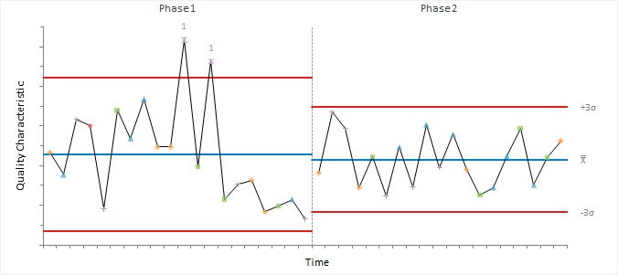
Tests for special-cause variation determine when a process needs further investigation.
| Test | Rule | Problem indicated |
|---|---|---|
| 1 | 1 point is outside the control limits. | A large shift. |
| 2 | 8/9 points on the same size of the center line. | A small sustained shift. |
| 3 | 6 consecutive points are steadily increasing or decreasing. | A trend or drift up or down. |
| 4 | 14 consecutive points are alternating up and down. | Non-random systematic variation. |
| 5 | 2 out of 3 consecutive points are more than 2 sigmas from the center line in the same direction. | A medium shift. |
| 6 | 4 out of 5 consecutive points are more than 1 sigma from the center line in the same direction. | A small shift. |
| 7 | 15 consecutive points are within 1 sigma of the center line. | Stratification. |
| 8 | 8 consecutive points on either side of the center line with not within 1 sigma. | A mixture pattern. |
You should choose tests in advance of looking at the control chart based on your knowledge of the process. Applying test 1 to a Shewhart control chart for an in-control process with observations from a normal distribution leads to a false alarm once every 370 observations on average. Additional tests make the chart more sensitive to detecting special-cause variation, but also increases the chance of false alarms. For example, applying tests 1, 2, 5, 6 raises the false alarm rate to once every 91.75 observations.
Most tests beyond test 1 are only appropriate when trying to bring a process under control. Tests 2, 3, 5, and 6 detect small shifts once a process is under control although it is often preferable to using a combination of a Shewhart chart with test 1 for detection of large shifts and an EWMA or CUSUM chart for detecting smaller shifts and trends.
It can be useful to add zones at ±1, 2, and 3 sigmas to the control chart to help interpret patterns. For control charts with unequal subgroup sizes, the center line, control limits and zones may vary. In this case, the tests apply to a standardized control chart where the points are the number of standard deviation units from the center line. Such a control chart has a constant center line at 0, and upper and lower control limits of +3 and -3 respectively making patterns easier to spot.
Tests 1, 5, 6, 2 are defined by the Western Electric CO (1958) as the original 4 rules. Tests 1-8, with the modification of test 2 to from 8 to 9 points, are defined by Lloyd S. Nelson (1984). Variations of these eight rules with different run lengths and rule ordering are recommended by various other authors, one of the most popular in the book by (Douglas C. Montgomery, 2012).
Apply advanced rules to increase the sensitivity of a Shewhart control chart to detect small shifts, drift, and other patterns.
Change the style of the control chart.
Label control chart points to identify them or document causes of special-cause variation.
Stratify the points on a control chart using colors and symbols to uncover causes of variation the process.
Use separate process statistics for different phases/stages or when other changes occur in a process that affects the process quality characteristic statistic.
Process control and capability analysis study requirements and dataset layout.
Use a column for each variable (Copper); each row has a single measurement.
| Copper |
|---|
| 7.96 |
| 8.52 |
| 9.24 |
| 7.96 |
| 10.04 |
| 8.68 |
| 7.46 |
| 8.84 |
| 8.9 |
| 9.28 |
| … |
Use a column for each variable (Copper), and optionally columns for subgroup (Day), stratification (Operator), phase/stage (Phase); each row has a single measurement.
| Day (optional) | Operator (optional) | Phase (optional) | Copper | Comments (optional) |
|---|---|---|---|---|
| 1 | SNH | IQ | 7.96 | |
| 1 | SNH | IQ | 8.52 | |
| 2 | JDH | IQ | 9.24 | |
| 2 | GMH | IQ | 7.96 | |
| 3 | SNH | IQ | 10.04 | Electrode failure |
| 3 | SNH | IQ | 8.68 | |
| … | … | IQ | … | |
| 20 | JDH | OQ | 8.68 | |
| 20 | SNH | OQ | 8.76 | |
| 21 | JDH | OQ | 8.02 | |
| 21 | GMH | OQ | 8.7 | |
| … | … | OQ | … |
Use a column for each subgroup (Sample), a column for the subgroup size (Sample size), and a column for the number of cases (Frequency); each row has a the frequency count for each sample.
| Sample | Sample size | Nonconforming units |
|---|---|---|
| 1 | 100 | 7 |
| 2 | 80 | 8 |
| 3 | 80 | 12 |
| 4 | 100 | 6 |
| 5 | 110 | 10 |
| 6 | 110 | 12 |
| 7 | 100 | 16 |
| 8 | 90 | 10 |
| 9 | 90 | 6 |
| 10 | 120 | 20 |
| … | … | … |

