1. Statistical Reference Guide
  2. Pareto analysis

Pareto analysis

Pareto analysis identifies the most important quality-related problems to resolve in a process.

The Pareto principle (also known as the 80/20 rule) states that for many events, roughly 80% of the problems come from 20% of the causes. This statement is merely a rule of thumb and is not an immutable law of nature. More generally, a small subset of issues tend to cause most problems, and it is useful to identify those issues as they have the most impact on the process.

Pareto chart

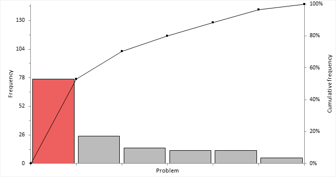
A Pareto chart shows the frequency of occurrences of quality-related problems to highlight those that need the most attention.


pareto chart

Bars represent the individual values ordered by decreasing magnitude. A line represents the cumulative total. The left vertical axis is the frequency of occurrence or some other unit of measurement (such as cost or time). The right vertical axis is the cumulative frequency expressed as a percentage or total of the unit of measurement (such as total cost, total time).
Note: In user-interface controls and documentation, it is typical to refer to the count/frequency for usability and clarity rather than more generic terms such as measure/unit of measurement.

Creating a Pareto chart

Plot a Pareto chart to identify the most frequently occurring quality-related problems.

  1. Select a cell in the dataset.
  2. On the Analyse-it ribbon tab, in the Statistical Analyses group, click Pareto, and then click Single Pareto Chart.
    The analysis task pane opens.
  3. In the Variable drop-down list, select the categorical variable.
  4. If the data are in frequency form, in the Frequency drop-down list, select the frequency count variable.
  5. In the Primary axis drop-down list, select:
    Option Description
    Count Show the frequency of occurrence or unit of measurement.
    Percent Show the percentage of the total frequency or a total of the unit of measurement.
  6. Optional: To force the primary and secondary axis so that 1 unit on the primary axis is equal to the percentage of the total on the secondary axis, select the Lock axes scales check box.
  7. Optional: To label the bars, select the Label bars check box.
  8. Optional: To label the line, select the Label cumulative line check box
  9. Click Calculate.

Creating comparative Pareto charts

Plot a series of Pareto charts to identify the most frequently occurring quality-related problems stratified by up to 2 factors.

  1. Select a cell in the dataset.
  2. On the Analyse-it ribbon tab, in the Statistical Analyses group, click Pareto, and then click Comparative Pareto Chart.
    The analysis task pane opens.
  3. In the Variable drop-down list, select the categorical variable.
  4. If the data are in frequency form, in the Frequency drop-down list, select the frequency count variable.
  5. In either or both the Factor (column) and Factor (row) drop-down lists, select the categorical stratification variables.
  6. In the Primary axis drop-down list, select:
    Option Description
    Count Show the frequency of occurrence or unit of measurement.
    Percent Show the percentage of the total frequency or a total of the unit of measurement.
  7. Optional: To force the primary and secondary axis so that 1 unit on the primary axis is equal to the percentage of the total on the secondary axis, select the Lock axes scales check box.
  8. Optional: To label the bars, select the Label bars check box.
  9. Optional: To label the line, select the Label cumulative line check box
  10. Optional: In the Layout drop-down list, select:
    Option Description
    Flow Layout the plots across the width of the page, before flowing onto a new row.
    Matrix Layout the plots in a matrix as defined by the row and column factors.
  11. Click Calculate.

Merging Pareto chart categories

Merge categories to reduce clutter and see the vital few rather than the trivial many.

You must have already completed either of the tasks:
  1. Activate the analysis report worksheet.
  2. On the Analyse-it ribbon tab, in the Pareto group, click Combine.
    The analysis task pane, the Categories panel opens.
  3. To merge all the categories with a frequency less than a threshold:
    1. In the Combine group, select the Threshold option.
    2. In the Less than value / % edit box, type the frequency count or relative frequency % threshold.
    3. In the Name edit box, type the name of the newly merged category.
  4. To merge a fixed number of smallest categories:
    1. In the Combine group, select the Last option.
    2. In the Categories / % edit box, type the number of categories to merge, or the % of categories.
    3. In the Name edit box, type the name of the newly merged category.
  5. To merge specific categories:
    1. In the Combine group, select the Custom option.
    2. In the Categories grid, click to select the first category, and then hold down SHIFT and click to select the last category to make a contiguous selection, or hold down CTRL and click to select additional categories to make a discontiguous selection.
    3. Click Merge.
    4. In the Categories grid, under the Name column, alongside the category in the edit box, type the name of the newly merged category.
  6. Click Recalculate.

Varying Pareto chart bar colors

Color bars to highlight the importance of the vital few.

You must have already completed either of the tasks:
  1. Activate the analysis report worksheet.
  2. On the Analyse-it ribbon tab, in the Pareto group, click Vary Colors.

    Each bar is varied in color using the color assigned to the categories of the variable in the dataset.

  3. To color the bars to highlight some other attribute such as importance:
    1. Select the Assign Colors check box.
    2. In the Categories grid, under the Color column alongside the category, in the drop-down list, select the color. If you do not assign a color, the bar is colored gray.
    3. Repeat step 3.b for each category.
  4. Click Recalculate.

Reordering Pareto chart bars

Reorder bars to put a specific category at the end (for example, Miscellaneous).

You must have already completed either of the tasks:
  1. Activate the analysis report worksheet.
  2. On the Analyse-it ribbon tab, in the Pareto group, click Reorder.
    The analysis task pane Categories panel opens.
  3. Select the Keep specific category at end check box.
  4. In the drop-down list, select the category to place at the end.
  5. Click Recalculate.

Sorting bars on comparative Pareto charts

Sort the bars into the same order to make comparisons easier.

You must have already completed either of the tasks:
  1. Activate the analysis report worksheet.
  2. On the Analyse-it ribbon tab, in the Pareto group, click Reorder.
    The analysis task pane Categories panel opens.
  3. Select the Sort all by same key check box.
  4. In the drop-down list(s), select the plot to use as the sort order.
  5. Click Recalculate.

Study design

Pareto analysis study requirements and dataset layout.

Requirements

  • A categorical variable of failures.
  • 1 or 2 factor variables.

Dataset layout

Use a column for the variable (Failute), an optional column for the factor variable (Operator); each row has the values of the variables for a failure (ID).

ID (optional) Operator (optional) Failure
1 SNH Colorimeter drift
2 SNH Miscellaneous
3 JDH Electrode failure
4 GMH Deformed tubing
5 SNH Reagents
6 SNH Light failure
7 JDH Deformed tubing
8 SNH Colorimeter drift
9 JDH Colorimeter drift
10 GMH Deformed tubing

Frequency form dataset layout

Use a column for the variable (Failute), an optional column for the factor variable (Operator) and a column for the number of cases (Frequency); each row has the values of the variables and the frequency count.

Failure Operator (optional) Frequency
Colorimeter drift SNH 14
Colorimeter drift JDH 15
Colorimeter drift GMH 22
Deformed tubing SNH 4
Deformed tubing JDH 5
Deformed tubing GMH 5
Electrode failure SNH 1
Electrode failure JDH 2
Electrode failure GMH 3

Statistical Reference Guide v6.15