
Bland and Altman (1983) popularized the use of the difference plot for assessing agreement between two methods. Although their use was to show the limits of agreement between two methods, the plot is also widely used for assessing the average bias (average difference) between two methods.
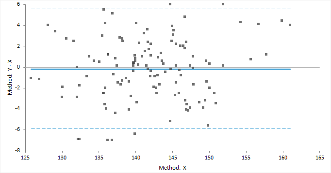
The classic difference plot shows the difference between the methods on the vertical axis, against the best estimate of the true value on the horizontal axis. When one method is a reference method, it is used as the best estimate of the true value and plotted on the horizontal axis (Krouwer, 2008). In other cases, using the average of the methods as the best estimate of the true value, to avoid an artificial relationship between the difference and magnitude (Bland & Altman, 1995).
A relative difference plot (Pollock et al., 1993) shows the relative differences on the vertical axis, against the best estimate of the true value on the horizontal axis. It is useful when the methods show variability related to increasing magnitude, that is where the points on a difference plot form a band starting narrow and becoming wider as X increases. Another alternative is to plot the ratio of the methods on the vertical axis, against the best estimate of the true value on the horizontal axis.


From the Statistical Reference Guide for Analyse-it 6.24.0: https://analyse-it.com/docs/user-guide/method-comparison/difference-plot
We use essential cookies to run the site. With your permission we'd also like to use analytics and
advertising cookies to see how visitors find and use Analyse-it, so we can keep improving it and reach
more people like you.
You can change your mind at any time, see our
Privacy policy.