
CUSUM and EWMA are time-weighted control charts. Both plot a statistic that carries information from earlier points forward. The memory is what makes them sensitive to a small shift, which a Shewhart chart would take many samples to notice.
The gap is larger than most people expect. A Shewhart chart with three-sigma limits signals on a stable process about once in 370 points, which is the behaviour you want. Faced with a real shift of one standard deviation, the same chart takes around 44 points to react. A one-sigma shift still leaves almost every point inside the limits. Forty-four points is six weeks of daily data. CUSUM and EWMA get there in about ten.
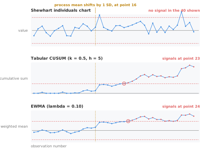
A Shewhart chart judges each point on its own, and forgets it immediately. The independence is a real strength. The chart is robust, easy to explain and quick on a large sudden shift, which is often the costliest failure.
The cost appears when the shift is small. Move the process mean by one standard deviation and about 98% of points still land inside three-sigma limits. The chart has no way to notice that they are now landing consistently above the centre line, because each point is assessed alone. Run and trend rules exist precisely to patch this, and they help, at the cost of a higher false-alarm rate.
CUSUM and EWMA attack the same problem differently. Instead of adding rules about patterns of points, both change the statistic being plotted. A run of small deviations in one direction then accumulates into something the limits can catch.
A CUSUM chart plots a running total of how far the process has departed from target. Deviations in the same direction add up; deviations that alternate cancel out. A persistent bias of a fraction of a standard deviation therefore grows steadily, while noise only wanders.
The practical form is the tabular CUSUM, which keeps two one-sided sums, one for upward shifts and one for downward. Each is reset to zero whenever it would go negative, so a sum only grows while the evidence points one way. Two parameters control it.
The reference value k is the slack. Deviations smaller than k pull the sum back towards zero, so ordinary noise does not accumulate. Set it to half the shift you want to detect, in standard deviations: k of 0.5 to catch a one-sigma shift.
The decision interval h is the limit the accumulated sum is compared against, also in standard deviations. The conventional pairing is k of 0.5 with h of 4 or 5. With k of 0.5 and h of 5, the chart runs about 465 points between false alarms, comparable with a Shewhart chart. The same chart detects a one-sigma shift in roughly ten.
A CUSUM also tells you when the shift began. The point where the sum last sat at zero is the estimate of the change point, which narrows the search for the assignable cause considerably.
An EWMA chart plots an exponentially weighted moving average. Each new value is blended with the previous average, so every past observation still contributes, with a weight that decays geometrically the further back it lies.
One parameter, lambda, sets how fast that decay is. A small lambda means a long memory and high sensitivity to small shifts. A large lambda means a short memory and behaviour closer to a Shewhart chart. Values between 0.05 and 0.25 cover most practical use, and 0.10 to 0.20 is the usual starting range.
The plotted statistic is an average, so its variance is smaller than that of a single observation. The control limits are therefore narrower than the three-sigma limits of an individuals chart. The limits also start narrow and widen to their steady-state width over the first ten or twenty points, sooner for a larger lambda. With lambda of 0.10 and limits set for a similar false-alarm rate, the chart detects a one-sigma shift in about ten points, much like a well-tuned CUSUM.
EWMA is the more forgiving of the two to set up. Only lambda usually needs choosing, because the limit width L is normally left at or near 3. The chart is easier to read for people used to a smoothed line, and the smoothing degrades gracefully if lambda is somewhat wrong.
CUSUM and EWMA perform almost identically at detecting small sustained shifts, so the choice rarely turns on power. The choice turns on what else you want from the chart.
| CUSUM | EWMA | |
|---|---|---|
| Parameters to set | Two, k and h | Two, lambda and L, with L usually near 3 |
| Tuned for | A specific shift size, chosen in advance | A range of small shifts |
| Estimates when the shift started | Yes, from the last zero | No |
| Reads like | A staircase that climbs once the process moves | A smoothed version of the process itself |
| Large sudden shift | Slower than Shewhart | Slower than Shewhart |
The last row decides the answer. Both charts are worse than a Shewhart chart at the thing a Shewhart chart is for, because averaging and accumulating both dilute a single extreme point. So run a time-weighted chart alongside the Shewhart chart, not instead of it. The pair covers both failure modes: the sudden excursion and the slow drift.
Both charts assume the observations are independent. Autocorrelation affects them more than it affects a Shewhart chart, because both carry information forward. Autocorrelated data produce signals that have nothing to do with a shift in the mean. Non-normality matters less: an EWMA with a small lambda is more robust to it than an individuals chart.
Download the Shewhart, EWMA and CUSUM example (.xlsx): copper concentration in a plating pool across the IQ, OQ and production phases. An Xbar-R chart with Montgomery rules flags seven signals. EWMA with λ = 0.2 and L = 3 flags eight, and CUSUM with h = 5 and k = 0.5 flags eleven. The workbook is ready to open in the Analyse-it trial. Reading out-of-control signals covers what to do once either chart alarms.
Replacing the Shewhart chart rather than adding to it. A time-weighted chart is slower on a large sudden shift, which is the failure mode most likely to hurt a patient or a batch. Keep both.
Choosing k or lambda after looking at the data. Both parameters set the shift size the chart is tuned for. The size is a decision about what matters to the process, not about what the data happen to show. Fix it before you plot.
Estimating the parameters from an unstable baseline. The target and the standard deviation must come from a period when the process was actually in control. Take them from a run that contains the drift and the chart treats the problem it is meant to find as normal.
Applying detection rules meant for a Shewhart chart. Runs, trends and zone rules assume independent points. On a CUSUM or an EWMA the points are correlated by construction, so those rules signal far too often. Use the decision interval or the EWMA limits alone.
Ignoring autocorrelation. Where consecutive measurements are related — a process measured more often than it can change — both charts alarm on the correlation rather than on a shift. Sample less often, or model the correlation first.
Analyse-it draws the time-weighted charts alongside the Shewhart ones, inside Excel:
Every feature from all five editions for 15 days. Control charts, time-weighted ones included, are in the Quality Control & Improvement and Ultimate editions, from US$ 290 a year. Validated against published reference datasets and thousands of internal test cases. See which control chart do you need to place these among the other seven, or the time-weighted control chart reference guide.