
Every control chart plots a statistic against control limits and asks one question: is the process still behaving the way it did when the limits were set? What changes from chart to chart is the statistic on the axis, and the statistic follows from three decisions you make before any data are plotted.
Nine charts cover almost everything, in three families.
| Chart | Data | What it plots |
|---|---|---|
| Xbar-R | Variables, in subgroups | Subgroup mean and range, for small subgroups |
| Xbar-S | Variables, in subgroups | Subgroup mean and standard deviation, for larger subgroups |
| I-MR | Variables, one at a time | Individual values with the moving range |
| p | Attribute, defective units | Proportion defective, varying sample size |
| np | Attribute, defective units | Number defective, constant sample size |
| u | Attribute, defects | Defects per unit, varying sample size |
| c | Attribute, defects | Count of defects, constant sample size |
| CUSUM | Time-weighted | Cumulative sum of deviations from target |
| EWMA | Time-weighted | Exponentially weighted moving average, tunable to the shift size |
Three decisions pick one out of the nine, and the rest of this guide takes them in order.
A variable is something you measure on a continuous scale: a thickness, a concentration, a time. An attribute is something you count: defective units, or defects per unit. The distinction decides the whole family. Variables data carry far more information per point and support tighter, more sensitive charts. Where you can measure rather than count, measure.
For variables, the question is whether you collect single observations or rational subgroups: several units produced under the same conditions. Subgroups let you separate within-subgroup variation from between-subgroup variation, and the separation is what lets a chart distinguish a real shift from ordinary noise.
With subgroups you plot the subgroup mean on an Xbar chart, paired with a chart of the spread. For small subgroups, up to about eight or ten, the spread chart is an R chart of the range. For larger ones it is an S chart of the standard deviation, because the range would waste information.
Where the process yields one value at a time, such as a batch assay or a daily figure, you use an I-MR chart: individuals with a moving range. In a clinical laboratory, the Levey–Jennings chart is the individuals half of that chart, run on a stable control material. The limits come from the material’s own mean and standard deviation rather than from the moving range. Always read the spread chart first. If the R or S chart is out of control, the limits on the mean chart are not trustworthy.
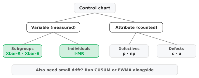
For attributes, the count type sets the chart. Counting defective units gives a p chart (proportion, varying sample size) or an np chart (number, constant sample size), both built on the binomial distribution. Counting defects, where one unit can carry several, gives a u chart (defects per unit, varying size) or a c chart (count, constant size). Both are built on the Poisson distribution. Choosing a defective-unit chart when you should be counting defects, or the reverse, puts the wrong distribution behind your limits.
A Shewhart chart (Xbar, I-MR, p and the rest) reacts quickly to a large, sudden shift but is slow to notice a small, sustained drift. Each point is judged on its own. A time-weighted chart catches a gradual failure far sooner by accumulating information across points. Reagent degradation, tool wear and calibration drift are typical gradual failures.
A CUSUM chart sums deviations from target, so a persistent small bias builds into a clear signal. An EWMA chart plots an exponentially weighted moving average, tunable to the shift size you care about. Run one of these alongside the Shewhart chart rather than instead of it. The pair catches both the sudden shift and the slow drift.
Whatever the chart, the control limits must come from a period when the process was stable, and from enough of it. Twenty to twenty-five subgroups is the usual minimum, or upward of a hundred individual points, for the estimate of the spread to settle. For control material in a clinical laboratory, CLSI C24 sets a minimum of 20 runs, with the limits refined as data accumulate.
The limits describe how the process actually varies, not the specification. A baseline that already contains a shift puts the centre line in the wrong place, and any limits computed from the overall standard deviation are widened by it. Either way, the chart treats the problem you meant to detect as normal. Where the process runs in distinct periods, such as before and after a change, use separate control limits for each phase rather than one set spanning both.
Download the Xbar-R control chart example (.xlsx) — copper plating across three phases with detection rules and operator stratification, plus EWMA and CUSUM charts of the same data. The workbook is ready to open in the Analyse-it trial.
The example workbook is downloading.
It opens in Excel on its own — the data and the finished results are both in it. Analyse-it is what lets you change the analysis and re-run it, try the same study on your own data, or work through it to see how the software handles it.
Every feature from all five editions for 15 days.
Counting when you could measure. Attribute charts need large samples to match the sensitivity a variables chart gets from a handful. If the characteristic can be measured, an Xbar or I-MR chart will see trouble sooner.
Reading the mean chart before the spread chart. An out-of-control R or S chart invalidates the limits on the mean. Settle the spread first.
Expecting a Shewhart chart to catch a slow drift. Small sustained shifts are what CUSUM and EWMA are for. A Shewhart chart will get there eventually, but often too late.
Setting limits from an unstable period. Limits computed over data that already contain the problem are centred in the wrong place, and too wide if taken from the overall spread. Establish them on a stable period.
Analyse-it charts all of them, inside Excel:
Every feature from all five editions for 15 days. Control charts are in the Quality Control & Improvement and Ultimate editions, from US$ 290 a year. Validated against published reference datasets and thousands of internal test cases. See reading out-of-control signals for what the chart flags once it is running, or the process control reference guide.