Every feature from all five editions for 15 days.
Quality Control & Improvement edition from US$ 290 a year · 30-day money-back guarantee.
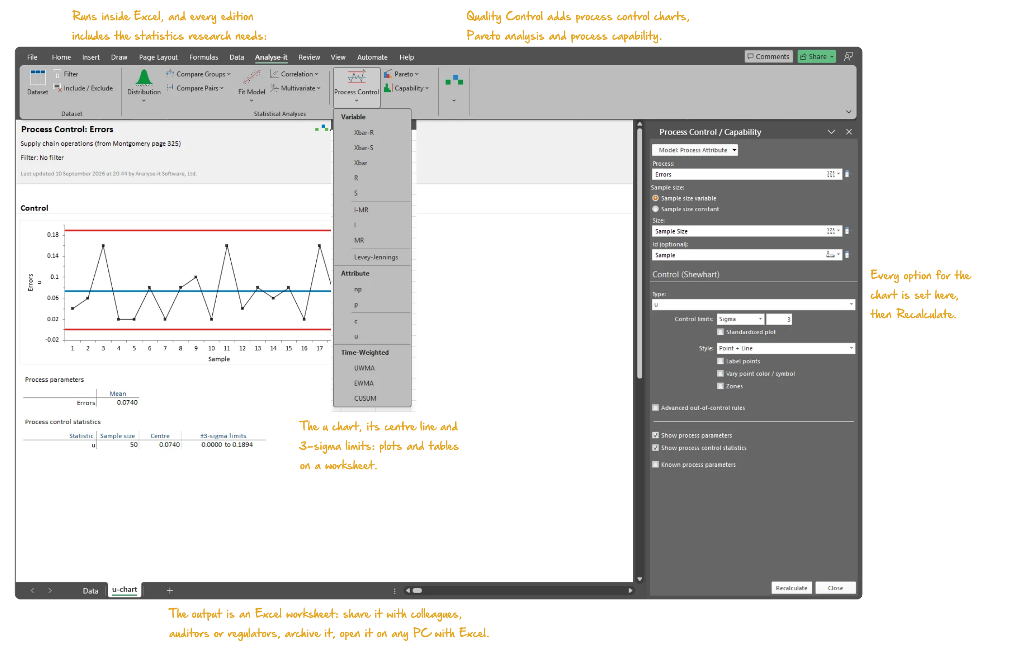
A quality team asks the same three questions all year. Is the process stable? Is it capable of meeting the specification? And when the answer to either is no, what changed? The first two are answered by charts and indices. The third is answered by ordinary statistics, which is where most quality toolkits stop.
Analyse-it runs all three inside Excel. The control chart, the capability study and the hypothesis test that confirms the cause are the same tool, working on the same data, producing one workbook. Nothing is exported to a second package, and nothing leaves the machine it was analysed on.



A control chart is only as good as the rule set behind it. Too few rules and a slow drift runs for weeks before a point crosses a limit. Too many and the operators learn to dismiss the flags, which is worse than having no chart at all. The rule set is a decision to make deliberately, before the data arrives.
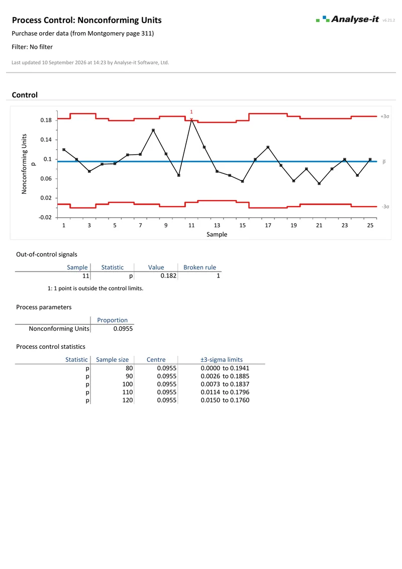
Analyse-it draws Shewhart variable charts — Xbar-R, Xbar-S and I-MR — and the attribute charts p, np, c and u. Detection rules come as WECO, Nelson, Montgomery or a set you define yourself. Phases mark a deliberate change such as a new lot or a re-tooling. The limits then recalculate either side of the change, rather than dragging the old process across the new one. Stratification separates lines, shifts or operators on the same chart.
Where a drift is small and sustained rather than sudden, CUSUM, EWMA and UWMA accumulate the evidence and signal earlier than any Shewhart rule will. Reading out-of-control signals covers how to tell a real shift from the false alarms any rule set produces.
Control charts and detection rules → 6 pages
Shewhart, EWMA and CUSUM
6 pages
Shewhart, EWMA and CUSUMA capability index is an estimate, and a single number hides how uncertain that estimate is. Quoted from thirty observations, a Cpk of 1.33 is consistent with a true value well below the limit your customer wrote into the contract. The confidence interval is the part of the result that answers the question actually being asked.
Analyse-it reports Cp, Cpl, Cpu, Cpk and Cpm for the within-subgroup variation, and Pp, Ppl, Ppu and Ppk for the overall variation, with confidence intervals on each. Nonconforming units and sigma metrics come from the same analysis. Where the data is not normal, transformations are applied and shown rather than normality being assumed, so the choice is visible to whoever reviews the study. Cp, Cpk and Ppk explained sets out what each index measures and why the within and overall figures differ.
Capability analysis in detail →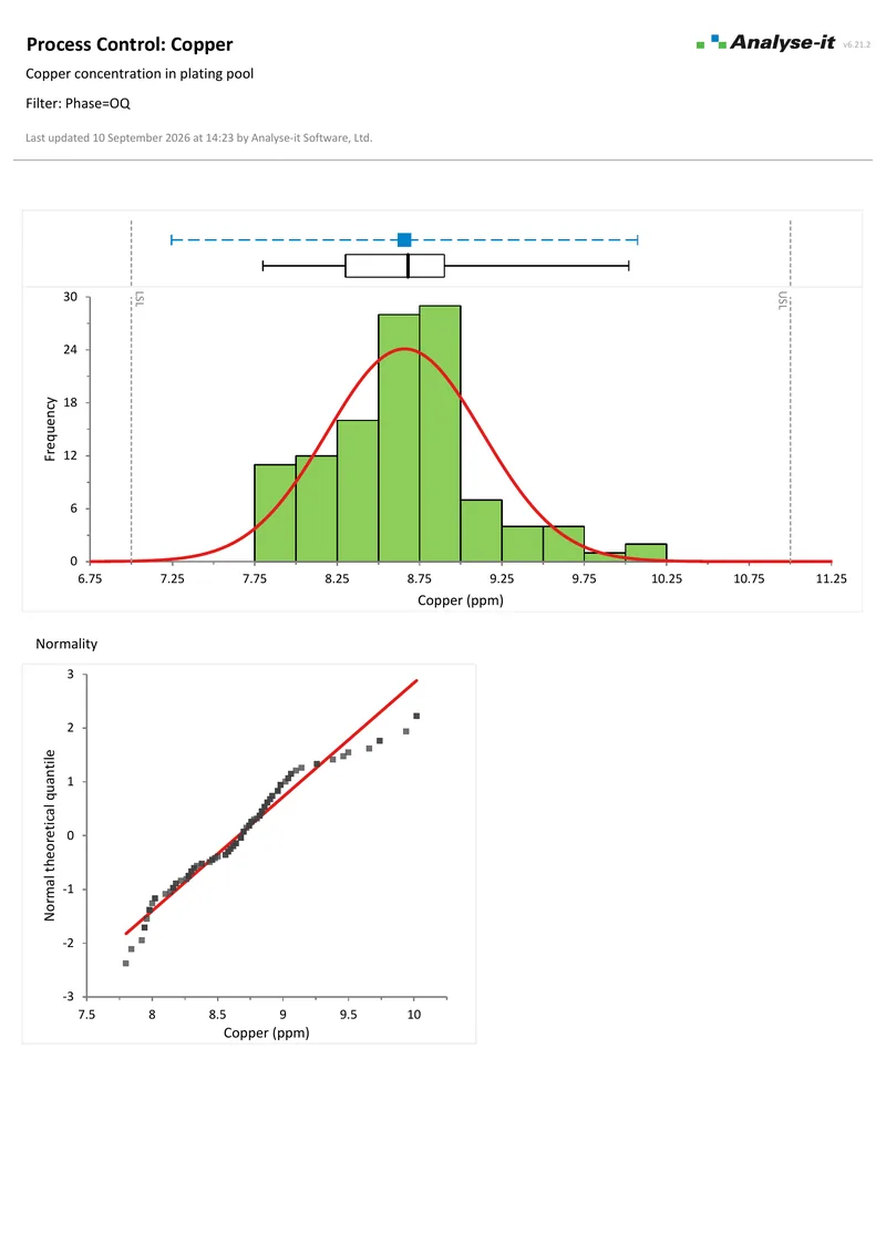 3 pages
Process capability
3 pages
Process capability 4 pages
Continuous distribution
4 pages
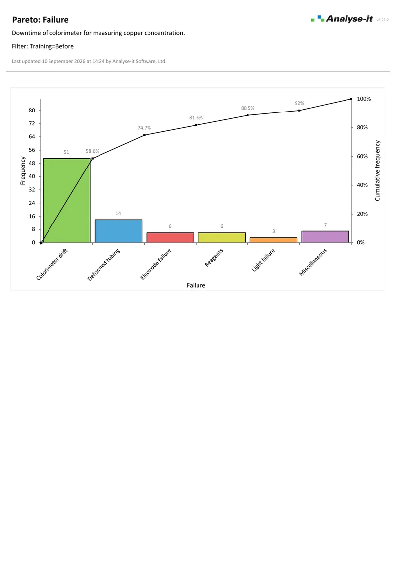
Continuous distributionPareto analysis is simple arithmetic and is still the fastest way to stop a team working on the third most common failure. The value is in the stratification. A defect that dominates overall may belong almost entirely to one line, one shift or one supplier, and the combined chart hides that.
Analyse-it draws the Pareto chart with its cumulative percentage line and stratifies it two ways at once. Combine, reorder or colour the bars so the categories match how the plant actually records them.
Pareto analysis →A chart tells you when a process moved. Finding out why is ordinary statistics: comparing groups, fitting a model, testing whether a factor matters. Quality teams routinely own a package that charts well and then borrow a second one for this part, or rely on spreadsheet formulas that nobody validates.
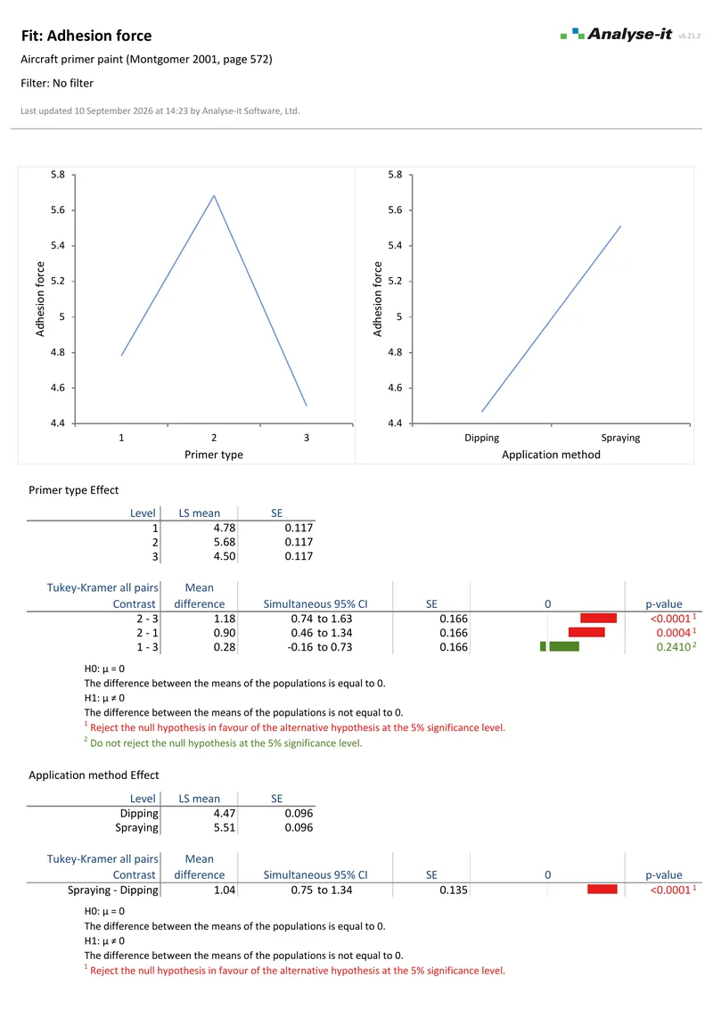
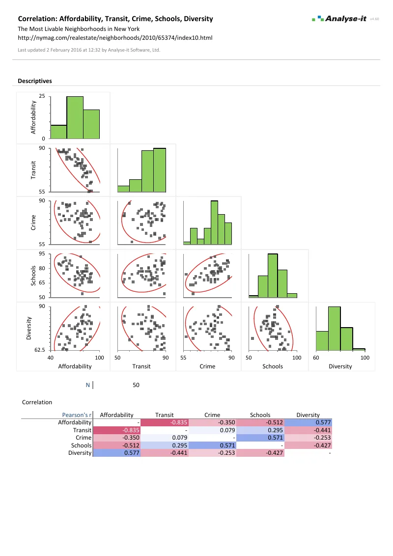
Every Analyse-it edition includes the full Standard edition. Hypothesis tests, one-way, two-way and multi-factor ANOVA, regression and the diagnostics that go with it are in the same ribbon as the control chart. Factorial designs let you vary the suspected factors together rather than one at a time, which is both faster and better at finding interactions.
Factorial designs covers how to plan one and read the interactions it finds.
The Standard edition statistics →Before any chart is believed, the measurement system itself has to be good enough for the tolerance it is judging. Characterising it — repeatability, the between-operator and between-day components, linearity across the range — is a separate study, and in Analyse-it a separate edition.
The Method Validation edition holds those analyses: precision with nested random factors, variance components with exact, Satterthwaite and MLS confidence intervals, and linearity. Ultimate holds them alongside the control charts. A plant doing both wants Ultimate rather than two licences. Measurement system analysis explained covers what the study is and how the components are read.
The investigation is where a quality toolkit usually stops. The examples below are the Standard edition analyses that follow a signal — and every edition includes them.
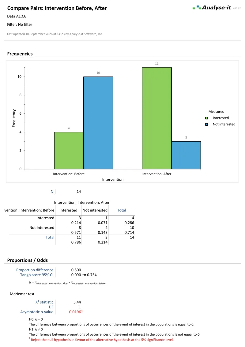 1 page
Related contingency table
1 page
Related contingency table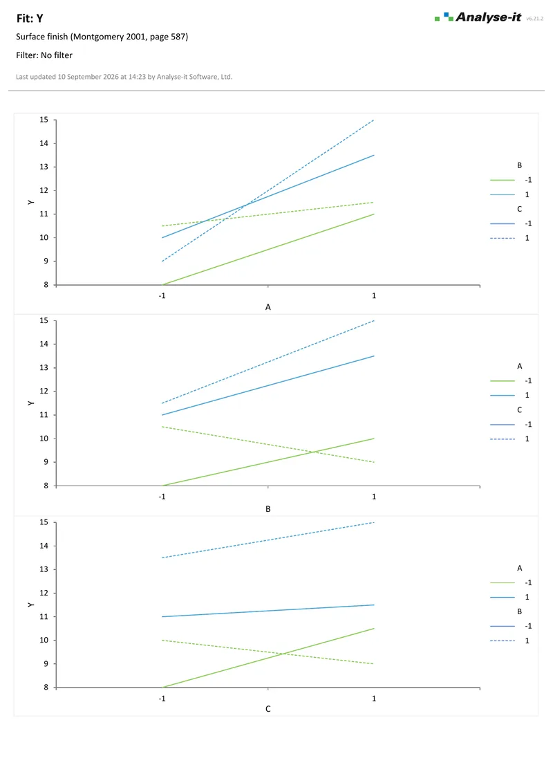 3 pages
Three-factor ANOVA
3 pages
Three-factor ANOVA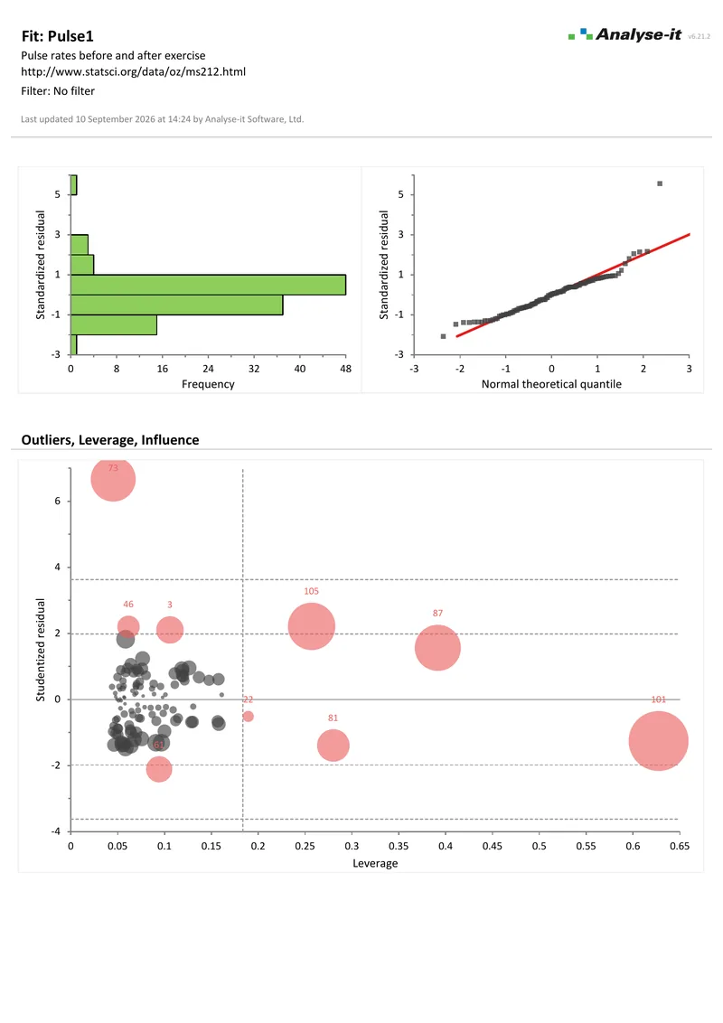 4 pages
Multiple regression
4 pages
Multiple regressionControl charts, capability indices and Pareto analysis are the Quality Control & Improvement edition. Like every edition, it includes the full Standard edition — the tests, ANOVA and regression the root-cause work needs. Measurement system work is the Method Validation edition, as above. Ultimate holds both in one licence, which is what a plant doing charting and measurement system studies wants. The comparison table lists every analysis against every edition.
Every calculation is performed by Analyse-it — no Excel formulas and no third-party functions — validated against the NIST Statistical Reference Datasets and thousands of internal test cases. Results are ordinary Excel workbooks holding the data, the analysis and the conclusion together. The workbooks carry no formulas, so what you reported is what you find when you reopen the file. How Analyse-it is developed and validated →
Try it on your own data first. The 15-day trial is every feature from all five editions — install it and start straight away.
Quality Control & Improvement edition: US$ 290 per year or US$ 760 for a perpetual licence. Every purchase carries a 30-day money-back guarantee. Need a quote for purchasing? Choose the licence on the pricing page and click Get a quote.