
A control chart carries two kinds of evidence. A single point beyond a three-sigma limit is the obvious one, because a stable process produces such a point only about once in 370. But a process that has shifted often signals first through the pattern of points that are still within the limits. A set of supplementary rules exists to read those patterns.
The rules split each half of the chart, between the centre line and a control limit, into three bands one standard deviation wide. Zone C is nearest the centre, zone B beyond it and zone A just inside the three-sigma limit. A process in control scatters points across these zones in a predictable way: about 68% in zone C, 27% in zone B and 4% in zone A. The points also fall in roughly even numbers either side of the centre. When the observed pattern departs from that expectation, the process has probably moved, even though no single point has escaped.
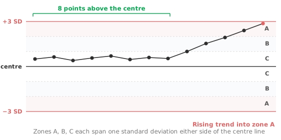
The signals fall into a few families. A run is a long stretch of consecutive points all on one side of the centre line, and says the process mean has moved to a new level. A trend is several points climbing or falling in sequence, and says the process is drifting, as with tool wear or a degrading reagent. A drift too slow for the rules to catch is the case for a CUSUM or EWMA chart alongside this one.
Points that avoid zone C, falling in zones A and B on both sides of the centre, indicate increased variability or a mixture of two processes. Nelson’s rule for this is eight in a row. Points packed within zone C (Nelson’s rule is 15 in a row) suggest the opposite: stratification, or control limits that no longer reflect the true spread. An oscillation is a sequence of points alternating in direction, up then down then up, and hints at a systematic effect such as alternating operators or shifts. Nelson’s rule is 14 in a row.
Three widely used rule sets encode these patterns, and they overlap heavily rather than compete. The Western Electric (WECO) rules are the classic set, and they flag four patterns. The first two are one point beyond zone A, and two of three consecutive points in zone A or beyond on the same side. The other two are four of five in zone B or beyond on the same side, and eight in a row on one side of the centre.
The Nelson rules extend them with explicit trend and oscillation tests. The Montgomery rules are a compact, widely taught selection. Pick one set and apply it consistently. Stacking every rule from every set together inflates false alarms while adding little sensitivity, because the sets largely test the same patterns.
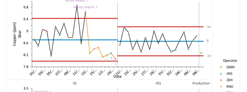
Every rule you add raises sensitivity and, with it, the false-alarm rate. A chart running many rules at once will signal on a stable process more often than the nominal “1 in 370” of the three-sigma limit alone suggests. With all four WECO rules, a stable process gives a false alarm about once in 92 points (Champ and Woodall, 1987). A team that sees its chart alarm on a stable process soon stops trusting it. Choose the smallest set that catches the failure modes your process actually has. Treat every genuine signal as a prompt to find the assignable cause. A signal with no investigation behind it is wasted. Where signals recur, Pareto analysis ranks the causes so effort goes where most of the loss is.
Download the Xbar-R detection-rules example (.xlsx) — copper plating with Montgomery rules and annotated assignable causes, ready to open in the Analyse-it trial.
The example workbook is downloading.
It opens in Excel on its own — the data and the finished results are both in it. Analyse-it is what lets you change the analysis and re-run it, try the same study on your own data, or work through it to see how the software handles it.
Every feature from all five editions for 15 days.
Watching only for points beyond the limits. The runs and trends inside the limits are the early warning. Waiting for an escape throws that lead time away.
Applying every rule at once. More rules mean more false alarms. Choose one coherent set and hold to it.
Signalling without investigating. A flagged point is the start of a search for an assignable cause, not the end. Log what you found.
Leaving stale limits in place. After a deliberate, understood process change, recompute the limits for the new phase. Old limits will flag the new normal endlessly.
Analyse-it applies the rules to Shewhart charts of the mean, individuals and attributes and labels what it finds, inside Excel:
Every feature from all five editions for 15 days. Detection rules come with control charts in the Quality Control & Improvement and Ultimate editions, from US$ 290 a year. Validated against published reference datasets and thousands of internal test cases. See which control chart do you need for choosing the chart itself.