
A Pareto chart is a bar chart of defect categories sorted from most to least frequent, with a line tracking the running cumulative percentage across the top. The purpose is prioritisation. A Pareto chart ranks a list of problems by frequency, or by cost. The ranking lets a team see at a glance where the loss is concentrated and start there.
Read the bars for the size of each category and the line for the accumulation. The line rises steeply over the first few categories and then flattens. Where it flattens is the boundary between the causes worth addressing and the long tail that is not.
If two or three bars account for most of the height and the cumulative line has already passed 80% by the third category, you have found your targets. Fixing those few removes most of the loss, and the dozen small categories behind them can wait.
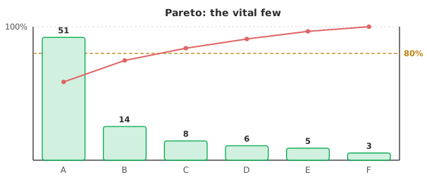
The “80–20 rule” is the observation that roughly 80% of effects often come from about 20% of causes. The rule is a useful expectation, not a law your data must obey. Some processes concentrate more sharply than that, with one cause dominating. Others are flatter, with the loss spread across many categories and no clear few to attack.
Read the split your data actually show rather than forcing them onto the ratio. A flat Pareto is itself telling you something: that there is no single dominant cause, and improvement will need broader change.
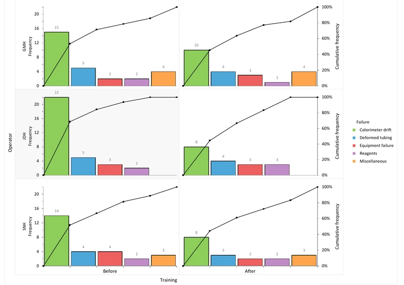
A single Pareto can hide as much as it reveals. A category that looks moderate overall may be dominated by one operator, one shift, one machine or one material lot. A comparative Pareto, which breaks each category down by such a factor, exposes that.
The most actionable finding is often not “this defect is common” but “this defect is common on this line”, because that points straight at a cause. Stratifying before and after a change also shows whether the fix moved the category it targeted.
A Pareto ranks by whatever you counted, so count what matters. Ranking by frequency answers “which defect happens most?” Ranking by cost, or by downtime, answers “which defect hurts most?” The two rankings often put different categories first.
A rare defect that scraps an expensive unit can outweigh a common one that is trivially reworked. Decide which loss you are trying to reduce, such as cost or hours of downtime. Tally each category in those units rather than as a bare count, and let the ranking follow.
Download the Pareto analysis example (.xlsx): colorimeter downtime failures with simple and comparative Pareto charts stratified by operator and training, ready to open in the Analyse-it trial.
The example workbook is downloading.
It opens in Excel on its own — the data and the finished results are both in it. Analyse-it is what lets you change the analysis and re-run it, try the same study on your own data, or work through it to see how the software handles it.
Every feature from all five editions for 15 days.
Forcing the 80–20 split. The ratio is a tendency, not a rule. Read the concentration your data show; a flat Pareto is a finding, not a failure.
Ranking by frequency when cost is what matters. The most common defect is not always the most damaging. Tally each category in the units of the loss you care about.
Skipping stratification. An aggregate Pareto can mask a driver confined to one operator, machine or lot. Break the categories down.
Chasing the long tail. Effort spent on the trivial many yields little. Fix the vital few first, then reassess.
Analyse-it charts the analysis from your own counts, inside Excel:
Every feature from all five editions for 15 days. Pareto analysis is in the Quality Control & Improvement and Ultimate editions, from US$ 290 a year. Validated against published reference datasets and thousands of internal test cases. See which control chart do you need for monitoring the gains, or the Pareto chart reference guide for the technical detail.