
A receiver operating characteristic (ROC) curve plots a test’s sensitivity against its false-positive rate at every possible cut-off. A test that returns a number (a marker concentration, an assay signal) only becomes a yes/no result once you pick a cut-off. The ROC curve shows how the test performs across every cut-off at once. The area under it is the single number most often used to summarise how well the test discriminates. Both are widely reported and widely misread.
Every cut-off you could choose gives a pair of numbers, a sensitivity and a specificity. The sensitivity is the proportion of diseased subjects correctly flagged, and the specificity is the proportion of non-diseased subjects correctly cleared. Lower the cut-off and you catch more true positives but also more false positives. Raise it and the reverse. The ROC curve plots sensitivity against 1 − specificity (the true-positive rate against the false-positive rate). The curve traces that trade-off across the whole range of cut-offs.
A test with no discriminating ability sits on the diagonal. Every gain in sensitivity is paid for one-for-one in false-positive rate. A good test bows towards the top-left corner, where sensitivity is high and false positives are few. The shape of that curve, not any single point on it, is the test’s performance.
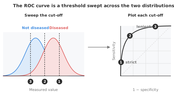
The area under the ROC curve — the AUC, also written AUROC — collapses that whole curve into one number, conventionally between 0.5 and 1. A test scoring below 0.5 is discriminating in reverse. The AUC has a clean, exact interpretation, and it is the one worth remembering. The AUC is the probability that the test scores a randomly chosen diseased subject higher than a randomly chosen non-diseased one (counting ties as half).
An AUC of 0.5 is no better than chance and 1.0 is perfect separation. An AUC of 0.8 means that, four times out of five, a randomly picked patient with the condition has a higher result than one without.
Interpretive bands for the AUC are widely quoted, and they are a convention rather than a rule:
| AUC | Conventional reading |
|---|---|
| 0.5 | No discrimination — equivalent to guessing |
| 0.5 – 0.7 | Poor |
| 0.7 – 0.8 | Acceptable |
| 0.8 – 0.9 | Excellent |
| ≥ 0.9 | Outstanding |
Treat those labels with care. An AUC of 0.75 may be ample for a triage test that only has to order patients for further work-up. The same AUC may be quite inadequate for a test that will rule out a serious diagnosis on its own. What counts as a good AUC depends on the clinical job and on what the test replaces, not on which band the number falls in.
Two properties make the AUC useful. The measure is threshold-independent, so it summarises discrimination without committing to any particular cut-off. The AUC is also prevalence-independent, describing the test rather than the population you tried it on. Threshold-independence is also its limitation. Because the AUC averages over the entire curve, it can hide poor performance in the specific region of sensitivity or specificity that matters clinically.
An AUC estimated from a sample is not the truth. The estimate carries uncertainty, and that uncertainty shrinks as the numbers of diseased and non-diseased subjects grow. The DeLong method gives a non-parametric confidence interval for the AUC that makes no distributional assumption about the test values. Reporting the AUC that way is standard. An AUC of 0.82 means something quite different with a 95% interval of 0.79–0.85 than with one of 0.66–0.98. Quoting the point estimate alone hides that.
When you have two markers measured on the same subjects (a new assay and an established one, say), the question is whether one discriminates better than the other. Their AUCs cannot be compared with an ordinary two-sample test. The two are correlated: they were measured on the same people, so their errors move together. DeLong’s test for the difference between correlated AUCs accounts for that pairing. DeLong’s test is the standard way to ask whether the gap between two ROC curves is more than sampling noise.
The AUC is threshold-free, but a test in routine use is not. At some point you have to draw a line and call results positive or negative. The ROC curve is where you choose it.
The most common rule is Youden’s index: the cut-off that maximises sensitivity plus specificity minus one. Geometrically, Youden’s cut-off is the point on the curve furthest above the diagonal. Youden weights sensitivity and specificity equally, which is often not what the clinic wants. Missing a serious treatable disease is rarely as tolerable as a false alarm.
When the costs are asymmetric, or the prevalence is far from 50%, the optimal cut-off shifts. A choice weighted by cost and prevalence gives a lower expected cost than Youden’s when those are known. A decision plot (performance against cut-off) makes the consequences of each choice visible. The shape of that trade-off matters more than any single “optimal” point.
The workbook below compares two markers, oxidised LDL and LDL, on the same 50 subjects. Each marker has an ROC curve and an AUC with its confidence interval, and the DeLong test compares the two. A decision threshold plot shows sensitivity and specificity across every OxLDL cut-off. Open it in the trial and add a threshold to see the two rates at that point.
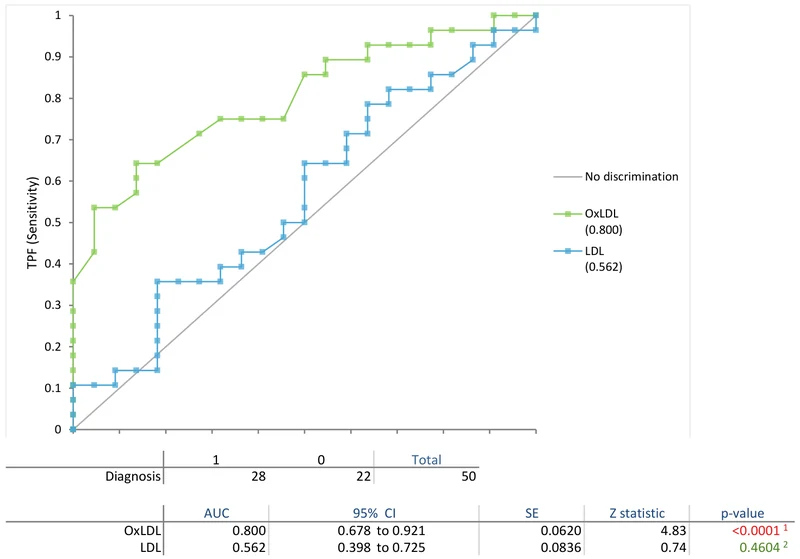
Download the CLSI EP24-A2 diagnostic performance example workbook (.xlsx) — OxLDL and LDL on the same 50 subjects, with ROC curves, each AUC with its confidence interval, the DeLong comparison and a decision threshold plot, ready to open in the Analyse-it trial.
The example workbook is downloading.
It opens in Excel on its own — the data and the finished results are both in it. Analyse-it is what lets you change the analysis and re-run it, try the same study on your own data, or work through it to see how the software handles it.
Every feature from all five editions for 15 days.
Reading the AUC as “accuracy”. The AUC is a ranking probability, not the proportion of correct classifications. A test can have a high AUC and still be useless at the one cut-off you have to work at. Check the region of the curve you actually operate in.
Comparing paired AUCs with an unpaired test. Two tests measured on the same subjects give correlated AUCs. Use DeLong’s paired comparison, not a two-sample test that assumes independence.
Quoting the AUC without a confidence interval. A point estimate hides how much the sample could be misleading you. Report the interval, and say what its width means for your conclusion.
Treating Youden’s cut-off as the right one. Youden’s index is optimal only if the two errors cost the same and the prevalence is 50%. When either condition fails (which is most of the time in medicine), weight the choice by cost and prevalence.
Confusing discrimination with predictive value. The AUC and sensitivity/specificity describe the test. What a positive result means for a given patient depends on prevalence, which the ROC curve does not capture; predictive values answer that question.
Analyse-it builds the curves and the comparison from your own data, inside Excel:
Every feature from all five editions for 15 days. Diagnostic performance is in the Medical, Method Validation and Ultimate editions, from US$ 340 a year. Validated against NIST and CLSI reference datasets. Full detail in the diagnostic performance reference guide; see also likelihood ratios, whose value at any threshold is the slope of the curve there.