
Sensitivity, specificity and the positive and negative predictive values are four statistics read from one 2×2 table, made by evaluating a diagnostic test against a known truth. The difficulty is that the four answer two different questions, and the pair most often quoted is rarely the pair the reader needs.
Here is a test with 90% sensitivity and 95% specificity, applied to 1,000 subjects of whom 100 have the condition.
| Disease present | Disease absent | Total | |
|---|---|---|---|
| Test positive | 90 true positives | 45 false positives | 135 |
| Test negative | 10 false negatives | 855 true negatives | 865 |
| Total | 100 | 900 | 1,000 |
The four statistics are the same four cells read in two directions. Sensitivity and specificity are read down the columns, dividing by what is true. Predictive values are read across the rows, dividing by what the test said. That one distinction accounts for nearly every confusion in this subject.
Sensitivity, also called the true positive rate, is the proportion of truly diseased subjects the test identifies: 90 of the 100 in the first column, so 90%. Specificity, or the true negative rate, is the mirror image: the proportion of non-diseased subjects the test correctly clears. In the second column the test clears 855 of the 900, so 95%. The complement of specificity, 1 − specificity, is the false positive rate, which is the quantity plotted on the horizontal axis of a ROC curve. A highly sensitive test rarely misses disease. A highly specific test rarely produces a false alarm.
Both are, to a good approximation, properties of the test rather than of your population. The reason is that neither depends on how common the disease is in the group you tested. A sensitivity measured in one population is therefore a reasonable guide to another.
One caveat is the spectrum effect. A test evaluated on obviously sick against obviously healthy subjects looks more sensitive and specific than it proves to be in the ambiguous middle. The ambiguous middle is where the test gets used. Disease prevalence itself, though, does not move either number.
Sensitivity and specificity start from known disease status and give the probability of a test result. In the clinic that reasoning runs backwards: you have a positive result and you want the chance the patient has the disease. The answer is the positive predictive value (PPV): of everyone who tests positive, the proportion who are truly diseased. In the table, PPV is 90 of the 135 in the first row, so 67%. The negative predictive value (NPV) is its counterpart for negative results: 855 of 865, so 99%.
Predictive values are the numbers that matter at the point of care. Unlike sensitivity and specificity, they depend heavily on how common the disease is. The same 90%-sensitive test gives a PPV of 67% here, and far less than that in a screening population.
The four statistics produce two recurring mix-ups. Each is the same mistake: reading a row when you meant a column, or the reverse.
| The confusion | Sensitivity or specificity asks | The predictive value asks |
|---|---|---|
| Sensitivity vs PPV | Of those with disease, how many test positive? (90%) | Of those testing positive, how many have disease? (67%) |
| Specificity vs NPV | Of those without disease, how many test negative? (95%) | Of those testing negative, how many are disease-free? (99%) |
In the table above, sensitivity is 90% while PPV is 67%, from the same 90 true positives. The numerator does not change; the denominator does. Sensitivity divides by the 100 who have the disease. PPV divides by the 135 who tested positive. Whenever someone says a “99% sensitive” test means a positive result is 99% likely to be right, they have swapped one denominator for the other.
Two further pairings are worth naming. Sensitivity and specificity trade against each other. Moving the test’s cut-off raises one and lowers the other, so quoting one alone says nothing. And balanced accuracy, the simple average of sensitivity and specificity, is sometimes reported as a single summary. Equal weighting of the false-negative and false-positive rates is a decision about clinical cost and prevalence, and it should be made deliberately, not inherited from a formula.
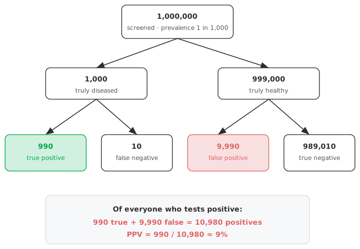
Take an excellent test — 99% sensitive and 99% specific — and hold it fixed while the prevalence changes. Per 100,000 people tested:
| Prevalence | With disease | True positives | False positives | PPV |
|---|---|---|---|---|
| 0.1% (1 in 1,000) | 100 | 99 | 999 | 9% |
| 1% | 1,000 | 990 | 990 | 50% |
| 10% | 10,000 | 9,900 | 900 | 92% |
| 50% | 50,000 | 49,500 | 500 | 99% |
The test never changed. At a prevalence of 1 in 1,000 the 999 false positives swamp the 99 true ones, so fewer than one positive result in ten is correct. At 50% prevalence the same test is right 99 times in 100.
A positive result from an excellent test can be more likely wrong than right when the disease is rare. Testing a symptomatic, high-risk group instead of the general population raises the prevalence, and the same test’s PPV rises with it. Screening an asymptomatic population and testing a symptomatic patient are different problems, even with the same assay.
All four statistics are proportions estimated from a finite sample, so all four carry uncertainty — often more than people expect, because the diseased group is frequently small. Report a confidence interval on every one. The Wilson score interval is a sound default. The Wilson interval behaves far better than the textbook (Wald) interval when the count is small or the proportion sits near 0 or 1. A naive interval in those conditions can run below 0% or above 100%.
A likelihood ratio combines sensitivity and specificity into one measure that, like them, does not depend on prevalence. The positive likelihood ratio, sensitivity divided by (1 − specificity), says how much more likely a positive result is in a diseased than a non-diseased person. Multiplying the pre-test odds by that ratio gives the post-test odds.
Reasoning that way takes you from a patient’s baseline risk to their risk after the result. You do so without a population prevalence that may not match the patient in front of you. See likelihood ratios explained for the full account: how the odds multiply, how to read the magnitude and the link to the ROC curve.
Download the CLSI EP12-A2 example workbook (.xlsx) — two qualitative tests for H. pylori evaluated against a known true state in 102 subjects. The workbook reports sensitivity and specificity with Wilson confidence intervals and predictive values at the study’s own prevalence, ready to open in the Analyse-it trial.
The example workbook is downloading.
It opens in Excel on its own — the data and the finished results are both in it. Analyse-it is what lets you change the analysis and re-run it, try the same study on your own data, or work through it to see how the software handles it.
Every feature from all five editions for 15 days.
Quoting a predictive value without a prevalence. A PPV is only meaningful for the prevalence it was computed at. Move the test to a population with different disease frequency and the number changes. State the prevalence, or report likelihood ratios instead.
Confusing sensitivity with PPV. “99% sensitive” and “a positive result is 99% likely to be right” are different claims, and the prevalence table above shows how far apart they can fall. For the 99%-sensitive, 99%-specific test in that table, the two agree only at a prevalence of 50%.
Ignoring the width of the interval. A sensitivity of 95% from 20 diseased subjects (19 of 20) has a 95% confidence interval reaching down to about 76%. Report the interval, and size the diseased group with its width in mind. See how many samples for a diagnostic accuracy study.
Forgetting the spectrum effect. Sensitivity and specificity measured on unambiguous cases overstate real-world performance in the difficult middle. Evaluate on the population the test will be used in.
Analyse-it turns a 2 × 2 table into the full set of measures, with intervals, inside Excel:
Every feature from all five editions for 15 days. Diagnostic accuracy is in the Medical, Method Validation and Ultimate editions, from US$ 340 a year. Validated against NIST and CLSI reference datasets. Full detail in the diagnostic performance reference guide; the ROC and AUC guide covers discrimination across all cut-offs.