
A Levey–Jennings chart checks that your measurement procedure is still on target before you release patient results from the same run. The chart plots the measured value of a stable quality-control material, run after run. A centre line marks the material’s established mean, and horizontal lines mark fixed multiples of its standard deviation (SD). Mechanically, the chart is an individuals chart: one point per control measurement, with control limits drawn at standard-deviation intervals. The difference is where the standard deviation comes from. A Levey–Jennings chart uses the material’s established mean and SD, not the moving-range estimate an individuals chart computes.
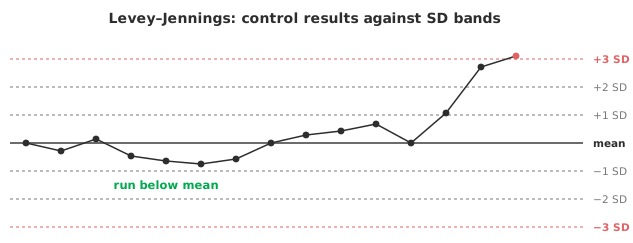
The centre line is the mean of the control material, established over a stable baseline period. The lines above and below sit at plus and minus one, two and three standard deviations of that same material.
Read each control result against those bands. A result close to the mean is expected. A result beyond ±2 SD is unusual but not rare: a stable method produces one about once in 22 results. A result beyond ±3 SD is a strong signal that something has gone wrong with the run, because a stable method produces one only about once in 370.
Crucially, the mean and SD are the laboratory’s own figures for that material on that method, gathered over enough runs to be stable. The manufacturer’s insert values describe a different setting and do not belong on the chart.
A method rarely performs identically across its range. Quality control therefore uses more than one level of control material, typically two or three spanning the low, normal and high parts of the measuring interval. Each level is charted separately with its own mean and standard deviation.
A method can sit in control at a normal concentration while drifting near a clinical decision point. Only a chart established at that level will show it. Establish and revise each level’s limits independently. Read the levels together: a shift on one but not the others points to a different cause than a shift on all at once.
Because a Levey–Jennings chart is a Shewhart chart, the patterns that signal trouble are the ones any control chart shows. A single point beyond 3 SD is the most obvious signal and, for a small shift, the slowest to arrive.
For a small shift, the patterns inside the limits matter more, because they arrive earlier. Two of them have names worth knowing.
A shift is a run of consecutive results on one side of the centre line. The measurement level has moved to a new value and stayed there. The cause is usually something that changed at a single moment, such as a new reagent lot, a recalibration or a maintenance visit. Eight or nine consecutive points on one side is the usual trigger: eight in the WECO and Montgomery rules, nine in Nelson’s.
A trend is a sequence of results climbing or falling steadily. Here the level is moving continuously rather than in one step, which points to something degrading: a deteriorating reagent, an ageing calibration, a drifting incubator temperature. Six or seven points in the same direction is the usual trigger.
A third pattern has no standard name but is equally informative. When results scatter further towards the limits than usual while the centre holds steady, imprecision has increased but the level has not moved.
Generic detection rule sets look for these patterns. The best known are the Western Electric (WECO) rules, the Nelson rules and the Montgomery rules. Each applies to a chart of QC material as readily as to one on a production line.
The commonest way a Levey–Jennings chart goes wrong is in its limits. Set the limits too tight and the chart rejects good runs and wastes reagent on repeats. Limits become too tight when they are set from too few runs or from a period that happened to be unusually stable.
Set them from the manufacturer’s insert rather than your own performance and they describe a laboratory that is not yours. Establish the mean and SD over a representative baseline of at least 20 runs, the minimum CLSI C24 sets, and refine them as data accumulate. Revisit them after any deliberate change to lot, calibration or instrument.
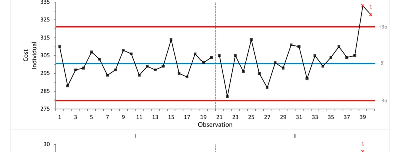
Download the individuals chart example (.xlsx): single observations on an I-MR chart across two phases, with limits from a known mean and sigma, as a Levey–Jennings chart takes them. The workbook is ready to open in the Analyse-it trial.
The example workbook is downloading.
It opens in Excel on its own — the data and the finished results are both in it. Analyse-it is what lets you change the analysis and re-run it, try the same study on your own data, or work through it to see how the software handles it.
Every feature from all five editions for 15 days.
Using insert values as the mean and SD. The chart must reflect your method’s own performance on the material, established locally, not the manufacturer’s figures.
Limits from too short a baseline. A handful of runs gives an unstable SD and limits that are too tight or too loose. Build the baseline over enough runs to settle.
Watching only for the 3 SD breach. Runs and trends within the bands are the early warning of a shift. Apply detection rules, not just the outer limit.
Never revising the limits. A new reagent lot or recalibration can move the mean. Re-establish the baseline after a deliberate change rather than charting against a stale one.
Analyse-it draws the chart and applies the rules to your own control data, inside Excel:
Every feature from all five editions for 15 days. Control charts are in the Quality Control & Improvement and Ultimate editions, from US$ 290 a year. Validated against published reference datasets and thousands of internal test cases. See reading out-of-control signals for the detection rules in full.