
Clinical trials, cohort studies and registries all produce time-to-event data: time to death, recurrence, graft failure, readmission. At the end of follow-up many subjects have not yet had the event. Some are still alive, some left the study, and for others the analysis was cut off while they were still event-free.
For these subjects the survival time is not known, only that it exceeds the time observed so far. Such an observation is censored (strictly, right-censored), and censoring is common rather than exceptional.
Discarding censored subjects throws away much of the data and biases the result. Treating their last-seen time as an event time is also wrong, because it counts events that did not happen and understates survival. The Kaplan–Meier estimator is the standard way to estimate the survival function while using every subject for exactly as long as they were observed.
A censored subject still carries information. Someone event-free at 18 months tells you the survival probability has not dropped to zero by 18 months, even though you never see their event. The mean and median of the observed times cannot use that information accurately. A mean of follow-up times is not a mean survival time when half those times are censored, and it will understate survival badly.
What you need is an estimate of the survival function itself: the probability of remaining event-free beyond each point in time. A censored subject contributes to the risk set up to the moment they are censored and then simply leaves it, without being counted as an event.
The estimator steps down only at the times an event actually occurs. At each event time, the survival probability so far is multiplied by the fraction of the at-risk group that comes through that time without the event. That fraction is the number at risk minus the number of events, divided by the number at risk. Between events the curve is flat.
A censoring time produces no step. The censored subject simply leaves the risk set, so every later step is computed over a smaller denominator. The result is the familiar descending staircase, whose shape depends entirely on when events happened and how many subjects were still being followed at the time.
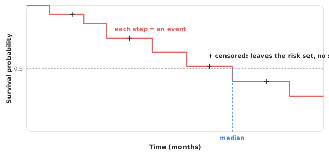
Three quantities can be read from the estimate. The median survival is the time at which the curve crosses 0.5. The median is more informative than a mean when the distribution is skewed or the tail is heavily censored, and it is reported with a confidence interval.
The survival probability at a given time — one-year survival, five-year survival — is read vertically off the curve at that time, again with an interval.
The mean survival time is the area under the survival curve. The identity surprises people, so it is worth seeing why it holds. The curve gives S(t), the probability of surviving beyond time t. Take a thin slice of time of width dt at time t. The fraction of subjects still alive through that slice is S(t), so the slice contributes S(t) × dt to the average time lived. Add up every slice and you have added up the whole area under the curve, which is therefore the mean survival time. The same argument is why a curve that stays high for longer represents a longer average survival, whatever shape it takes on the way down.
One caveat follows from that. The area can only be measured over the times you observed, so where follow-up is incomplete the mean is defined only up to the last observed time. A restricted mean survival time over a fixed horizon — mean survival within five years, say — is often the honest summary. The restricted mean is also the fallback when the proportional-hazards assumption fails.
Quoting any of these without a confidence interval hides how much precision the censoring has cost you.
A survival curve is conventionally published with a number-at-risk table beneath it, giving how many subjects remain under observation at each of a series of time points. The number falls for two different reasons: subjects who have the event leave the risk set, and so do subjects who are censored.
The table tells you how much to trust the right-hand end of the curve. Early in follow-up the estimate rests on the full cohort. Late in follow-up it may rest on a handful of subjects, so each remaining event moves the curve by a large step and the confidence interval widens sharply. A curve that looks flat and reassuring beyond five years means very little if only six subjects were still at risk at that point.
Read the number at risk before drawing any conclusion from the tail. A published curve without one should be treated with suspicion, because the reader has no way to judge where the estimate stops being reliable.
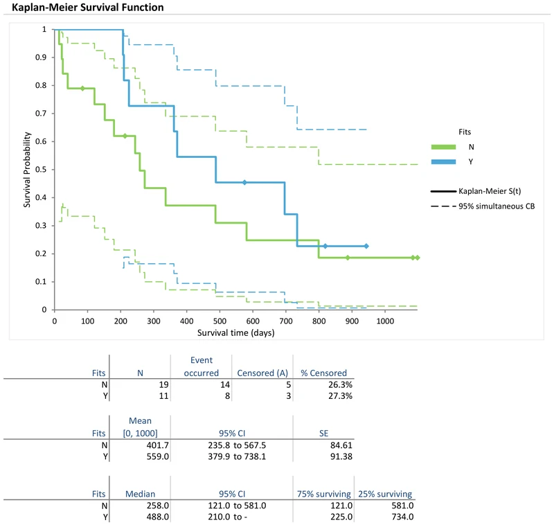
A pointwise confidence interval has its stated coverage at one nominated time only, such as five-year survival. Joined up across the follow-up, the pointwise intervals do not have that coverage for the whole curve at once. If you scan across the entire follow-up looking for where the curves separate, a pointwise band will mislead you, because you are making many comparisons.
A simultaneous confidence band holds across the whole time range. The Nair (equal-precision) and Hall–Wellner bands are the two standard constructions, differing in where they are widest. The Nair band is the pointwise interval widened by a constant factor, so it keeps the pointwise shape. The Hall–Wellner band is narrower than the Nair band in the middle of follow-up and wider at the early and late extremes. Use a pointwise interval for a single pre-specified time, and a simultaneous band for statements about the curve as a whole.
Reading the tail of the curve without the number at risk. The far right of a survival curve often rests on a few subjects, where one event moves the estimate a long way. Check how many remain at risk before quoting a late survival probability.
Averaging the follow-up times. The mean of observed times is not the mean survival time when observations are censored, and it understates survival. Estimate the survival function, and take the mean as the area under it.
Dropping censored subjects. Censored subjects carry information up to the time they were last seen. Excluding them discards much of the data and biases the estimate. Kaplan–Meier uses each subject for exactly as long as they were observed.
Reading a pointwise band as if it covered the whole curve. Pointwise coverage holds at one pre-specified time only. To make statements across the follow-up, use a simultaneous band.
Quoting a median past the data. If the curve never reaches 0.5 within follow-up, the median is not estimable. Report survival at a defined time instead of extrapolating a median that the data do not support.
Download the Kaplan–Meier example workbook (.xlsx) — brain cancer survival in 30 patients, analysed by the yes/no Fits factor (19 patients against 11) and by tumour grade over three groups. Both analyses give mean survival restricted to [0, 1000] days and median survival with 95% confidence intervals, quartile survival times and a log-rank test. The Fits analysis adds a 95% simultaneous confidence band, and the tumour grade analysis a log [−log S(t)] vs log t plot. The workbook is ready to open in the Analyse-it trial.
Analyse-it estimates the survival function from your own time-to-event data, inside Excel:
Every feature from all five editions for 15 days. Survival analysis is in the Medical and Ultimate editions, from US$ 340 a year. Full detail in the survival and reliability reference guide. The group-comparison tests and Cox regression the rest of the study needs are in the same editions.