
Snee collected data on the hair color and eye color of 592 students on a statistics course. The question is how to understand the association between the two variables. For more information see Story: Patterns of Association.
In this tutorial you will perform the following tasks:
When two variables are measured the relationship between them is often of interest. A contingency table describes the joint distribution of the variables. It can also describe the marginal distributions of each variable, or the conditional distribution of one variable given the other.
The contingency table shows the joint distribution of the variables.

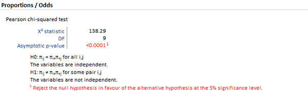
The hypothesis test p-value is highlighted as it is less than 5% significance level (the actual p-value is < 0.0001). You can interpret the p-value as indicating a substantial departure from independence.
A p-value offers little insight into the data. It may indicate that there is an association, but does not identify the nature of the relationship. A mosaic plot expresses the deviations from independence.
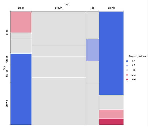
The mosaic plot represents the counts in a contingency table by tiles whose area is proportional to the cell count. Column widths show the marginal proportions of hair colors. The heights of the tiles show the conditional frequency of eye color given hair color. Under the null hypothesis of independence, the heights of the tiles in each row should be the same.

It is easier to see the deviation from independence by coloring and shading the tiles by the residuals from the Pearson test. Positive deviations are blue, negative red. The absolute value of the residual is shown by the shading; cells with residuals less than 2 are unfilled; cells >= 2 are filled; those >= 4 are filled with a darker pattern. Under the assumption of independence, these values roughly correspond to two-tailed probabilities p < .05 and p < .0001 that a given value of exceeds 2 or 4.
You can see from the mosaic plot that Black/Brown and Blond/Blue are over-represented, while Blond/Brown is under-represented.
To increase the visual impact of the mosaic plot you can reorder the rows and columns to make the pattern more coherent. It is useful to re-order the categories so that the deviations from independence have opposite-corner pattern, with positive values running from bottom-left to top-right corners and negative values along the opposite diagonal.
The over-representation of Black/Brown and Blond/Blue is now much more apparent, together with the under-representation of Blond/Brown and people with Black hair and Blue eyes. Although the table was reordered based on the residuals you can see that both dimensions are ordered from dark to light, suggesting an explanation for the association.
From the Tutorials for Analyse-it 6.24.0: https://analyse-it.com/docs/tutorials/association