
On March 1, 1984 the Wall Street Journal published data on the advertising spend and yield for a number of commercial TV adverts. The advertisements were selected by an annual survey conducted by Video Board Tests, Inc., a New York ad-testing company, based on interviews with 20,000 adults who were asked to name the most outstanding TV commercial they had seen, noticed, and liked. The retained impressions were based on a survey of 4,000 adults, in which regular product users were asked to cite a commercial they had seen for that product category in the past week. Of interest is fitting a model to describe the relationship, and making predictions using the model. For more information see DASL Story: TV Advertising Yields.
In this tutorial you will perform the following tasks:
The scatter plot is a fundamental tool for looking at bivariate data. It shows the important characteristics of the data and can be used to decide what model may describe the relationship between the variables.
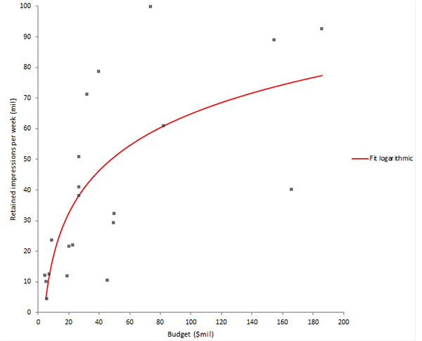
The scatter plot suggests the relationship between advertising yield and spend is not a straight line. It appears the yield increases sharply at lower spend and levels out as spending increases.
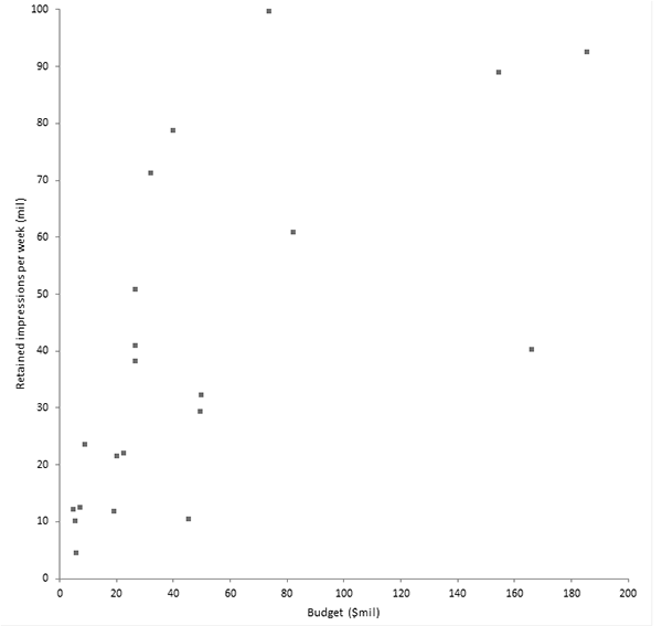
After inspecting the scatter plot the next step is to fit a model to describe the relationship.
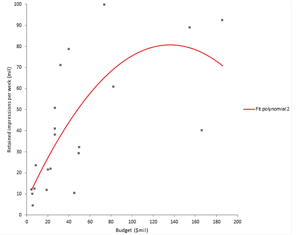
The regression line on the scatter plot shows the relationship described by the model.
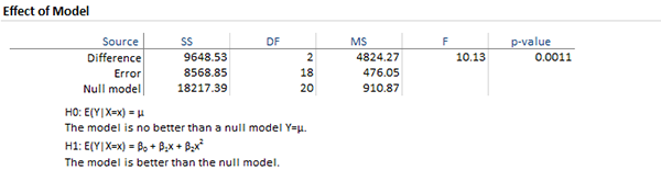
The effect of model table p-value of 0.0011 tells you that there is a statistically significant relationship between spend and yield.
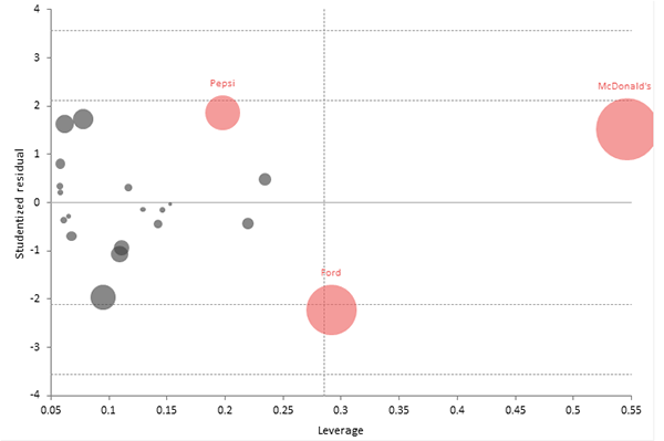
The residual plot and normality plot show that the assumptions do not seem to be seriously violated.

However the influence plot shows that McDonald's has a large influence on the fit.
Looking again at the scatter plot and fit shows there is a downturn in the fitted line, compared to the data, as the spend increases. It might be worth considering alternative models to better describe the relationship.
After fitting a model and looking at the diagnostics you might reconsider some decisions. Often you may want to reformulate the model by changing the fit, or by adding, removing, or applying transformations to the variables.
The scatter plot suggests the logarithmic model fits quite well and better describes the relationship than a quadratic model. The influence plot shows there are no outliers or highly influential plots.
In many cases the purpose of model fitting is to make predictions about the response given a value of the predictor.
It is important to remember that making predictions outside the observed range of the data (known as extrapolation) is risky. It is impossible to be sure that the fitted relationship extends beyond the observed range.
For a Budget of 100 million $ the average retained impressions per week is 64.9 million. The 95% confidence interval (CI) 50.2 to 79.5 million is the uncertainty in the mean estimate. The 95% prediction interval (PI) 18.2 to 111.6 is the interval we would expect a single future observations to lie within.

From the Tutorials for Analyse-it 6.24.0: https://analyse-it.com/docs/tutorials/simple-regression