
Correlation cannot tell you whether two methods agree. Regression characterises the bias but not, at a glance, its size in the units you care about. The Bland–Altman difference plot answers the question a method comparison exists to ask. The question is how far apart the two methods’ answers are, across the measuring range, in the analyte’s own units. The plot is the most useful single picture in a method comparison, and also the one most often read without care.
For each sample, plot the difference between the two methods on the vertical axis against the mean of the two on the horizontal. The mean is used as the best available estimate of the true value when neither method is a reference. Plotting the difference against one of the methods instead would build in a spurious relationship. When one method is a true reference, plotting the difference against that reference is legitimate and often preferred.
Changing the axes in this way makes bias visible. A scatter plot of one method against the other hides a constant offset inside a cloud near the line of equality. The difference plot puts the offset on the vertical axis where you can see it.
Two numbers summarise the plot. The mean difference is the average bias between the methods, and a value away from zero means one method reads systematically higher than the other. The limits of agreement are that mean difference plus and minus 1.96 standard deviations of the differences:
limits of agreement = mean difference ± 1.96 × SD of the differences
The multiplier is 1.96 because 95% of a normal distribution lies within 1.96 standard deviations of its mean. The two limits therefore bracket about 95% of the differences between the methods. Note that the standard deviation is the one of the differences, not of either method’s own results.
The limits are what you report, because they say in plain units how far apart the two methods are likely to be for an individual sample. Compare them against a clinically allowable difference. Limits that fall inside what is clinically tolerable mean the methods can be used interchangeably. Limits that fall outside it mean they cannot, however small the mean bias. A near-zero average difference counts for little when individual samples still disagree by more than is clinically acceptable.
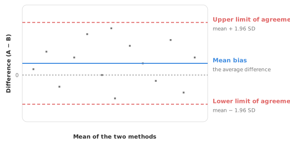
Constant limits of agreement assume two things, and the plot itself lets you check both. The differences should be roughly normally distributed, and the bias and the scatter should be constant across the measuring range. A violation shows up immediately in the picture. The commonest violation is a cloud of differences that fans out as concentration rises. Constant limits are then too wide at the bottom of the range and too narrow at the top. Quoting a single pair of limits for such data misleads the reader.
When the scatter grows with concentration, you have two options. The first is to transform the data. A log transformation often stabilises the spread, and constant limits on the log scale then become proportional limits back on the original scale.
The second is to model the relationship. Regress the differences on the mean to model the bias, and the absolute residuals on the mean to model the scatter (Bland and Altman 1999). The limits of agreement then widen with concentration, following the data rather than pretending the spread is flat. A percentage difference plot, showing the difference as a proportion of the mean, is a third view that often makes a proportional pattern obvious. Do not fit constant limits to a fanning plot and report them as if they held everywhere.
The limits of agreement are computed from a sample, so they carry their own uncertainty. The confidence interval around a limit is wide unless the sample is substantial, which is why a method comparison needs a reasonable number of samples. The standard error of each limit is about 1.7 times the standard error of the mean bias (Bland and Altman 1986). A limit therefore needs about three times as many samples as the mean bias to be estimated equally precisely. Report the confidence intervals alongside the limits.
Bland–Altman analyses are often under-reported. Bland and Altman’s own papers, and the reporting guidance that follows them, ask for a specific set of items. Report all of these:
Two omissions account for most weak reports. The first is quoting limits of agreement with no allowable difference to judge them against, which leaves the reader unable to tell whether the methods agree well enough. The second is quoting the limits without their confidence intervals, which presents an uncertain estimate as though it were exact.
Limits of agreement and confidence intervals are often confused, but they describe different things.
The limits of agreement describe the spread of individual differences: how far apart the two methods are likely to be for one sample. The limits stay roughly the same width however many samples you collect, because they describe the methods, not your study.
A confidence interval describes uncertainty in an estimate. The mean difference has one, each limit of agreement has one, and all of them narrow as the sample grows. A confidence interval on a limit answers “where might this limit really sit?”, while the limit itself answers “how far apart might two measurements of one sample be?”.
A study can therefore have a tight confidence interval around a limit of agreement that is far too wide to accept. Equally, a study can have a tolerable limit estimated so imprecisely that you cannot rely on it. Report both, and judge the limit against the allowable difference while judging the interval against how much precision your decision needs.
The two answer different questions and work best together. Bland–Altman asks “how far apart are the methods, and is that acceptable?”, judging agreement in clinical units against an allowable difference. Regression — Deming or Passing–Bablok — asks “what is the structure of the bias?”. The regression separates a constant offset from a proportional one and estimates the bias at specific decision points. A thorough comparison runs both. Use the difference plot to judge whether the disagreement is tolerable. Use the regression to characterise where it comes from.
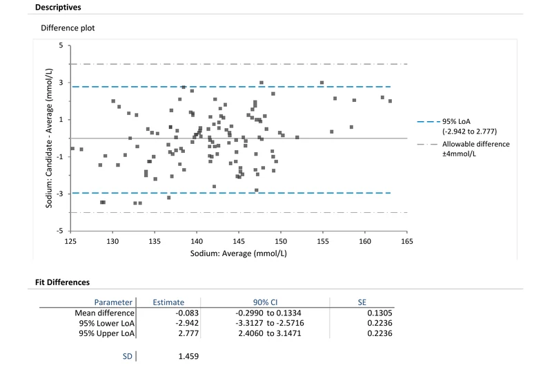
Download the CLSI EP21-A Bland–Altman example workbook (.xlsx) — a sodium agreement analysis with the mean difference, limits of agreement, and an allowable difference band, ready to open in the Analyse-it trial.
The example workbook is downloading.
It opens in Excel on its own — the data and the finished results are both in it. Analyse-it is what lets you change the analysis and re-run it, try the same study on your own data, or work through it to see how the software handles it.
Every feature from all five editions for 15 days.
Reporting limits of agreement with nothing to judge them against. Limits of −2.9 to 2.8 mmol/L are neither good nor bad until you state the allowable difference. Without it the reader cannot reach a conclusion.
Plotting the difference against one method instead of the mean. Unless that method is a true reference, this builds in a spurious slope. Use the mean of the two.
Reporting only the mean bias. A small average difference can hide wide limits of agreement. The limits, not the mean, are what you compare against the allowable difference.
Fitting constant limits to a fanning plot. If the scatter grows with concentration, constant limits are wrong across most of the range. Transform, or let the limits vary with the mean.
Using a Bland–Altman analysis unchanged to compare two instruments. The plot is right, but the question for two analysers running the same method is different. What matters is whether each difference sits inside a pre-set limit, not what the limits of agreement are. See comparing instruments within one laboratory.
Quoting the limits without their confidence intervals. The limits of agreement are uncertain, especially with modest samples. Report the intervals, and size the study to make them tight.
Analyse-it builds the difference plot and the limits from your own pairs, inside Excel:
Every feature from all five editions for 15 days. Method agreement is in the Medical, Method Validation and Ultimate editions, from US$ 340 a year. Validated against NIST and CLSI reference datasets. Full detail in the method comparison reference guide; see also why correlation fails and choosing a regression.