
Cross-tabulate two categorical variables and you have a contingency table. Which test applies depends on three things. The first is whether the observations in the two classifications are independent or paired. The other two are how large the table is and how large the expected counts are. Get the first one wrong and no amount of care with the other two will rescue the analysis.
The Pearson χ² test asks whether two classifications are independent. The table can be any size, provided each subject contributes to exactly one cell: treatment group by outcome, supplier by defect type. The test compares the counts you observed with the counts you would expect under independence, and sums the squared discrepancies, each divided by its expected count.
For a 2 × 2 table the same test can be read as comparing two proportions, which is usually the more natural framing. The likelihood-ratio G² test answers the same question a different way and generally agrees. Some prefer it for its additivity when tables are partitioned.
The important caveat is about the expected counts, not the observed ones. The χ² approximation degrades when expected counts are small. The conventional guidance is that all expected counts should be at least 5, though a small number between 1 and 5 is usually tolerable in a larger table. Software will happily compute χ² on a table where the approximation has broken down and hand you a p-value that means nothing.
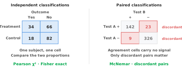
Fisher’s exact test computes the probability directly rather than approximating it, so it is valid however small the counts. For a 2 × 2 table with sparse cells it is the right choice. With modern computing there is little reason not to use it as the default for small 2 × 2 tables generally.
Yates’ continuity correction is a historical device worth retiring. Yates devised it to make χ² behave more like Fisher’s test before the latter was practical to compute. The correction over-corrects, and now that the exact test is easy to run there is no reason to use it.
Paired classifications are the case that gets missed most often. If the same subjects are classified twice, the observations are not independent and χ² does not apply. Paired designs include two tests run on each specimen, an assessment before and after, and matched case-control pairs.
The table now means something different. The diagonal cells are the pairs where the two assessments agreed. The off-diagonal cells are where they disagreed. McNemar’s test asks whether the two kinds of disagreement are equally common, which is really the question “did the proportion change?” The test uses only the discordant pairs, because subjects on which both assessments agree carry no information about a difference between them.
Power therefore depends on the number of discordant pairs, not the number of subjects, which often surprises people. A study with 500 subjects and only 12 discordant pairs has much less power than its sample size suggests. Relying on the discordant pairs alone also means the exact form of the test matters when those counts are small.
Do not confuse McNemar with agreement. McNemar asks whether the marginal proportions differ, that is, whether one test calls more positives than the other overall. Two tests could disagree on a great many individual subjects while calling the same total number positive. McNemar would find nothing and agreement would be poor. If agreement between raters or methods is the question, you want Cohen’s kappa, which measures something different.
A significant χ² test says the classifications are related. What it does not say is how strongly, or in which direction. For a 2 × 2 table there are three standard measures, and which one you quote should be a deliberate choice.
The difference in proportions (risk difference) is on the most interpretable scale. Twelve percentage points is something anyone can reason about, which makes the risk difference the right measure when absolute impact is what matters.
The ratio of proportions (risk ratio) expresses the effect multiplicatively: twice as likely. The risk ratio is intuitive but hides the baseline. Doubling a risk from 0.1% to 0.2% is a very different proposition from doubling 20% to 40%.
The odds ratio compares odds rather than probabilities, is the measure that comes out of logistic regression, and is the one most often misread as a risk ratio. The two diverge whenever the outcome is common.
Each should carry a confidence interval. The method used to construct it matters more than for most statistics. Simple normal-approximation intervals behave poorly near 0 and 1 and with small samples. Score-based intervals (Miettinen-Nurminen, Newcombe, Tango, Wilson) behave far better at the boundaries, and proportions in diagnostic and quality work often sit there.
A significant χ² on a 4 × 5 table tells you the classifications are related somewhere, without saying where. Pearson residuals locate it. Each is (observed − expected) / √expected, and its square is that cell’s contribution to χ². A large positive residual is a cell with far more observations than independence would predict.
A mosaic plot coloured by Pearson residual shows this directly, with cell areas proportional to counts, and it is a considerably faster read than a table of residuals. Grouped and stacked frequency plots are the plainer alternatives when the structure is simple.
A 2 × 2 table comparing a test against a reference standard looks identical to the tables above but is read quite differently. The question is not association but sensitivity and specificity, conditioning on true status. The correct vocabulary is percent agreement rather than sensitivity where there is no gold standard, only a comparator method. PPA and NPA vs sensitivity and specificity covers that case.
Download the contingency table example workbook (.xlsx) — hair and eye colour for 592 people, with the Pearson χ² test, a clustered frequency plot and a mosaic plot coloured by Pearson residual. The second example covers a paired 2 × 2 table: before and after an intervention, with the proportion difference, its Tango score interval and the McNemar test.
The example workbook is downloading.
It opens in Excel on its own — the data and the finished results are both in it. Analyse-it is what lets you change the analysis and re-run it, try the same study on your own data, or work through it to see how the software handles it.
Every feature from all five editions for 15 days.
Using χ² on paired data. The same subjects assessed twice need McNemar. This is the commonest error in the topic.
Checking observed counts instead of expected ones. It is the expected counts that govern whether the χ² approximation holds.
Reporting a p-value with no effect measure. Give the difference, ratio or odds ratio with a confidence interval.
Using McNemar to assess agreement. It tests marginal proportions. Agreement is kappa.
Normal-approximation intervals on proportions near 0 or 1. They can run outside the possible range entirely. Use score-based intervals.
Stopping at a significant χ² on a large table. Residuals or a mosaic plot tell you which cells are driving it.
Analyse-it builds the contingency table from Compare Groups, or from Compare Pairs for paired data, and runs the tests on it, inside Excel:
Every feature from all five editions for 15 days. Categorical data analysis is part of the Standard edition, so it is in every Analyse-it edition, from US$ 155 a year. Validated against NIST Standard Reference Datasets.