
A correlation coefficient compresses the relationship between two variables into one number between −1 and +1. The compression is useful, and it is also risky. Very different patterns can produce the same coefficient, and the number alone cannot tell you which pattern you have. Plot the data first.
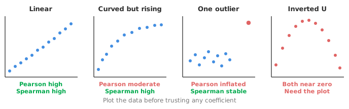
Pearson’s r measures how closely the points cluster around a straight line. The word linear matters. A relationship can be perfect, deterministic and unmistakable to the eye and still return a modest Pearson r if its shape is curved.
Pearson’s r assumes both variables are continuous and, for the confidence interval and test, approximately bivariate normal. The coefficient is sensitive to outliers, since one point in the far corner of a scatter plot can move r substantially. A change of units, by contrast, has no effect on r.
Square it and you get the proportion of variance in one variable that the linear relationship accounts for. The squared value is a useful reality check. An r of 0.7 sounds strong until you notice it accounts for under half the variation.
Spearman’s rs is Pearson’s correlation computed on the ranks rather than the values. Replacing values by ranks discards the spacing between them and keeps only the order. Ranking therefore changes what is being measured: not whether the relationship is a straight line, but whether it is consistently increasing or consistently decreasing.
Three consequences follow. First, Spearman handles curved-but-monotonic relationships that Pearson understates. Second, Spearman is more resistant to outliers, because an extreme value just becomes the highest rank. Third, Spearman works on ordinal data, such as severity scores or grades, where the order is meaningful but arithmetic on the values is not.
Kendall’s τ also works on order, but by a different construction. Tau considers every pair of observations and asks whether they are concordant or discordant. In a concordant pair, the observation that is higher on the first variable is also higher on the second. Tau is essentially the excess of concordant over discordant pairs as a proportion of all pairs.
The construction gives tau a more direct interpretation than Spearman’s coefficient. A τ of 0.6 means concordant pairs outnumber discordant ones by 60% of all pairs. Tau is also better behaved with small samples, and handles tied values more gracefully, which matters when data are coarsely ranked with many repeats. Its numerical value is typically smaller than Spearman’s on the same data, and that is a property of the different definitions rather than a weaker relationship. Never compare the two directly.
Use Pearson when “linear” is genuinely what you mean, both variables are continuous, the relationship looks linear on a scatter plot and no outliers distort it.
Use Spearman when either variable is ordinal, when the relationship is monotonic but curved, or when outliers or skew make Pearson unreliable.
Use Kendall in the same situations as Spearman. Prefer it for small samples, for data with many ties and when you want a coefficient you can state in plain terms.
Report a confidence interval whichever you choose. Correlation coefficients from small samples are far less stable than they look: an r of 0.6 from fifteen observations carries an interval running roughly from 0.1 to 0.85. An interval that wide is a considerably more accurate description than the point estimate alone.
Correlation is not causation. The warning is familiar, yet correlations are still often reported as if they showed cause. A lurking third variable driving both is always available as an explanation.
Correlation depends on the range you sampled. Restrict the range and the correlation shrinks. Widen it and the same underlying relationship yields a higher coefficient. The number describes your sample as much as the relationship itself.
Correlation is symmetric and has no units. It cannot tell you how much one variable changes per unit of the other. If that is the question, you want regression, which is directional and reports an effect on the scale of the measurement.
Correlation is not agreement. This is the misuse that does real damage. Two measurement methods can correlate at 0.99 while one reads consistently 20% higher than the other. Correlation is blind to that, because it is blind to the line the points sit on. For comparing methods you need bias and limits of agreement, not a coefficient, as set out in why correlation is the wrong statistic for method comparison.
With many variables, a correlation matrix, especially colour-mapped, is an efficient overview. A scatter plot matrix beside it prevents the mistake the fourth panel above illustrates. Where the matrix shows blocks of variables moving together, factor analysis is the method that estimates what they have in common.
But be careful with the p-values. Ten variables produce 45 correlations. At the 5% level, more than two would be expected to look “significant” even if nothing were related at all. A matrix is for finding candidates worth investigating, not for harvesting significant results. Where many correlated variables need summarising rather than sifting, principal component analysis is the better tool.
Download the correlation example workbook (.xlsx) — New York neighbourhood liveability, five variables, with Pearson coefficients, confidence intervals and significance tests, a colour-mapped correlation matrix and a scatter plot matrix, ready to open in the Analyse-it trial.
The example workbook is downloading.
It opens in Excel on its own — the data and the finished results are both in it. Analyse-it is what lets you change the analysis and re-run it, try the same study on your own data, or work through it to see how the software handles it.
Every feature from all five editions for 15 days.
Computing a coefficient without plotting the data. Curvature, clusters and outliers are all invisible in a single number.
Using correlation to assess agreement between methods. It cannot see bias at all. Use bias and limits of agreement.
Comparing Kendall’s τ with Spearman’s rs. The two are defined differently and sit on different scales, and τ is routinely smaller for the same relationship.
Reading a low Pearson r as no relationship. It means no linear relationship. An inverted-U can be perfect and score zero.
Harvesting significant correlations from a large matrix. With 45 coefficients, a few will reach significance by chance alone.
Ignoring the range you sampled. A narrow range depresses the coefficient; a wide one inflates it. Neither changes the underlying relationship.
Analyse-it reports the coefficient and the shape together, inside Excel:
Every feature from all five editions for 15 days. Correlation is part of the Standard edition, so it is in every Analyse-it edition, from US$ 155 a year. Validated against NIST Standard Reference Datasets. Full detail in the correlation reference guide.