
Principal component analysis (PCA) re-expresses a set of correlated variables as a new set of uncorrelated ones, the principal components. The components are ordered so the first captures as much of the variation as possible, the second as much of what remains, and so on. Measurements taken on the same samples are usually related, because several reflect a common underlying property. When the variables are strongly correlated, the first few components carry most of the variation.
Nothing is discarded in the process itself: with p variables you get p components, which together contain exactly the information you started with. The reduction happens later, when you decide the last few components are just noise and stop looking at them.
Three quantities do the work here, and telling them apart is most of understanding the output.
Loadings (the coefficient matrix) say how each original variable contributes to each component. They are what you read to interpret a component. If six variables all load heavily and positively on the first component, that component is a general “size” or “overall level” axis. If some load positively and others negatively, it contrasts the two sets instead.
Scores are each observation’s position on each component: the new coordinates. Plotting the first two scores against each other is often the single most informative picture you can get of a multivariate dataset. The plot can show clusters, gradients and outliers that no single pair of original variables makes obvious.
Eigenvalues tell you how much variance each component accounts for. As a percentage of the total, the eigenvalues show how much variation the first few components capture, and so how much you lose by ignoring the rest.
A biplot puts observations and variables in the same picture. The biplot is where PCA becomes useful for interpretation rather than just a tidy summary. In the classic Gabriel biplot, observations appear as points and variables as vectors radiating from the origin.
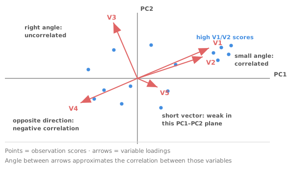
That last rule is what makes a biplot worth the trouble. You can look at a cluster of samples and read off directly which measurements characterise it. A Gower-Hand biplot goes further, drawing variables as calibrated axes with scale markings rather than as vectors. You can then read approximate values off the plot instead of just directions. Where only the variable structure is of interest, a correlation monoplot shows the variables alone.
PCA maximises variance. A variable with a large numeric spread dominates the components simply because of its units. Measure one thing in metres and another in millimetres and the second has a variance a million times larger, so it takes over the first component.
Running PCA on the correlation matrix is equivalent to standardising every variable to unit variance first, which removes the problem. Standardising is the right default whenever variables are measured on different scales. Use the covariance matrix only when all variables share the same units and their relative variances are genuinely part of what you want the analysis to reflect.
No single rule settles this, and treating any of the conventions as firm is a mistake. Four approaches are used, and they are best used together.
The scree plot shows eigenvalues in order. You look for the elbow where the curve flattens, and keep the components above it. The cumulative variance criterion keeps enough components to reach a chosen percentage. A threshold of 80% is common and entirely arbitrary. The eigenvalue-greater-than-one rule, applied to a correlation matrix, keeps components explaining more than a single original variable would. The rule is the most mechanical of the four and tends to keep too many. Parallel analysis keeps a component only while its eigenvalue exceeds that of random data of the same size, and performs best of these in simulation studies.
Keep a component if you can interpret it. A component that no combination of your subject knowledge can make sense of is usually noise, whatever its eigenvalue says.
PCA and factor analysis are routinely conflated, but they answer different questions. PCA is descriptive: it re-expresses the total variance in the observed variables, with no model behind it. The components are constructions rather than claims about anything real.
Common factor analysis assumes a model: a small number of unobserved latent factors generate the shared variance among your variables, with the rest unique to each. Factor analysis separates common from unique variance, which PCA does not, and rotation is a routine part of interpreting it. Orthogonal rotations such as Varimax keep factors uncorrelated. Oblique ones such as Oblimin allow them to correlate, which is often more realistic.
The practical rule: if you want to compress correlated measurements into a few summary axes, use PCA. If you believe in underlying constructs and want to estimate them (the usual situation with questionnaire or rating data), use factor analysis. If the factors will form a scale, check its internal consistency with Cronbach’s alpha as well.
PCA finds linear combinations, so a curved structure gets spread awkwardly across several components rather than captured by one. PCA is also unsupervised: components are chosen to explain variance among the predictors, with no reference to any outcome. So the component that explains the most variance need not be the one that predicts anything. And PCA is sensitive to outliers, because a single extreme observation can inflate a variance and tilt a component towards itself. Check a score plot for exactly that before you interpret anything.
Download the multivariate example workbook (.xlsx) — a principal component analysis of 12 neighbourhood liveability measures, with eigenvalues and coefficients, a PCA biplot with the neighbourhoods marked by borough and a correlation monoplot. The same workbook holds a common factor analysis reporting uniqueness, communality and loadings, and is ready to open in the Analyse-it trial. The correlation example covers the correlation matrix and scatter plot matrix that usually come before a PCA.
The example workbook is downloading.
It opens in Excel on its own — the data and the finished results are both in it. Analyse-it is what lets you change the analysis and re-run it, try the same study on your own data, or work through it to see how the software handles it.
Every feature from all five editions for 15 days.
Not standardising variables on different scales. The components will follow the units rather than the structure.
Treating the eigenvalue-greater-than-one rule as a decision. It is a convention, and a generous one. Read the scree plot and ask whether the component means anything.
Naming a component and then reasoning as if it were real. A label is a convenience for discussion, not evidence that an underlying quantity exists.
Confusing PCA with factor analysis. One re-expresses total variance with no model; the other estimates latent factors from shared variance. The two answer different questions. Factor analysis explained takes the other side of the distinction.
Reading vector length as importance without checking the plane. A short vector means the variable is poorly represented by these two components, not that it is unimportant. The variable may load heavily on a later component.
Interpreting components before checking for outliers. One extreme observation can define an entire component.
Analyse-it computes the components and draws the biplots, inside Excel:
Every feature from all five editions for 15 days. PCA and factor analysis are part of the Standard edition, so they are in every Analyse-it edition, from US$ 155 a year. Validated against NIST Standard Reference Datasets. See Pearson, Spearman or Kendall for the correlations underneath, or the reference guide for the technical detail.