
A residual is what the model got wrong for one observation: the value you measured minus the value the model predicted. If the model has captured the structure in the data, what remains should be nothing but noise, scattered evenly about zero with no pattern of any kind. Any pattern in a residual plot is structure the model failed to capture, and it is telling you something the summary statistics cannot.
The same logic applies to regression, ANOVA and ANCOVA, which are the same fitted model underneath. The summary statistics — R², F, p — all summarise the model as if its form were right, so none of them can tell you whether it is.
Plot residuals against fitted values, or against a predictor. Look for a shapeless horizontal band centred on zero. Four departures from that are worth recognising on sight.
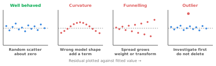
Curvature. Residuals that arch (negative at both ends and positive in the middle, or the reverse) mean you have fitted a straight line to something bent. The fix is in the model, not the data: add a polynomial term, transform a variable, or fit a non-linear form. Curvature is a common finding and is often missed, because a curved relationship can still produce a very high R².
Funnelling. A residual band that widens as the fitted value grows (heteroscedasticity) means the measurement is more variable at high values than at low ones. Funnelling is extremely common for anything measured as a concentration or a count. The model’s coefficients may still be reasonable, but the standard errors and intervals are not, because they assume one constant variance. The remedy is a variance-stabilising transformation, or weighting the fit so the more precise observations count for more. The same reasoning lies behind weighted regression in fitting a calibration curve.
Outliers. An outlier is a single residual far from the rest, worth investigating but never worth deleting on the strength of the plot alone. A genuine extreme value is data and a transcription error is not, and the plot cannot tell you which one you have.
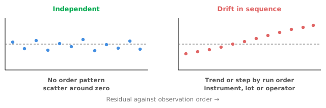
Drift in sequence. Plot residuals in the order the data were collected. Any trend, cycle or step is evidence that something changed during the run: a drifting instrument, a new reagent lot, a second operator. A lag-1 plot (each residual against the one before it) exposes serial correlation directly. Independence is an assumption of the model, and one that is often violated without anyone noticing.
The residual distribution plot and the normal Q-Q plot address the normality assumption. Be clear about how much the assumption actually matters, because it gets more attention than it deserves. Regression and ANOVA assume the residuals are approximately normal, not the response and not the predictors. With a reasonable sample size, moderate departures affect the confidence intervals on the coefficients very little. Prediction intervals for single new observations are the exception, because they depend on the shape of the error distribution at any sample size.
A Q-Q plot that falls below the line at the left and rises above it at the right, an S shape, indicates heavy tails. One that bows the same way along its whole length indicates skew, usually better treated by transforming the response than by abandoning the model. What should concern you is not a slightly wavy Q-Q plot but a badly skewed one. Strong skew often travels together with the funnelling above and has the same fix. Testing normality — and what to do when it fails goes further into when normality actually matters.
Leverage measures how unusual an observation’s predictor values are: how far out along the x-axis it sits. Influence measures how much the fitted model would change if you removed the observation. The two are not the same, and a residual plot alone will not show you the difference.
A point with high leverage that lies on the trend has almost no influence, and may even help pin the fit down. The dangerous case is a point with high leverage that sits off the trend. Such a point can drag the entire line towards itself and, having done so, ends up with a small residual, because the line now passes close to it.
Cook’s D combines both into one number: how much the fitted values as a whole shift when an observation is dropped. An outlier and influence plot, of studentised residuals against leverage with each point sized by Cook’s D, separates unusual points from influential ones. If one or two observations are carrying your conclusion, you want to know before you report it, not after a reviewer asks.
R² is the proportion of variance the model explains. That proportion says nothing about whether the model is the right shape, whether the variance is constant or whether a handful of points are driving the fit. A curved relationship fitted with a straight line can return R² = 0.98 while being systematically wrong across the range. Systematic error of that kind is what matters if you are going to predict from the model.
Two further cautions. R² never decreases when you add a predictor, even a useless one, so it cannot be used to compare models of different sizes. Adjusted R², AIC and BIC exist for that comparison, as covered in building a multiple regression model. Where the fit is a comparison of two measurement procedures rather than a prediction, a high R² is not evidence of agreement at all. The reasons are in why correlation is the wrong statistic for method comparison.
Fit the model. Look at the residual plot for curvature and funnelling. Look at the sequence and lag plots if the data have an order. Look at the outlier and influence plot. Look at the Q-Q plot last, because normality is the assumption that matters least. Only then read the coefficients. If any of these checks showed something, change the model and start again. The process is a loop, not a checklist, and each pass takes a minute or two.
Download the regression example workbook (.xlsx) — a power-function fit of retained impressions against TV advertising budget, with a 95% confidence band, a residual plot, normality diagnostics and the outlier and influence plot, ready to open in the Analyse-it trial.
The example workbook is downloading.
It opens in Excel on its own — the data and the finished results are both in it. Analyse-it is what lets you change the analysis and re-run it, try the same study on your own data, or work through it to see how the software handles it.
Every feature from all five editions for 15 days.
Reporting a model without ever plotting the residuals. The summary statistics assume the model is right. Only the residuals can tell you whether it is.
Reading a high R² as evidence of a good fit. It measures explained variance, not correctness of form. Curved data fitted with a line can score beautifully.
Deleting outliers because they are outliers. Investigate the observation. Remove it only for a reason you could state to someone else, and report that you did.
Missing the high-leverage point because its residual is small. An influential point pulls the line towards itself and hides in the residual plot. Use Cook’s D.
Fretting about mild non-normality while ignoring funnelling. Non-constant variance damages your intervals far more than a slightly heavy tail does.
Never plotting residuals in run order. Drift and serial correlation are invisible against fitted values and obvious against sequence.
Analyse-it produces the full diagnostic set for every model fitted in Fit Model:
Every feature from all five editions for 15 days. Regression and ANOVA are part of the Standard edition, so they are in every Analyse-it edition, from US$ 155 a year. Validated against NIST Standard Reference Datasets.